 |
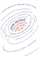
| Rough draft, undecided between disc or belt, with both curves shown. The warm yellow tone in the center will come later. |
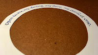
It was hard to describe the problem with words, even to myself, so finally I had to build little models out of stiff paper, letter on them, and stare at them.

 Right, note how the verticals lean in at the ends of the upper curve in this belt mockup...
 ...or out at the ends of the lower curve.
Left, in the disc mockup, the letters lean out at the ends of the upper curve...

I just could not decide how to portray the universe using letters. Finally, I went back and looked at the astronomy photos that first inspired me. That's when I discovered I should use BOTH kinds of letters. They needed to start out flat on a disc, and end upright on a belt, and then vice versa below the vortex.
There are two useful design lessons to learn here:
1. If you can describe the problem, you can start to solve it;
2. Your original inspiration--thumbnail sketch, napkin scribble, or internet search result--is often the most useful corrective to confusion.


Nicely expressed.
ReplyDelete