Showing posts with label World Calligraphy. Show all posts

Wednesday, June 22, 2016

A modern Finnish Gothic alphabet

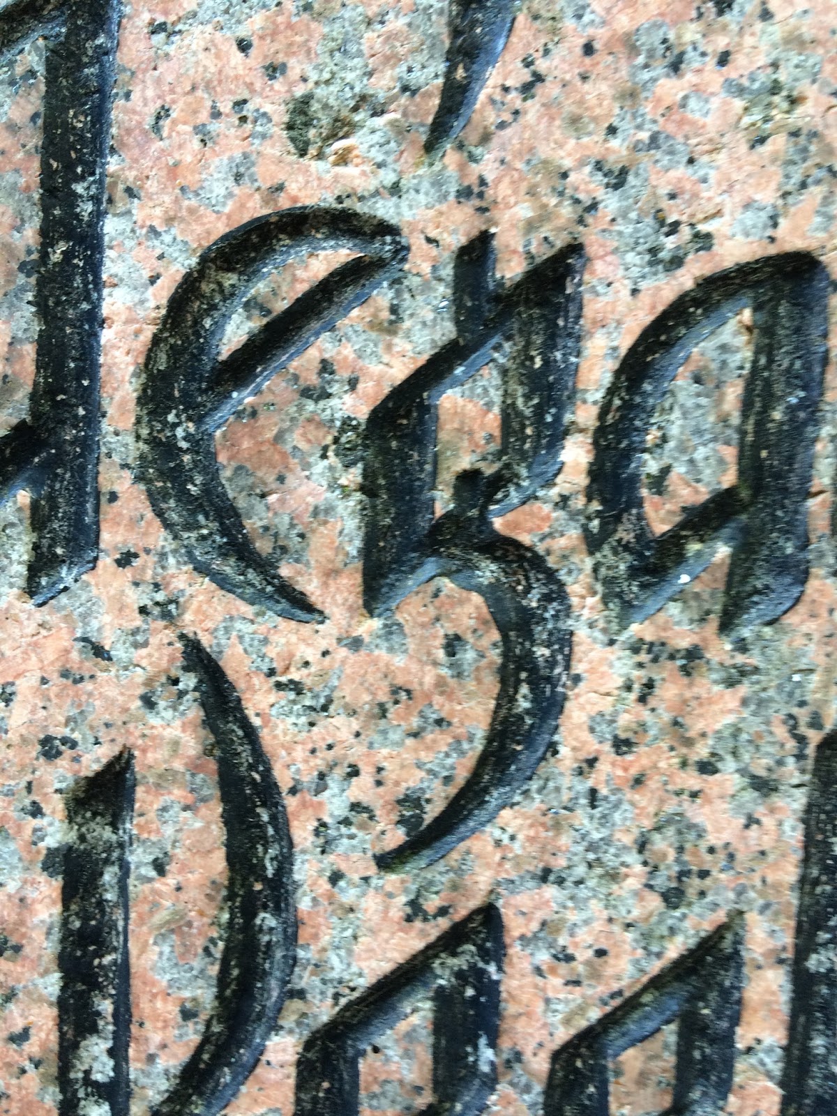
Last week, I noticed this war monument* in the Kamppi cemetery, by the Old Church in Helsinki.  It is carved in a stark, forceful version of Gothic, without the square serifs but with the same heavy width of stroke and uniform letter bodies.  Letters have to be robust to survive being carved into granite, a process undertaken today almost invariably with a power chisel.  


The letters e and a break up the rows of vertical
strokes, with half- or whole-round shapes, 
The letter g shows the kind of calligraphic
ingenuity that brings a smile to a calligrapher's
face. And the thought: I've got to try that one!  


The same message appears in three languages: Finnish, Estonian, and Swedish.  


* "The...monument in the Old Church Park was erected in 1919 in memory of the Finnish volunteers who fell in the Estonian war of independence. The bodies of 25 Finns from Helsinki were carried back from Tallinn aboard the icebreaker Wäinämöinen, and a service was held on 16 February 1919." From Park Walks in Helsinki website. 

Sunday, June 19, 2016

Numbers on the street, Helsinki

I continued to find new numerals on my rambles through Helsinki. 


Friday, June 17, 2016

Some more signs from Helsinki streets

Look in the shady section, for the
word KAHVILA in Jugenstil letters.  
This brass sign is about 12 inches wide or 30 cm.  
Looking for these signs can transform any walk, in any city, into a treasure hunt.  My tips for finding the calligraphy around you: look high, look low, and look again.  


Sunday, June 12, 2016

Two endearing Finnish calligraphy signs

Some 140 years ago, Helsinki artists embraced Art Nouveau, known to them as Jugendstil. Many of these letters can still be seen on buildings.  

I could not resist these two little charmers.  They are about half a meter in length.  


Two takes on Turku

I had just an hour to walk around Turku.  What a lovely city: but the only lettering I found was made of flowers.  And spray paint. 

A gold mine of calligraphy was to be found at the calligraphy conference nearby.  Finland's first national meeting; 80 calligraphers; half a dozen workshops; high level of design and execution; next year's convention already mapped out.  Everything.    

More beautiful Finnish letters!

House identification placque.
This week I'm back in Helsinki for a revisit.  Last year I thought I found every last gorgeous letter in town, but it took just a few short walks around to reveal a new batch for me.  

Here are a few gems:


"Suomi" is Finland's own traditional name for itself.  Above, and at right, it appears in hefty letters that emphasize the strength of the doorway below it.   


BÖLS is the name of the stock exchange, it is
appropriately carved of solid granite, in a style
that looks like 
pure muscle in letter form.

Thursday, April 21, 2016

The last few letters from Spain

A few letters from my recent trip: M and S, in honor of, well, me.  

If you squint at O S O (cropped from "El Coso" logo), it can look like a face staring at you through glasses.   


Sunday, April 17, 2016

Two Spanish calligraphers and their eye for letters

I was lucky to meet Spanish calligrapher Juan Quiros in Valencia, and talk about freelancing, his life as a calligrapher, and the rich assortment of letters he sees on walks around the city.  The picture shows us having tea in the Colon Market.  

Joan and several like-minded friends have opened my eyes to all the other letters I can see if I manage to come back some day.  
On Facebook, David Quay has the eye of a genius for beautiful and interesting Spanish letters.  I wish I'd seen this letter-artist's stream of wonderful photos.  Evidently I just scratched the surface of the riches offered by signage in Valencia and Barcelona.  Next time!  
Interested calligraphers can friend them on Facebook and follow their urban letters.  

Saturday, April 9, 2016

Iron monograms

Valencia's architectural style offers a lot of ornamental iron work, along with a lot of tile (they even put decorative tile on the underside of little outdoor outdoor balconies!).  Often an elaborate iron gate in a doorway includes the initials of the building's title. 

Right:  
B + V 
G + B


Left:
J + C + M

A beautiful example.  


Tuesday, April 5, 2016

Moorish flavor in a few Spainsh calligraphy signs

Well-chosen calligraphy helps add flavor to simple logos and signs.  Spain absorbed 800 years of Muslim influence on art, architecture, dress, cuisine, and music.  
Here is some creative lettering from restaurant signs, reflecting the underlying Moorish influence in Spanish art. 


A sign for a Flamenco venue at left evokes the arched doorways, keyhole screens, and pointed domes of Moorish architecture. 


The flowing curves of Arabic calligraphy appear below in the letters of another restaurant. 

.


Monday, April 4, 2016

Madrid street numerals

I saw these numbers recently on the streets of Spain.  The 17 at right is a particularly ornate example of the many tile numbers that designate homes and businesses.  

Left, a favorite Spanish color scheme of blue, turquoise, yellow, and gold--also a favorite Moorish palette.  

Below, a metal 4 has pleasing curves.  And an almost unreadable 13 (?) challenges interpretation.  


And these three were from tile, for house numbers in Toledo; very standardized but appealing, nevertheless.  


I've collected several more numerals from Segovia. One is carved in granite, with both strength and elegance, on the base of a statue.  Two are included simply for their color.   


Friday, April 1, 2016

The fame in Spain stays mainly in the A's

I've started collecting examples of the letter A that have caught my eye on the streets of Valencia, Madrid, Segovia, and Toledo.  Here are a few from my walks.  

On my next trip, I will have to bring a zoom lens.  Meanwhile, thank you for tolerating their low-res graininess:  


A simple letter A, except for the little 
extension of the cross stroke to the left.  


Raised letter carved in granite.
                    Two As from the same logo.