Wednesday, October 10, 2018

Abecedary to color: I


Click here for a full-page, 
high-resolution printable.
It is always a challenge to make something out of capital I.  All you have to work with is basically one stroke, a simple rectangle.  And just to make your life difficult, there are an inordinate number of capital I s in written English. Not only is I is always capitalized when it occurs alone, but, except for the letter T, no other letter starts a sentence in English more often than I (as in the first sentence in this paragraph). Calligraphers find it hard not to envy the medieval scribe who frequently got to play with a capital Q, which frequently starts verses and chapters in Latin scripture.  

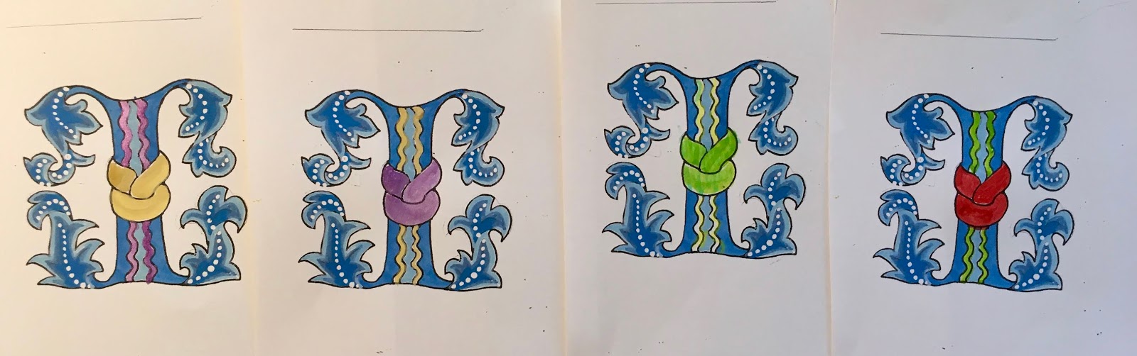
Feel free to make any plain I you encounter more elaborate.  

This letter I illustrates the Florentine technique of decoration that was popular in the late Middle Ages and Renaissance.  The leaves are highly stylized from the acanthus, shown at right, traditionally used in antiquity at the top of Corinthian columns. 

The manuscript leaves are colored with three slightly different tints (you can use two if you are just learning or the scale is very small), very pale at the edges and getting darker in middle.  Some styles add a row of white dots down the spine of the leaf, and surround the leaves with gold sparkles.  

I haven’t outlined the areas of light, medium, and dark tints for you on the printout, because the colors should seem to flow into each other.  But I’ve provided a set of step-by-step illustrations here.  


ABOVE: 
🀆 Light blue ðŸ€†  Light blue finished ðŸ€† Med blue ðŸ€† Medium blue finished 
🀆 Dark blue  ðŸ€† Dark blue finished  ðŸ€† White dots 🀆 White dots finished


Now I have to confess that I had trouble deciding what color to add once I'd finished all the blue.  So I ran four copies and tried out four different color combinations. This is usually a good way to discover what you like, but I still can't decide!  I'm thinking... 

No comments:

Post a Comment