ABCs of the USA: The stories behind America’s most distinctive calligraphy styles.

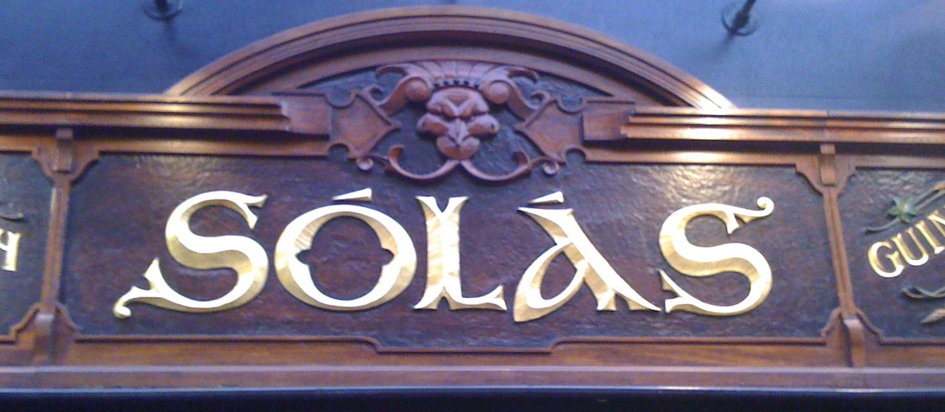
Generations of Irish immigrants have cherished many customs from the old country, including neighborhood pubs. Like ethnic restaurants everywhere, they declare their origins with logo designs in their own alphabet styles. All over Boston, where I live, green and gold signs welcome in a convivial crowd of celebrators wearing green. Many of them will spend the evening watching the broadcast of their favorite basketball team, the Celtics of course.
But celebrating national customs is not just about the Irish. Every immigrant adds to American life, enriching the tapestry. By celebrating each others' holidays, writing in each others' letters, we make our world.
Links to whole alphabets from earlier in this blog:
- Project (with Celtic border to print out), March 17, 2013:
- Celtic color and line: Sept 19, 2013:
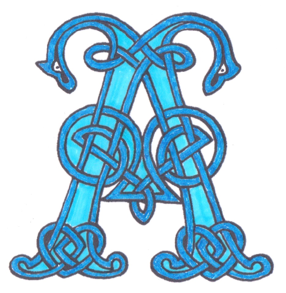
- Super Celtic March 16, 2013.
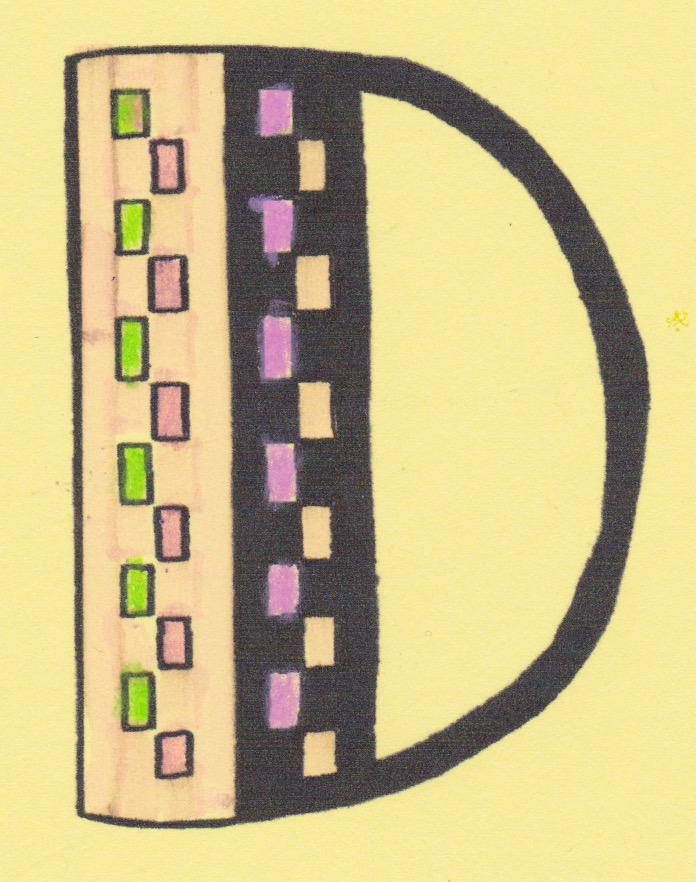
- Some Celtic initials to color in:
For more borders and capitals, see George Bain, Celtic Art: the methods of construction.
Also, see borders in Borders for Calligraphy: and read a chapter of insight and instruction in Learn Calligraphy.
 |