Showing posts with label baby gift. Show all posts

Tuesday, September 18, 2018

Abecedary to color: F


Click here for a full-page, 
high-resolution printable. 

Last week we talked about how the colors you choose can suggest a specific place; we aren’t done with that idea and will come back to it again and again.   
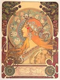
But color is not just about where, it’s also about when.  Some color combinations have become strongly identified with certain decades or centuries.  You can play around with them.  

The last F on this page comes from Art Nouveau, which dominated the 30 years that peaked in the 1890’s, which was actually known as the “Mauve Decade.”* Around the turn of the century, the most popular colors were lilac, ochre, olive, brown, dark red, and of course, mauve. 
I've colored this sample F in a mix of these desaturated, languid, and slightly off colors.    

* A few years later, historian Lewis Mumford coined the nickname “The Brown Decades” to describe the 30 years leading up to the Mauve Decade, from the end of the Civil War to mid 1890.  


Tuesday, February 4, 2014

Africa project: A Swahili quilt

The letters appliquéd on this little quilt read thamani mtoto, a Swahili phrase that means “precious baby.” 

Step-by-step instructions : 
Materials:
You will need two pieces 48” square (1.25 M) of lightweight cotton, and scraps at least 4” x 4” (10 cm), or 1/3-½ yards (30-40 cm) of contrasting fabric to make the letters.
The quilt shown here is made of African themed fabric.  You can use any brightly-colored scraps of your own.
Directions:
1. After you choose your Swahili words, print out the letter templates you need. Cut around them and lay them out to estimate how much they need to grow or shrink to fit on the large square area. Leave a margin of at least 3” (7.5 cm) around the edges.
2. Enlarge or shrink the letter templates (adjust the seam allowances if necessary) and pin them to the contrasting fabric scraps. Cut them out. Iron the seam allowances under and trim any excess. While you’re at it, iron the wrinkles out of the large background pieces.
3. Pin the letters into position on the background. Attach them with zig-zag machine stitching or hand sew them firmly to the background.
4. Sew the back and front of the quilt together inside out. Iron the seam on the right side. Stuff with batting.
5. Anchor the batting with at least nine single stitches.
6. Quilt the front to the back if desired. In this blanket, I left room to personalize the quilt with the baby’s name.
 http://crafternews.crownpublishing.com/2011/09/13/quilt-giveaway-and-instructions-from-margaret-shepherd-author-of-learn-world-calligraphy/

Templates for the alphabet itself are at: http://www.scribd.com/doc/64189517/Virtual-Swahili-Alphabet-Template-From-Margaret-Shepherd-author-of-Learn-World-Calligraphy  

If you do make a quilt with African-themed letters, send me a photograph.  I'll post it here, and I'll send you a copy of my book with a practice pen. 

Check out African motifs in Learn World Calligraphy.

Sunday, June 16, 2013

A baby gift, for Fathers Day

This project creates a hand-lettered gift for a new father or mother. But you can celebrate on any occasion with a baby's name in calligraphy. The steps I followed provide a useful guide if you would like to try something like it.  

I like to use the letters themselves to make a shape on the page, so I decided to have the baby’s vital statistics form an oval frame around the name.  While you can draw your own oval with a loop of string and two pins, I just used an old reliable oval template from my drafting days to make a 3 x 3.5 cm oval, and then enlarged it on my copier.  If the baby's name looks better horizontally, just turn it the long way. 

• A quick pencil draft shows how the letters fit my idea. I spelled out several of the numbers to give myself more text to work with.  When using letters in a circle or oval, I like to help the reader by separating them into two halves so as to keep them right-side up.  

More pencil drafts = better design.  
I tweaked the layout by raising the name .2 cm (such things matter!), and added arrows reminding myself where to shrink or stretch the smaller lettering. 

Then I laid the oval guideline over the draft on a light table and pencilled a more accurate layout.  No light table?  Lots of calligraphers happily hold two sheets of paper up to a sun-lit window to make them translucent.  

I tried a few letters with the ink and pen I intended to use, as a dress rehearsal.  My first try, gold and purple, made it look too much like royalty, so I tried it in a Dr P H Martin green and Speedball gold, which I like much better.  The trial letters alerted me to guard against the possibility of ink blots.   

NOW I was ready to letter in ink.  Choosing my favorite paper, I laid a 7” x 9” * piece of Arches Satine over the final draft and went to work.  →


Although this may seem like a lot of steps, it produces a thoroughly worked-out design that lets you concentrate all your attention on how you shape your letters, not where you put them.  
Plus there are no pencil marks to erase from the front of the finished art, leaving the paper surface untouched.  

Your design, by the way, will improve if you can “sleep on it” at some point in this process.  It’s amazing how much more clearly you see and think after half a day away.    

*Standard paper sizes make for quick and easy framing, a relief to young parents with too many details to look after in their lives.  Or you can present it in a temporary frame and let them get it framed at their leisure--after the baby graduates from college!