Showing posts with label Left-handed Calligraphy. Show all posts

Sunday, December 8, 2013

Fly casual


This little gem shows what you can do to include calligraphy in your life.  Instead of just clicking "reply" to send an RSVP to a party, my friend Allison whipped out a marker, wrote this message on mica, and mailed it in the mail.  What a treasure!  It's going onto the Christmas tree shortly, and will become a real heirloom as well as a classroom example of enjoying the moment.  

Don't get too fussy about letters.  Just write them, by hand, whenever you can.  

Tuesday, December 3, 2013

285 Very Skinny Coopy


1. Penstrokes at 0°
2. Penstrokes at 0° and at 45°
3. Penstrokes at 0° and 45° and 90°.  As usual, Z is a special case.  
Very Skinny Coopy takes most of the fun out of Coopy (see versions on June 12 #137, June 25 #148, Nov 20 #275, Nov 23 #278) by using an even narrower pen point .  There's such a thing as being TOO thin.  This alphabet can be used when you don't want anyone to notice the calligraphy.  

Thursday, November 21, 2013

276 Clear cut

These letters, Clear Cut, are made by cutting black 1" squares with mostly straight lines and moving the pieces to make white strokes.  

You can create simple block letters, or spend a little extra time and trouble to give the illusion of serifs and decorative strokes.  

We will come back to this idea during December, when patterned paper is a big part of our lives.  Start saving now.


Tuesday, November 19, 2013

274 Nouveau D-2

I don't have a good way to do K.  Ideas? beyond just picking words without it. 
I am not satisfied with yesterday's Nouveau D.  Here is another try, Nouveau two nibs, using a broad-edged pen for about half of the strokes to control the swell of the curves, and then finishing off the upper parts of the letters with a Speedball B nib to make a thin unvarying line.  

Admittedly, it's an clunky process that limits you to a few carefully planned words, but these letters do work.  And once you've tried them with your own pen, they belong to you in a special way.  

The blue strokes, at right, are done with a different pen from the black strokes, for emphasis only.  That's not the way I recommend you write the alphabet.  When you actually construct it, use one color for everything, as at lower right.  
  

Monday, November 18, 2013

273 Nouveau D

I'm sure you can do a more polished version of this rough draft.  It's just to get you started.  
This is a case where my battle cry "I can do that" turned into more of a challenge than I expected. The flowing forms of Art Nouveau generally lend themselves to drawing by hand or writing with a brush, rather than lettering with a thick and thin nib.  But i was convinced there had to be a way.  
This ambitious pen version Nouveau D uses the Speedball D nib at a 90° angle for most strokes but flat at 0° for some of the upper horizontals [illustrated in gray above].  This keeps the visual weight down low at the base of the letter.  

Tuesday, November 12, 2013

268 Showcard

The simplicity of Deco plus the humble warmth of the 1940s makes these letters appealing.   

Showcard is one more alphabet based on my favorite Speedball D nib.  This one, simplified from Coopy, was a workhorse for commercial letterers during the 1930s, '40s and '50s.  They cranked out stacks of signs for local businesses and national meetings--in fact, they were so vital to the big convention halls that they had their own unions.  
Eventually Letraset (and other brands of rub-on letters) and desktop printers put most of the sign writers out of work.  But their alphabets live on and continue to catch the eye.  

Monday, November 11, 2013

267 Doodled caps

Hard to improve on; you can try it out with your own doodle. 
Once you start to amuse yourself by dashing off drawn capitals, it's hard to stop.  Non-calligraphers, particularly, seem to rush up that learning curve to have fun with letter design long before they've learned the rules.  This means they invent GREAT alphabets.  

Here's my left-handed cousin Fred Fiske, giving yesterday's Post Medieval letters a handsome Deco look and then doodling inside the empty stroke [top row].  

OK: that's probably enough alphabets for a while based on Medieval Caps.  

Some taboos to try now and then in your calligraphy:
  • Use lined paper. 
  • Write with a thin marker.  
  • Walk off with hotel stationery. 
  • Hold a pen in your left hand....
  • Goof around.


Friday, November 8, 2013

265 Complex Medieval caps + dot


I used a Speedball B to make the dots all the same size.  You can just make circles with a small pen and fill them in.  
In addition to yesterday's Complex Medieval caps, you can add a decorative disk to the very thin curves.  I've shown this on most letters except A V W X Y Z; you may want fewer of them.  Or more!  


Thursday, November 7, 2013

264 Complex Medieval capitals


Complex Medieval builds on yesterday's Simplified Medieval.  Transform the letters with a mix of these six steps:
  1. Choose forms of E H M N T W that are less modern and more medieval.
  2. Exaggerate the contrast between thick and thin parts of curves.
  3. Make the outer curve a little sharper.
  4. Lower the corners of B D F P R...
  5. And extend their serifs, as well as those of P and H.
  6. Add a dramatic bulge and taper to one stroke in A H J K M N Q R T X Y Z
  7. An alternate M can be derived by rotating the W 180°.

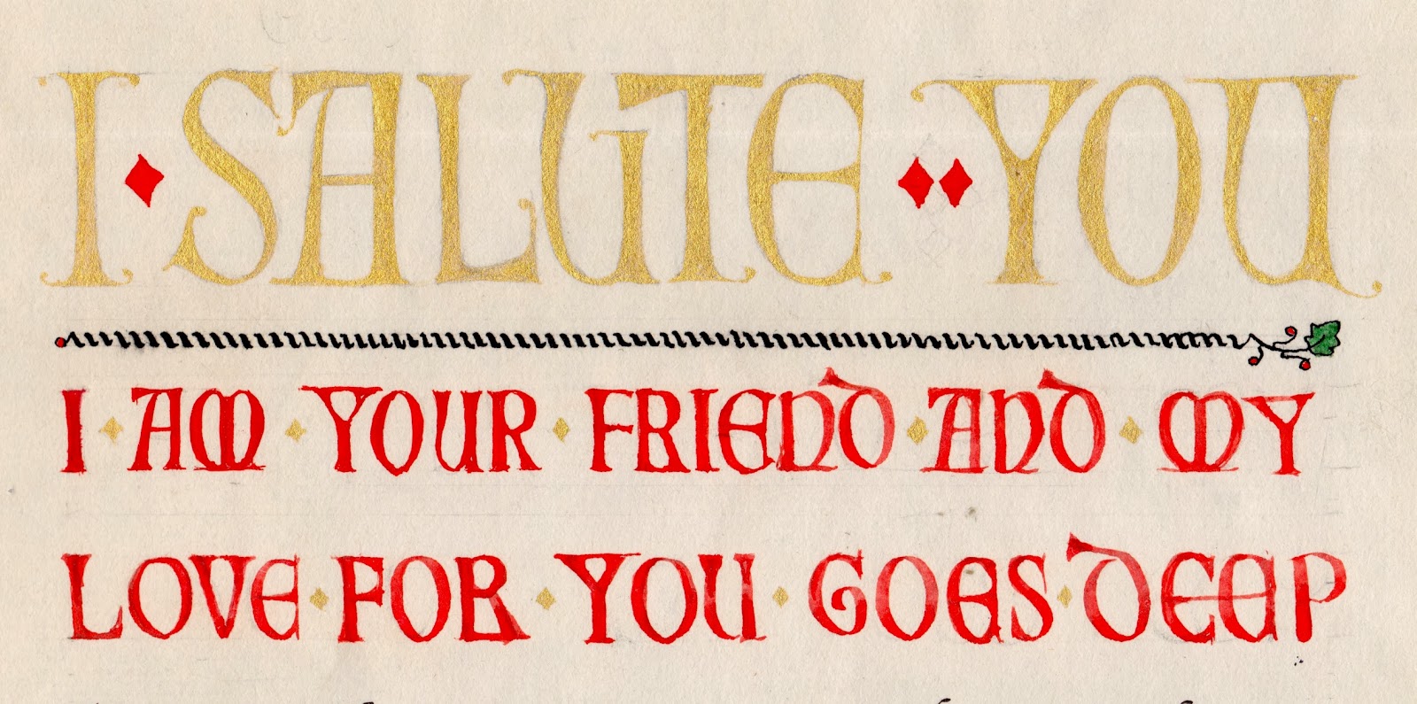
This quotation starts with large caps carefully rendered in powdered gold paint, known as "shell gold."  The smaller red caps are heavier, more like yesterday's  Simplified Medieval. It ends with the attribution, to Fra Giovanni also in shell gold. 

I haven't shown the text lettering itself.  This was only the third piece of calligraphy I tried, back when I was a beginner.  Actually, I'm still a beginner...  


Preview of tomorrow's alphabet.

Wednesday, November 6, 2013

263 Simplified Medieval caps

These drawn and filled in letters are not as refined as I would would make them for a formal design.  I just drew them to illustrate the two-step process.
When medieval scribes wanted to start their text with an enlarged word or two, they often chose to draw Roman letters, which came to be called Versals or Lombardic capitals.  I've named these Simplified Medieval caps, because they render the classic forms in a style that highlights their decorative inner spaces and hairline serifs.


Outline, to be covered up.  
Here is the first, outlined version; a scribe or illuminator would have sketched the letter in diluted gray or brown ink, intending to cover the outline with the final solid color of red or blue paint, or gold leaf.  The outlines--shown in black here--are not meant to be seen by the final reader; they just suggest where to paint or gild.


Thursday, October 31, 2013

256 Skritchy

This alphabet, Skritchy, not only looks but sounds creepy.  

  1. Take a coffee-stirrer and break it in half.  
  2. Dip it in black ink.  
  3. Hold it at right angles to the direction of the stroke.  
  4. Then drag it along on cheap paper.  

The wood corner on paper will stick and slip a little, making that jagged, itchy line.  And it also makes a little noise like dead fingernails on chalkboard.  The blots and splats are a bonus. Enjoy!  

Saturday, October 26, 2013

254 Highland

In the workshop where I learned this alphabet, we were given popsicle sticks to write with.  

Highland is made with straight, or slightly bent strokes that overlap.  It is strong, clear, and easily modified.  Almost all the strokes are done with the pen at a flat, 0° angle.  The horizontals in E F Z require a 90° pen angle.  

Highland is related to Dry Land (January 26 #23), Heavy Land (February 23 #47), Disjointed Neuland (May 30 #126), and Heavier Land (June 7 #133).  They are all based on Neuland, a popular type and calligraphy style.  (I'd better provide that basic alphabet soon, since you've now learned five variations.)  


Saturday, October 12, 2013

242 Single Deco


This alphabet is built on the same structure as Double Deco, from the day before yesterday.  It's a lovely example of how to suggest an era with the simplest unvarying line.  

Friday, October 11, 2013

241 Raised Roman

In Raised Roman, the imagined edges of an invisible solid letter can be created by strokes of the broad-edged pen. 


  • Raised Roman is constructed by laying paper over a simple Roman alphabet.  Even a narrow pen (here, one eleventh of the letter's height) creates the illusion of depth.
  • The narrow pen actually makes corners easier to dovetail.  
  • Note the slightly flared serifs.   
  • Experiment with the pen angle to make the diagonals visible.  

I have always liked the imagery in this poem by Wallace Stevens.  Here, "the greenness of night lies on the page and goes Down deeply into the empty glass..."  I floated the lime green letters above a three-dimensional illusion made a Raised Roman alphabet. The title character is described as reading by his own light, an enchanting image, and the poem ends with "the fusky alphabet."


preview of tomorrow's alhabet.


Thursday, October 10, 2013

240 Double Deco

This simplest of alphabets acquires great sophistication by its doubled line.  Double Deco also challenges you to make straight lines, and to space them just one pen width apart. 

The letter height is 18 pen widths.  Most curves are sections of a circle.  

Wednesday, October 9, 2013

239 Loopy Line


Adapted from Calligraphy Now.  
Loopy Line renders yesterday's alphabet with an unvarying line.  This line is heavy; a thinner version appeared on January 5 as Stringy. The loops are not all in the same places as yesterday.  And your interpretation probably will find new loops to try. 

Tuesday, October 8, 2013

237 In the Pink

These letters are cut out with zig-zag pinking shears.  You can try your own version, contrasting positive and negative space,  mixing colors, and layering them to intrigue the eye.  I made this one in a hurry; I'm sure you could take this idea much further.  


Thursday, October 3, 2013

234 Lean out [mono]

Keep the letters wide enough to accommodate the curved stroke, and don't try to lean them too much.  

I've been struggling with Italic letters that lean back instead of forward.  It's hard to make them look graceful.  Here is Lean Out Mono, a version written with an unvarying line. 
Preview of tomorrow's alphabet.


Saturday, September 21, 2013

224 Lights out

Today's alphabet, Lights Out, honors the Equinox, when the sun's light starts its long decline.  This simple style creates the optical illusion of a three-D letter on the page.  

Thursday, September 19, 2013

222 Celtic line

I've been thinking about what it is that makes Celtic letters Celtic.*   Here is a version, Celtic Line, that omits the traditional variation between thick and thin.  It still has eighth-century Irish flavor, but updated and simplified.  To keep it Celtic, I've emphasized the triangular serif and used some of the quirkiest letterforms.  

*In the Celtic chapter of Learn Calligraphy I dissect Celtic style into ten main characteristics, which I gave names that start with C to make them easier to remember: 

  1. comfort at all sizes
  2. choice of weights
  3. changeable pen angle
  4. compound serifs
  5. chunky extenders
  6. commoncase font
  7. cute proportions
  8. coils that continue
  9. coils that stretch
  10. contained spaces