

Complex Medieval builds on yesterday's Simplified Medieval. Transform the letters with a mix of these six steps:
- Choose forms of E H M N T W that are less modern and more medieval.
- Exaggerate the contrast between thick and thin parts of curves.
- Make the outer curve a little sharper.
- Lower the corners of B D F P R...
- And extend their serifs, as well as those of P and H.
- Add a dramatic bulge and taper to one stroke in A H J K M N Q R T X Y Z
- An alternate M can be derived by rotating the W 180°.
 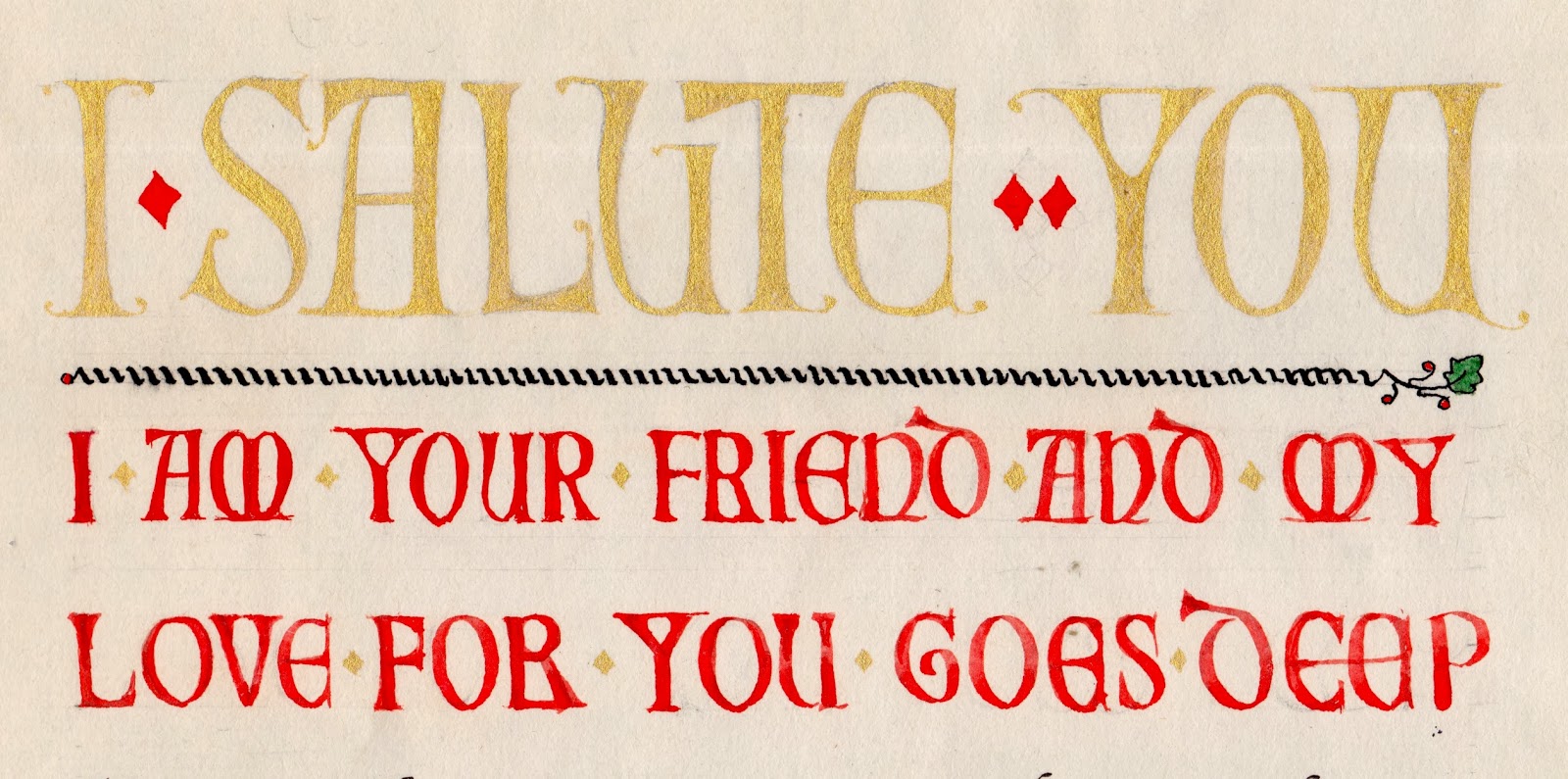 |
I haven't shown the text lettering itself. This was only the third piece of calligraphy I tried, back when I was a beginner. Actually, I'm still a beginner...
 |
| Preview of tomorrow's alphabet. |
No comments:
Post a Comment