Showing posts with label Gothic illumination. Show all posts

Sunday, December 15, 2013

Christmas cards, conventional or innovative

Gothic letters are inspiring to design with.  Their medieval flavor is closely identified with Christmas customs, which mainly came from Germany via 19th century England.  But also, their abstract hexagonal shape helps them express creative contemporary calligraphic layouts.  

The greetings above offer two different approaches: a conventional illuminated page with large capital and leafy border, or letters in white falling out of a midnight sky. You can experiment along the whole spectrum from the familiar to the unexpected.  

Thursday, December 12, 2013

292 Elf dot

Note: I got a little rushed on this alphabet: I forgot to use waterproof black ink for the outlined title.  Red and green watercolor inks made it run.  If you take care, you don't have to make that mistake. 


This is simple: take yesterday's Elf and add a gold dot where red meets green.  


Wednesday, December 11, 2013

291 Elf


Elf is just a simple nod to "It's Christmas!" Use basic outlined Gothic letters and fill the upper half with green, using a brush or pen.  Let it dry completely.  Wash out your brush or pen.  Then fill in the lower half of the letters with green.  

You could add a gold dot to where the colors meet.  Let's make that modification tomorrow: 


Thursday, December 5, 2013

Churchy

I don't really have a whole alphabet today, but want to share a raised inscription I s on 57th Street during a recent trip to New York. 
Maybe you can derive the missing letters from those here.  


Details below and left.  The Y is unusual. 

Friday, November 8, 2013

265 Complex Medieval caps + dot


I used a Speedball B to make the dots all the same size.  You can just make circles with a small pen and fill them in.  
In addition to yesterday's Complex Medieval caps, you can add a decorative disk to the very thin curves.  I've shown this on most letters except A V W X Y Z; you may want fewer of them.  Or more!  


Thursday, November 7, 2013

264 Complex Medieval capitals


Complex Medieval builds on yesterday's Simplified Medieval.  Transform the letters with a mix of these six steps:
  1. Choose forms of E H M N T W that are less modern and more medieval.
  2. Exaggerate the contrast between thick and thin parts of curves.
  3. Make the outer curve a little sharper.
  4. Lower the corners of B D F P R...
  5. And extend their serifs, as well as those of P and H.
  6. Add a dramatic bulge and taper to one stroke in A H J K M N Q R T X Y Z
  7. An alternate M can be derived by rotating the W 180°.

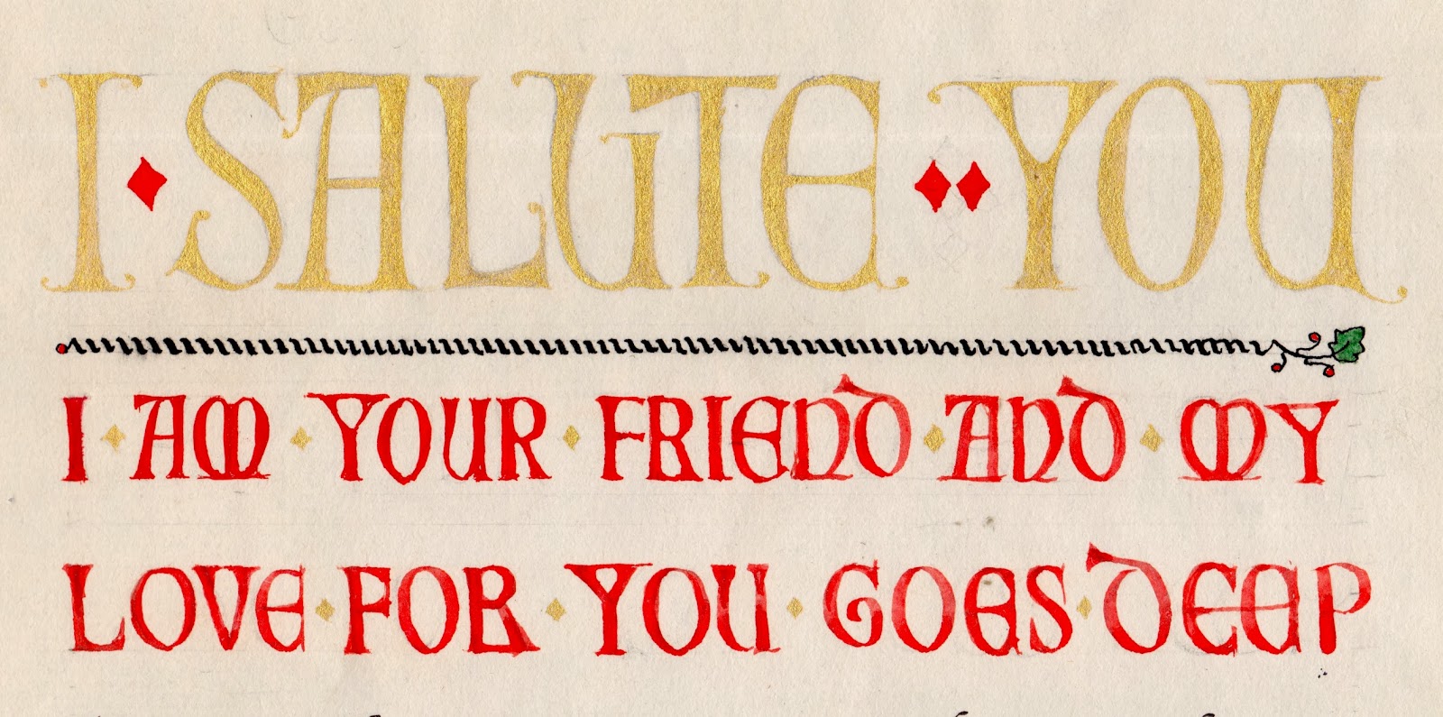
This quotation starts with large caps carefully rendered in powdered gold paint, known as "shell gold."  The smaller red caps are heavier, more like yesterday's  Simplified Medieval. It ends with the attribution, to Fra Giovanni also in shell gold. 

I haven't shown the text lettering itself.  This was only the third piece of calligraphy I tried, back when I was a beginner.  Actually, I'm still a beginner...  


Preview of tomorrow's alphabet.

Wednesday, November 6, 2013

263 Simplified Medieval caps

These drawn and filled in letters are not as refined as I would would make them for a formal design.  I just drew them to illustrate the two-step process.
When medieval scribes wanted to start their text with an enlarged word or two, they often chose to draw Roman letters, which came to be called Versals or Lombardic capitals.  I've named these Simplified Medieval caps, because they render the classic forms in a style that highlights their decorative inner spaces and hairline serifs.


Outline, to be covered up.  
Here is the first, outlined version; a scribe or illuminator would have sketched the letter in diluted gray or brown ink, intending to cover the outline with the final solid color of red or blue paint, or gold leaf.  The outlines--shown in black here--are not meant to be seen by the final reader; they just suggest where to paint or gild.


Tuesday, November 5, 2013

262 Original Medieval caps

I've left the J and V and W blank for your own versions.  

I recently traced these Original Medieval letters from a page that provided models for an illuminator to dramatize a paragraph once a scribe had lettered the text.  These letters are much more individual than modern versions, which tend to try to look like a font with uniform letter bodies and line endings.  Sometimes tracing is the only thing that will keep you from needlessly improving and updating an alphabet--not necessarily a bad thing but it's hard to stop doing.  
Source of initials.  


Tracing calligraphy is like historical re-enactment; you learn to do what the person of the period did, without trying to impose your own interpretation onto it. 


Thursday, October 24, 2013

252 U N Day

Today is United Nations day, so here are two medieval initials in color, plus nine different black and white versions of U and N.  Peace.   
From Capitals for Callligraphy.   

Monday, October 21, 2013

249 One with everything


Each letter has two colors, a gold dot, and a drop shadow.   

This one takes some explaining. 


A typical Book of Remembrance, from Canada. 
One of my first freelance clients was a company that supplied merchandise for churches--palms for Palm Sunday, bulletin forms for weekly services, choir robes, etc.  My task was adding names to "Books of Remembrance," big, ornate, leather-bound volumes that many churches maintained and displayed to honor their donors and supporters.  I had to continue their lists using the style of the original scribe, which meant that I ended up learning to imitate alphabets from as far back as 1910.  It was like doing archaeology and a historical re-enactment together.  


This was one of the most popular styles I encountered, which I call One with Everything.  I would NEVER suggest that you use this except as a heavy-handed way to suggest a bygone era, but you can load everything onto the alphabet just for fun.  And it makes your other freelance jobs seem easy.   


Friday, September 6, 2013

211 Heraldry Language

This alphabet, Heraldry Language, derives from Heraldry (July 9, #160).  It shows how the colors, patterns, and precious metals of medieval heraldry can be specified with great precision using words from a special vocabulary.  After reading the description, the illuminator used his own imagination and talent to create the escutcheon.*  
* If that word brings you to a screeching halt, think how I felt when I first encountered it on the SAT in high school.  Not fair!  I've made a point of using it here so you can ace your own tests.
There are a lot more ways to fine-tune the description of a family crest.  But these will get you started.


Sunday, September 1, 2013

Project: Placing a capital in Gothic text

  he first letter of a Gothic text is usually enlarged.  There are three ways to attach it to the text: no indent, partial indent, complete indent.


No indent
1.  Line up the capital to the left edge of the text without indenting it. The scribe has tagged the next letter with a dash of red after I, left, because it is as tall as three small letters.  P, right, is closer to the text letter's size.  

2.  Indent part of the capital, letting some of its left half hang into the margin.  E and P, right.  

3.  Completely sink the capital into the text, leaving its left edge flush with the text.  N, left, and S, below. 
Complete indent.

The illustrations here are from 50 Medieval Manuscript Leaves, used with the kind permission of photographer David Bindle.  The book is a treasure house of beautiful and instructive examples, well worth its price.  
http://www.blurb.com/b/2272528-50-medieval-manuscript-leaves

Saturday, August 31, 2013

206 Short & Stripey two-toned


Late 19th-century calligraphers liked to write their Gothic letters with a scroll pen (double nib) and then fill the space inside the stroke with two colors.  Short & Stripey Two-Toned combines blue and yellow fill.  
Gradual vs abrupt color change.  
There are two approaches to try: 

  1. Fill the lower half of the letter with blue first and then overlap the yellow to create green that gradually shades from blue to yellow.  
  2. Or fill the top half of the letter with yellow first.  Let it dry completely.  Then fill the bottom half with blue, without overlapping and gradual shading.  

A third technique accents the contrast with gold. We'll try that next week.  


Sunday, August 25, 2013

Project: Decorating three kinds of Gothic space


We've done a lot of Gothic text letters this month.  You'll be wanting to "capitalize" on them.  Here's how, based on the simplified Gothic letter forms of Versals, below from May 6, #105.   
Gothic manuscript capitals are decorated in some combination of these three kinds of space: surrounding the letter, inside the letter, and within the letter stroke itself. The letters above show each one; the letter below shows all three together.  
Three kinds of ornament.  
    1. Since many letters are circular shapes inside a square frame, you can decorate the corners. 

2. The interior space of most letters opens a window into foliage, pattern, or a scene.  


3. The space inside the stroke may be filled with ornament in color, or solid gold leaf (right).   


Medieval ornament wasn't always very elaborate.  This O is partly filled with parallel lines and loops.  This tiny R is painted blue and quickly filled and surrounded with simple red hash marks.  (Original size, about 1/4 " square. ) 

You can see some more examples of decorated capitals on my Pinterest board: http://pinterest.com/shepherdscribe/beautiful-letters-from-the-past/
The Y and O above are from the book 50 Medieval Manuscript Leaves, and are used here courtesy of David Bindle.  http://www.blurb.com/books/2272528-50-medieval-manuscript-leaves

Next Sunday's projects will explain how to place your capital letter in the text.  

Sunday, June 2, 2013

Embedded capitals

It is easy to combine a Gothic Capital with any small Gothic text letter to create a medieval page.  Follow the steps here: 
  1. Choose a text at least 30 words long.  This gives you flexibility in line layout.  The passage here has about 200 words, and I still ended up having to hyphenate 10 of the words.  A medieval scribe would have used, or invented, abbreviations rather than hyphenate.  
  2. Arrange the line length to make the first 3-6 lines of the paragraph half as long as the rest of the lines.  Sometimes your chosen text cooperates, sometimes it resists.  Don't give up.*   
  3. Try to make the short lines stack up to the same height as your planned capital.  If the natural word breaks in your text don't leave you with enough short lines, you can fill the space with ornament. 
  4. Letter the text. Don't forget to start with the second letter of the first word!  (Trust me.)  Medieval scribes sometimes lettered the initial very small in the space left for the capital, to remind the illuminator, as shown with the letter V in the illustration here.  
  5. Try a rough draft of your capital, in the space, sketched on a separate scrap of paper with patches of color.  Stand back and squint.  
  6. Trace or transfer a light outline of your capital.  Ink it in and color it and gild it.  Those techniques are a whole other project, but you can start with a one- or two-color letter, improvised from your own skills.  

Design tips: 
Don't make every capital large and ornate.; they'll just compete with each other.  The letter O that starts the second column is simply lettered, with a wide pen; it could be blue or red.  
Illuminated capitals: Assorted Gothic May 29
Traditional text letters : Rounded Gothic March 6, Plain Gothic April 11.       
This illustration is a whole page from Capitals for Calligraphy, my hand-lettered how-to book about the history, design, and layout of capitals.  Each page delivers information both to the side of your brain that reads words and to the side that sees images.    

*You may have to make your first lines much shorter, as in the small example at left, where the large capital leaves room for "[A] S  T H E" in single letters stacked along its right edge. 

Wednesday, May 29, 2013

125 Assorted Gothic Capitals

Gothic capitals are drawn with many shapes, scenes, serifs, and styles.  Here is an assortment of 26 ways to decorate an initial.  For the basic shapes, you can refer back to Versals (April 29) and Versals in Circles (May 6).  
  

The alphabet below first appeared in my basic book Learn Calligraphy .  You might enjoy printing it out and coloring it in. Use bright primary colors, plus gold or silver.  

Today, by the way, is considered by academic historians to be the ending of the middle ages, as the day in 1453 when Constantinople was conquered by the Turks.   
Because so many medieval capitals are built on similar shapes and resemble each other, you can easily modify, flip, or rotate one to look like another.  Change N to H,  D to C,  G to O, M to W.