Song of Solomon: timeless love poetry in contemporary calligraphy.
I’m only human. Sometimes I just choose a translation to fit the demands of the layout — not only to suit its tone but to actually provide me with the letters to design it with. Remember that medieval scribes loved to letter Beatus Vir because the initial B offers so much potential for design. And all calligraphers like to encounter passages that offer us a Q, Z, or other favorite letter to work with.
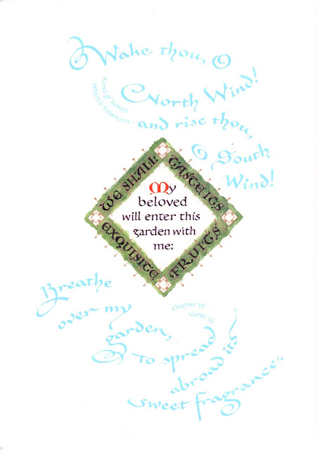
 |
| IV: 9 |
 |
| Detail |
For instance, several translations of Song of Solomon make a comparison to "one chain," "one jewel, " one link," or "one bead" of the beloved's necklace. These are all accurate, but I chose "one gem" because the g just looked like a natural part of the necklace.
Some other graphic reasons for choosing the translations I choose:
 |
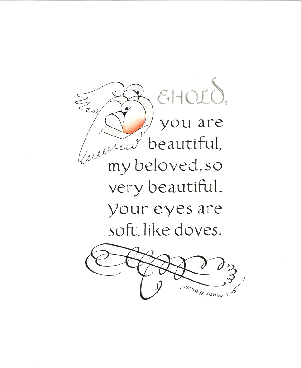
That "BELOVED" in the first
line of I: 15 seems more like a
dove than "How beautiful
you are" or "Ah, you are
beautiful" from other versions. |
- For overall length; sometimes the design wants lots of words, sometimes only a few.
- For emphasis; a design may highlight the end of the quotation rather than the beginning.
- To put a ascender or descender where I need it for decorative effect.
- For the word or initial it starts with. For instance, consider: I am my beloved’s and he is mine vs My beloved is mine and I am his. For calligraphers, I is a less interesting letter to work with than M.

 Oh, yeah, I forgot; I use these two Prismacolor pencils a lot in making rough drafts. So now I have mixed some ink to match them, too, and I am working them into current designs for Song of Songs.
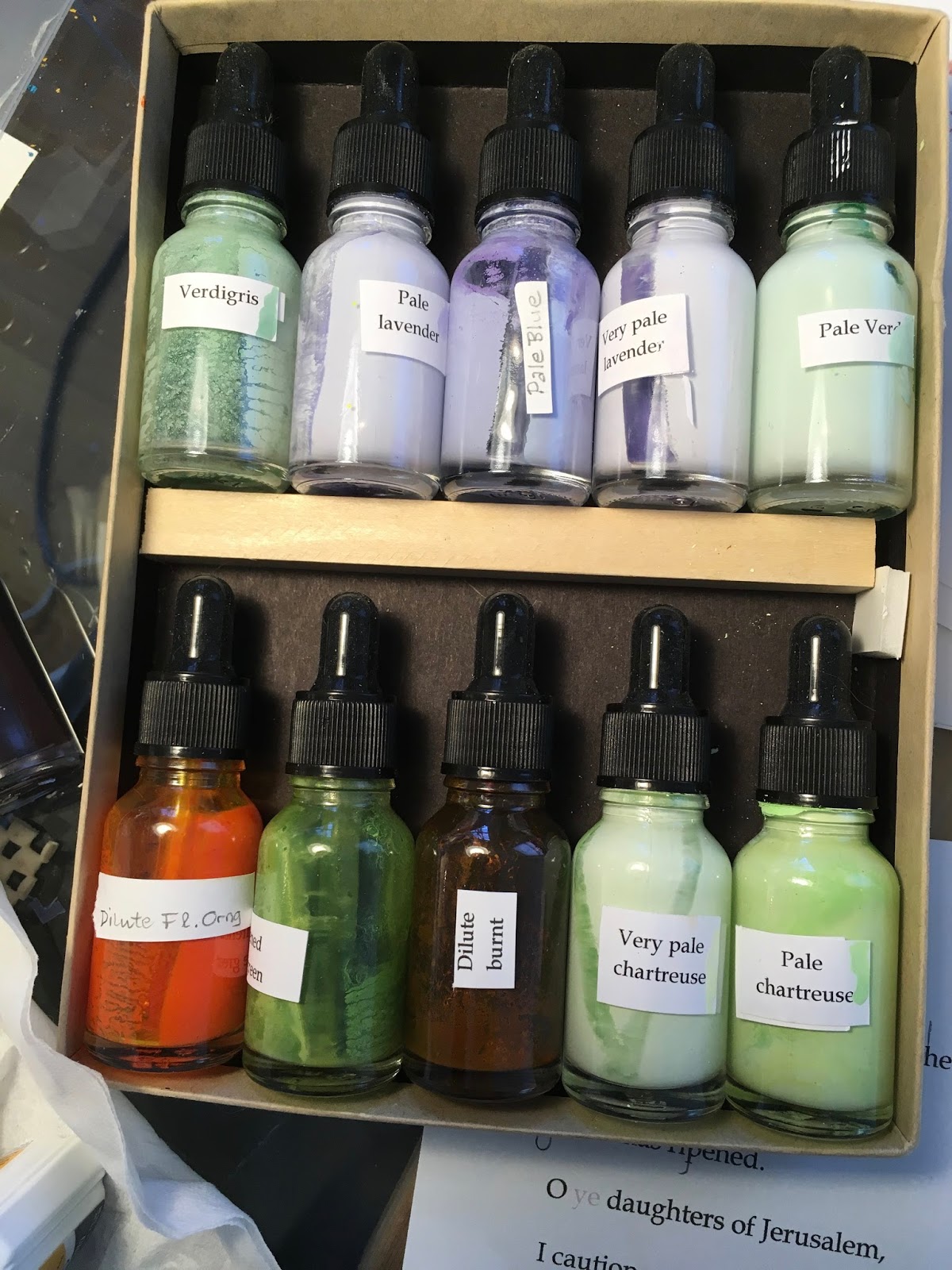


