Showing posts with label Calligraphy techniques. Show all posts

Wednesday, January 31, 2018

And two more colors

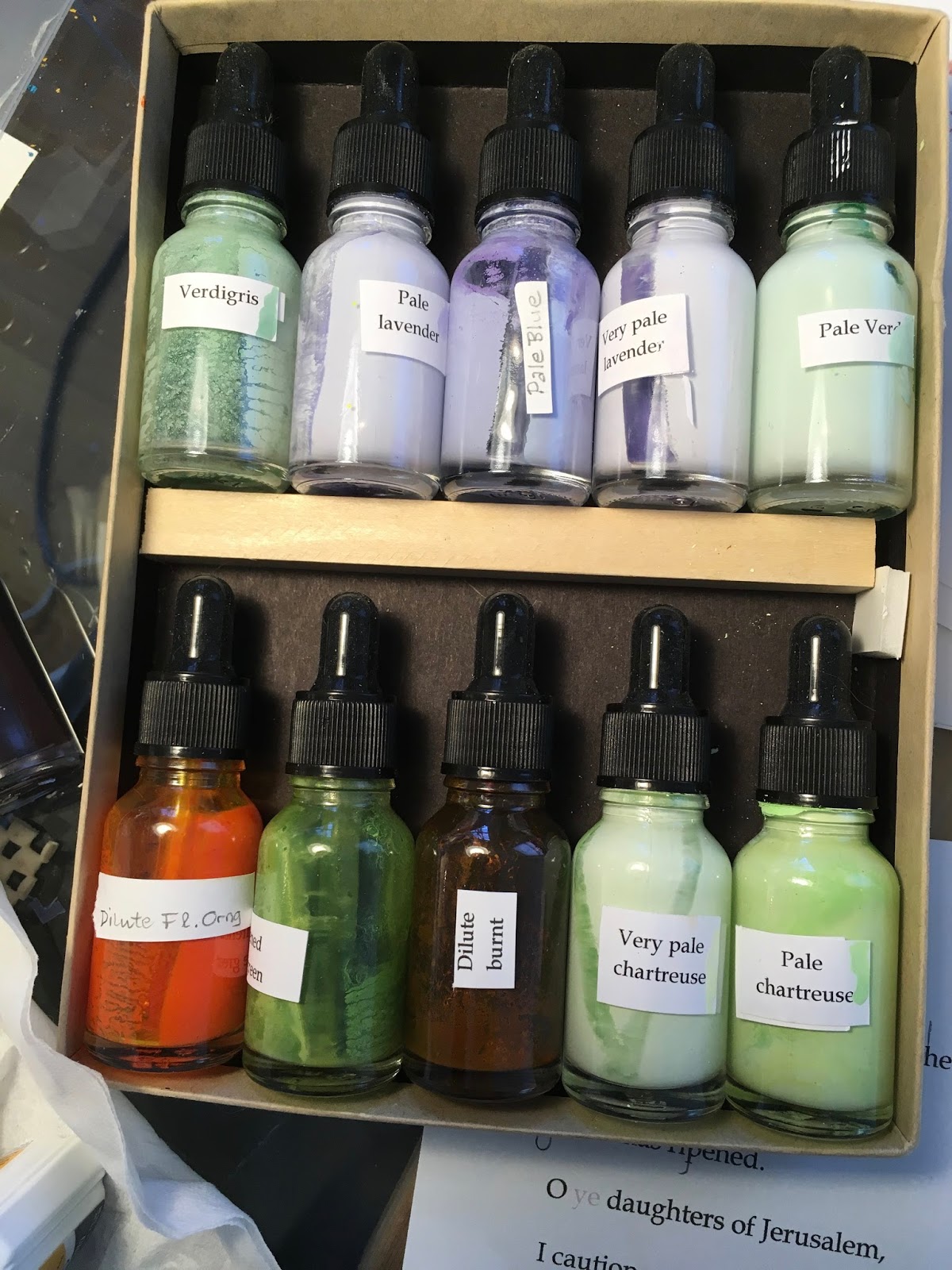
Oh, yeah, I forgot; I use these two Prismacolor pencils a lot in making rough drafts.  So now I have mixed some ink to match them, too, and I am working them into current designs for Song of Songs.  

At right: Pale gray lavender-lilac and chartreuse/lime 
In fact, if you don't intend to get any new supplies, you still might want to have these convenient bottles for custom-mixing small amounts of ink. The droppers let you fill your pen neatly instead of dipping.   

 bottles: Vivaplex, 24, Clear, 15 ml (1/2 oz) Glass Bottles, with Glass Eye Droppers


Calligraphers welcome every chance to explore color; its hue, saturation, and brightness, and how it changes when another color is nearby.  It's one more way to let the reader hear the tone of voice that words on paper suggest.  


Thursday, January 18, 2018

Colors that I like to come back to

Shortly after I started copying the Song of Songs, Which is Solomon's, I designed a title page that used seven strong, basic colors, which I have gone on to use over and over in the 50-some designs for the group.  I was especially partial to orange, indigo blue, and gray. 

But along the way I have found some new favorite colors that surprised me.  (If you've just sworn off browsing in art supply stores or sites because you already have too many pencils or inks, you might want to skip this post. I have too many pencils and pens and inks but I still just can't resist one more.)  
By exploring the Prismacolor display, I've found four colors new to me and learned to mix them with ink. 

  • First is the palest "Grey Green Light" color that I've already worked into the background of three pieces to add soft, subtle texture.   
  • The second is "Black Grape" that gives purple truly serious weight.  It was the perfect foil for the cream and sepia band of color in "Majestic as the..." Now I use it often.  
  • The third is "Metallic Green," a verdigris that seems to solve every color problem I encounter.  It's almost worn down, to a 3" stub.  Too bad for me, it seems to have been discontinued.  I'd give a big reward for anyone who finds one more.  
  • Orange comes in a lot of variations, such as the "Vermilion" here.  I like it because it punches through soft gray colors.  

Here are three of the designs 
I've used these colors in.  Let me know your own favorite colors.    


Saturday, January 13, 2018

Kinds of light from the sky

SONG of SONGS: Timeless love poetry in contemporary calligraphy. 

Letters, letter strokes, and lines of letters can portray many natural forms.  Here, suggested by the central metaphor, they portray what we see in the sky.  
(Scanned at home, not corrected yet for tone)

  •    A round area of aqua letters makes the disc of the moon.
  •     A descending column of gray letters falls right through the blue letters, suggesting a broad beam of light.
  •    A diagonal sliver of gold falls at a different angle within that beam.
  •    Simple lines of lettering with the verse's citation make thin rays of light.  
  •     The words spoken by the other young women form two other rays of light, set off to the left like a chorus or echo just outside the central spotlight.
  •    Traditional repeating pen strokes radiate out from the glowing moon, and evoke its pale greenish-bue light.  


We are so grateful to live in an era when astronomers' photos fill our eyes with gorgeous images of the heavens nearby and of deep space.     


Sunday, January 7, 2018

Galaxy arms Part two

SONG of SONGS: Timeless love poetry in contemporary calligraphy. 
Galaxy arms Part two: 
After comparing total randomness with strictly repeating pattern, I combined the two ideas.  The four different swaths I ended up making were based on spiraling galaxies, the DNA double helix, two twined colors, and an irregular sine wave that faded in and then faded out. In each case, the pattern formed against a background of random dots.  


I wanted the galaxy arms to have a similar texture to the lines of lettering--not too dense or too light--and to in some way echo the words in both form and content. 


Tuesday, January 2, 2018

Galaxy arms Part One

Song of Songs: Timeless love poetry in contemporary calligraphy. 

The vortex design posed many challenges.  How DO you show the arms of a galaxy?  Stars without number, and clouds, gases, black holes, and things we don't even have names for?  It's a little off-topic for a calligraphy design, but I've learned from decades of calligraphic design that to harmonize with the letters on the page, most decorative elements should be done with the same pens and inks.  
The decorative trails between the lines of lettering were mainly made of dots, plus a few stars and new moons and planets.  I experimented with both a random sprinkling, and with some clearly repeating patterns before I found a blend of both that also hinted at the underlying structure of astro-physics. 
Here are the experiments that didn't make it: random swaths of dots, at right, and some repeating patterns below that were too obvious.  Mimicking the texture of text is not simple; it challenges you to find more than letters in your pen.  

(Please overlook my problems with the background tone.) 


Friday, December 29, 2017

Seriously!


Song of Solomon: timeless love poetry in contemporary calligraphy. 


Sometimes calligraphers have to guard against making words too pretty, too quaint.  I like to use Versal letters, familiar capitals from medieval manuscripts, because they have more majesty, presence, and warmth than pure Roman or casual Italic.  But Versals can exude a little too much charm, reminding people of the middle ages or of Victorian Christmas cards, (above).  

The frank, fervent declaration of anguished love in this text called for letters that would make the words more stark and serious.  I took out or shortened some of the ball finials in my first draft.    
Compare the two sets of Versals at right to see where I simplified the capitals.
   

Tuesday, December 26, 2017

Lettering on the curve; belt or disc?

Song of Solomon: timeless love poetry in contemporary calligraphy. 


Rough draft, undecided
between disc or belt,
with both curves shown.
The warm yellow tone in
the center will come later. 
About V: 2 - 6. Letters can suggest not just depth but also the angle you are seeing it from.  I had a lot of trouble deciding whether the curved arms that spiral outward from the galaxy's vortex should look like they are on a belt, like a ring from an astrolabe, or suggest a disc, like the rings of Saturn.  They looked confusing in my draft, shown at left.  
It was hard to describe the problem with words, even to myself, so finally I had to build little models out of stiff paper, letter on them, and stare at them.  


Right, note how the verticals lean in at the ends of the upper curve in this belt mockup...           
...or out at the ends of the lower curve.  


Left, in the disc mockup, the letters lean out at the ends of the upper curve... 


...or in at the ends of the lower curve.  


I just could not decide how to portray the universe using letters.  Finally, I went back and looked at the astronomy photos that first inspired me.  That's when I discovered I should use BOTH kinds of letters.  They needed to start out flat on a disc, and end upright on a belt, and then vice versa below the vortex. 


There are two useful design lessons to learn here: 
1. If you can describe the problem, you can start to solve it;  
2. Your original inspiration--thumbnail sketch, napkin scribble, or internet search result--is often the most useful corrective to confusion.  

Thursday, December 21, 2017

From joy to despair

Song of Songs: Timeless love poetry in contemporary calligraphy.

I wanted my overall layout to suggest the intense pleasure and intense despair described in Chapter V: Verses 2 - 6.  I set myself the goal of using only the line spacing to evoke emotions.  

The text reads very simply, from top to bottom.  
   
The curves get closer and closer to each other as the young woman hears her lover approaching; the lines crowd together around  the glowing vortex (at present just a white space) where her "heart trembles;" then when he is unexpectedly gone the lines start to pull apart; finally when she says "he did not answer" her hope seems to drift into the cold and dark of the empty sky at night.  At that point, she feels as far from him as a distant star.  


Monday, December 18, 2017

Making the page glow

About 12" diameter.  
I have been trying out ways to support the visual image in the passage from Song of Songs VI: 8 - 10, which compares the beloved to the sun and moon.  To sum up various translations, she is said to be "luminous as the moon" and "brilliant as the sun."  Both of them glow; after I tried to get the glow of both moonlight and sunlight onto the same page, I began to see that they would cancel each other out.  So I settled on moonlight, with its spectrum of cool, greenish, bluish, lavender glow, to frame the main sentence.  I kept adding more  white to make the colors harmonize and not overwhelm the foreground.  


Detail

I used a 17th century calligraphic zigzag to give the colors subtle sparkle., and to maintain the language of the pen.  I'm not sure how far I'm going to let them radiate out from the center.  

There will be more lines of text to add once this layer dries.  


Tuesday, November 7, 2017

What does the universe look like? V: 2 - 6

Song of Songs: Timeless love poetry in contemporary calligraphy.

Every step of this design was really hard to get right.  The translation desperately needed modernizing; the intense emotions it described went from pleasure to despair; the fiery central glow had to be created from pen strokes; the lettering should follow curved guidelines.  
I'll describe how I made some of these decisions.  
   
1. Several words from the King James Version clearly needed re-translation.  When the woman hears her lover at the door, she says that "my bowels were moved for him." It's a real mood-killer.  Of course the modern reader, startled, can figure out the idea, but this phrase that was routine 500 years ago is unpleasant today. I substituted words from a later version, which also convey a visceral reaction but without any unwanted associations, "my heart trembled within me."*  


Translating the Bible for calligraphy is like rendering it for musical performance; you want the meaning and the art to reach the viewer or listener without any distraction.  


*The 50-some translations I consulted ranged widely to describe this gut feeling of anticipation: from "I was thrilled that he was near" to "my heart began to pound for him" to "I felt excited inside" to "my inmost being yearned for him."  


Wednesday, October 11, 2017

Fixing the "oops"

Yesterday's post about proofreading raised the topic of how to handle the mistakes you find.  
Let's define "mistake" as pigment that doesn't belong where it is on the page.  There are several ways to handle a calligraphy mistake. 
First do no harm.  I can't emphasize this enough; don't make the situation worse by over-reacting.  Spend 10 minutes to assess the error, relax, remind yourself that everyone makes mistakes. 
Assess the limits of your materials: What kind of ink: is it made of pigment or dye?  What kind of paper: soft and spongey or coated to keep the ink from soaking into the fiber?     
Level of scrutiny vs magnitude of error: is this a small glitch or something fundamental to the whole piece?  how close will the reader be to the page?  Is this original art or is it for a print?    


Hold the paper against a mailing tube or... 
... roll the paper around itself. 

In my recent mistake--the extra comma after the word "glance"--several factors were working for me: the paper had a hard surface already, called hot press, plate finish; it was made harder by a thin coat of sizing; the ink had dried to a thick layer on top, scarcely soaking into the paper fibers; the comma was sitting in white space, all by itself.  These allowed me to put a fresh blade* in the X-acto knife, curve the paper over a cylinder, and shave the ink off.  
*either curved #10 or pointed #11

With the blade parallel to the paper, peel up the smallest possible surface layer, then trim it off at a right angle to the first motion.  


Saturday, October 7, 2017

Proofread it one more time!

Song of Solomon: timeless love poetry in contemporary calligraphy.  

Corrected. How? see the next post.  
One comma too many
If you learn just one thing today, learn to take off your calligrapher's hat and put on your proofreader's hat.  I was ready to frame and show this finished design when a typo* jumped out at me.  Can you find it?


That prompted me to go back and re-proof my other two-dozen finished pages.  

This is the most frequent question that people ask calligraphers; what do you do if you make a mistake?  We will look at one solution this week.   

*Technically, a calligrapher's mistake should be a "write-o." 

Saturday, September 30, 2017

See the Song of Songs exhibition in Boston this autumn


Song of Solomon: timeless love poetry in contemporary calligraphy. 

Margaret Shepherd's monumental project has rendered
this unique book of the Bible into modern calligraphy.  
Twenty-eight designs from The Song of Solomon are now on exhibition at First Church Boston, September  24 - November 19, 2017.  


You are invited to the Artist's opening 
October 13, 5:30 - 7:00.  
Future showings will add more verses 
until completion in 2020. 

Friday, September 22, 2017

9. 18 And another final thought on translation


Song of Solomon: timeless love poetry in contemporary calligraphy. 

I’m only human.  Sometimes I just choose a translation to fit the demands of the layout — not only to suit its tone but to actually provide me with the letters to design it with. Remember that medieval scribes loved to letter Beatus Vir because the initial B offers so much potential for design.  And all calligraphers like to encounter passages that offer us a Q, Z, or other favorite letter to work with. 
IV: 9
Detail 

For instance, several translations of Song of Solomon make a comparison to "one chain," "one jewel, " one link," or "one bead" of the beloved's necklace.  These are all accurate, but I chose "one gem" because the g just looked like a natural part of the necklace.

Some other graphic reasons for choosing the translations I choose: 
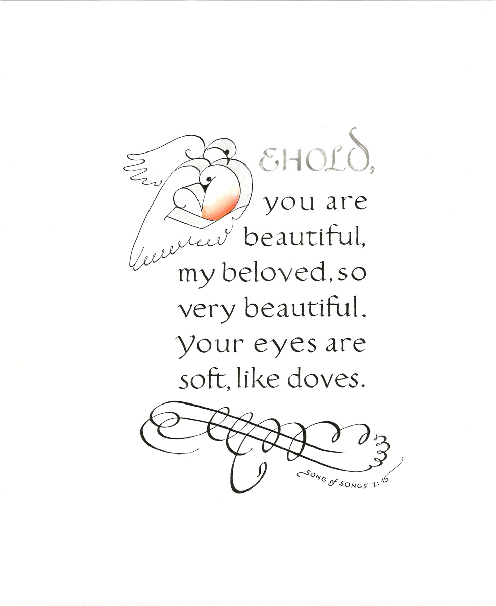
That "BELOVED" in the first
line of I: 15 seems more like a
dove than "How beautiful
you are" or "Ah, you are
beautiful" from other versions. 
  • For overall length; sometimes the design wants lots of words, sometimes only a few.  
  • For emphasis; a design may highlight the end of the quotation rather than the beginning. 
  • To put a ascender or descender where I need it for decorative effect.  
  • For the word or initial it starts with.  For instance, consider: I am my beloved’s and he is mine vs My beloved is mine and I am his.   For calligraphers, I is a less interesting letter to work with than M.  

Thursday, September 21, 2017

9.17 A final thought on translation

  Song of Solomon: timeless love poetry in contemporary calligraphy.  


But, trust me, even the most careful copying of a script
that you don’t read yourself is an open invitation to typos.

 
You’ve got to have a fluent speaker proofread it for you. 
Topic 17. Reaching back before the King James Version, you can include a second text in an older language and script.  That can add depth and richness to the design, and provides you twice as many words to design with. While most of your readers won’t be able to read it, you might benefit from how people actually enjoy calligraphy more when they don’t focus too much on a literal reading.  
Not from Song of Songs, for a change, just
the parting words of a colophon.  


There are many creative ways to combine two scripts on the page, like the Latin and English valediction at right.   

Wednesday, September 20, 2017

Thoughts on translation, Part 9.16: Stet

Topic fifteen: After a fortnight, I have one final thought; sometimes, you don't need to change a thing. The King James Version--as close to the "original version" as any English speaker is likely to get--still sometimes hits the nail on the head.  Mark Twain said it best; “The difference between the almost right word and the right word is really a large matter—it's the difference between the lightning bug and the lightning.” When lightening strikes, you know it.      

But don't stop searching; every different translation offers a window into a different time and place and mind, and gives new appreciation for the wordsmith's art.  After five centuries it's still hard to improve on the King James Version's "jealousy is cruel as the grave." But even such perfection wasn't inevitable; less than a century earlier, Wycliffe's translation had it as "evil is hard as hell."  

"The important thing is not to stop questioning," as Albert Einstein said.   Now I will go back to writing about how to arrange these carefully translated words with pen and ink.            

Monday, September 18, 2017

Thoughts on translation, Part 9.14: Visual vocabulary

Song of Solomon: timeless love poetry in contemporary calligraphy. 


Topic Fourteen: Some items just aren’t familiar to modern readers: for instance, do you know what spikenard or camphire actually look like, or how they smell? That's why I went looking for modern equivalents that people might recognize: green rushes, aloes, henna.  I kept myrrh because it feels familiar to everyone from the Christmas story, even though it's not a familiar plant.    

A hind, a roe, or a roebuck comes into focus for many of us only if it is called a gazelle. 


Scholars now think that the apple tree in II: 3 at right, may have actually been apricot or quince or orange, which are sweet and succulent, and native to the region since ancient times. I did not change the wording for this design, this time, because I wanted to experiment with the shape of the apple.  But the luscious color of the apricot keeps suggesting that someday I should try a design built on that updated translation.  

Stick with me for a few more days on translation topics, and then we will get back to interpreting scripture with calligraphy.  


Sunday, September 17, 2017

Thoughts on translation, Part 9.13: The back story

Song of Solomon: timeless love poetry in contemporary calligraphy. 

Topic thirteen: Bible verses, especially from the Old Testament, contain many implications we might miss.  For instance, the mandrake of VII: 13 was probably known to contain a mild hallucinogen in its root. For any listener who knows that, it creates a powerful metaphor for the delirium of infatuation itself.  

In VI: 8. (at left)  Mt Amana, Mt Shenir, Mt Hermon: the specific mountain peaks in Israel where the poet describes his beloved living with leopards and panthers, were familiar names to the original listeners.  (Some of these also appear in American place names, testimony to the religious background of many early settlers.) 

In I: 14, "My beloved is unto me as a cluster of henna in the vineyards of Engedi.”  En-Gedi today, near Masada, is still a flowering green garden in a dry land; last year it was one of the most popular destinations in the country. Every Israeli can visualize it.       

Indirectly, I have tried to hint at this extra dimension in my calligraphic design wherever possible.  Moral: if you don't recognize a word in scripture, looking it up will add to your enjoyment.  

Saturday, September 16, 2017

Thoughts on translation, Part 9.12: But how does it SOUND?

Song of Solomon: timeless love poetry in contemporary calligraphy.  
  
Topic twelve: To translate anything, but especially poetry, you must always keep your inner ear tuned to how it sounds out loud. I have spent many hours weighing the best word for a pleasant smell; I could choose from aroma, fragrance, incense, perfume, and my favorite, exquisite spices [to my ear, a better translation than powders of the merchant].  They all sounded equally good out loud.  

However, no matter how rich the English language may be in synonyms, they don't all please the ear; it only took one reading aloud for me to decide against any translation that called perfume ointment. Now that's a mood spoiler.  Read it aloud to someone you love, and decide if you, too, might want a different word. 
One more example, from I: 13.
"A bouquet of myrrh" just sounded a little more
romantic that "a bundle of myrrh." [KJV] or
"a bag of myrrh" [RSV].

And I haven't even mentioned VIII: 1, which starts "O that thou wert as my brother."  When was the last time you heard someone use wert in a conversation?!  

So read aloud, and listen to your ears. Even when Biblical poetry is meticulously rendered in calligraphy, it deserves extra attention to its sound, because it is so deeply rooted in our oldest oral culture.   

Friday, September 15, 2017

Thoughts on translation, Part 9.11: Lost in translaion and relocation

Song of Solomon: timeless love poetry in contemporary calligraphy.  

Topic Eleven:  Some compliments from 26 centuries ago are just not going to translate into today's love talk.  Lovers of that era compared their beloved to the most beautiful treasures in their world, but the metaphors are so dependent on the context of a desert tribe that they often sound odd in a literal translation today. 


VI: 5 - 6
When you tell today's young woman that her hair is like a flock of goats or that her teeth are beautiful because none are missing, she may not hear it as a compliment.  Whenever I came across these village metaphors, I was extra careful to choose a graceful translation.  And pray for the reader not to take it wrong.