Showing posts with label Illuminating. Show all posts

Tuesday, February 19, 2019

Abecedarium to color: Y

Click here for a full-size page
 to print out and color in.   
The letters on the Y page span at least a thousand years, from the Book of Kells to Art Nouveau.  Each one has had its own moment, with its own special materials and colors and context.  
  
The Celtic Y I have colored in here is adapted from an upside-down A, with coils added along its ends and its central join. You can keep an eye out for letters that can take on a new identity with a simple flip or rotation.   

Tuesday, January 29, 2019

Abecedary to color: X

Click here for a high-res, 
full-page printable to color in.
 X , this week's letter, lets us think about symmetry.  Many letters, especially the Versals based on Roman capitals, are symmetrical along their vertical or horizontal axis.  Or both, like the letters I, H, O, and X.  
This illustration comes from Learn Calligraphy,
by Margaret Shepherd, Random House.  page 91. 

If you are fascinated by symmetry, you can did deeper here.  Just as M C Escher's work [see V and W above] left people disoriented about the visual experience, Arthur Loeb's lifetime of study restored order to the many different kinds of symmetries

Tuesday, January 22, 2019

Abecedary to color: W


Click here for a high-res, 
full-page printable to color in.
The last W on this page, and the fourth V* on the previous post, are from a fascinating genre, where the artist seems to follow the rules of perspective but doesn't.  Your brain knows the structures can't exist but your eye keeps trying to find a way.  And coloring the image in doesn't help make it any less impossible.  You have to let go of trying to make sense of the image and just admit that you can be baffled.  

*That V is made of children's blocks to heighten the riddle.  (If you look carefully, you'll find that each picture shows something that starts with V.)


Enjoy the mental puzzles without worrying about solutions.  As R. Crumb said in one of his cartoons, "It's just ink on paper, folks!"  

The idea of impossible letters was first explored by type designers who were inspired by the work of M C Escher, a one-of-a-kind artist who changed forever the way people look at positive and negative space.  In the first half of the 20th century, he pioneered the study of tessellation, perspective, and the depiction of impossible objects. His work prefigured the concepts of fractals and forced perspective. 
Enjoy this excursion into the third dimension--and beyond.   

Wednesday, January 16, 2019

Abecedary to color: V

Click here for a high-res, 
full-page printable to color in.
This page offers six different takes on the very simple letter V.  It is an old letter from the earliest Latin alphabet, where for centuries it stood for the numeral 5 and also was used for the sound of U. Then it doubled itself to create W for the Germanic and English languages.    


Backwards V.  
V from same address, down underfoot and right way around. 


You might assume that a letter V based on Roman models should have a wider stroke on the left than on the right [see lower right].  Calligraphers know this contrast comes from holding a broad nib at a right-handed pen angle.  But once in a while you will see a typeface that reverses this order [see upper right], for no reason I've ever discovered.  
I'm adding this letter U, to show how easy it is for people who are unfamiliar with the realities of the broad-edged pen to get the thicks and thins wrong with U and V.  


 You'll also enjoy coloring in the grapes, once you've decided what color grapes actually should be.  Check out your grocery store [or your back yard, if you live in Chile] and compare.  

Above: two of the many grape colors, from my upcoming book Song of Solomon, to be published in 2020 by Paraclete Press.  

Tuesday, January 8, 2019

Abecedary to color: U

Click here for a high-res, 
full-page printable to color in.
U looks so simple, just half a circle and two uprights, but designers can't seem to resist filling it with all kinds of ornament and pattern.  

U is, in fact, a relatively recent addition to the alphabet, having been represented until well into the 16th century by the letter V.  As in carved inscriptions in Rome spelled Julius Caesar as IVLIVS CAESAR. You still won't find it in Polish, which seems to otherwise have an unlimited appetite for using consonants.   


Sometimes, when you're trying to understand letters from 12 centuries ago, you just have to wing it.  The fourth U of the page above is topped by a bird and some animal (a cat with its back fur up, maybe), but unless the man inside this letter is practicing yoga I cannot figure out what he is doing.  You are welcome to check out the original here, admire its blue and green color choices, make up your own story about this very flexible man, and color him in.   

Tuesday, January 1, 2019

Abecedary to color: T

Click here for a high-res, 
full-page printable to color in.


 t  he letter T comes in three distinct forms: a rounded spiral coil with a flat top; a central upright with a bar across the top; and the lower-case curved upright with a bar just above the middle (shown as this paragraph's capital but not included in this page's selection).  


This Celtic T (which happens to have an angular U woven into it) is characteristic of the playful, elastic, and sometimes surreal letters to be found in the Book of Kells.  The fish looks more real once you've colored him in, but--what color is a fish? Try everything from golden orange to teal blue to silvery gray.  Whatever you choose, it's clear there is a fish on the page, in a kind of 3-D realism, if you can accept that he happens to be snared in the tail of a sea monster lurking below.     

Wednesday, December 26, 2018

Abecedary to color: S

 S  can be simple or complex, though its shape is so distinctive that it has given its name to the "ess curve."  In classical Roman letter design, and many of today's type designs, the upper curve is slightly smaller than the lower, to keep it from looking top-heavy.   

In honor of tomorrow, the first day of the Kwanzaa holiday, this angular S is settled amid an angular background modeled on Kuba cloth from the Congo.  You can choose characteristic earth colors like brown, yellow ochre, and brick red; where you place them can either complicate or clarify the image.  Don't worry about irregularities in the pattern's "repeat." African textiles do not aim at such predictability.   


To evoke the texture of cloth, lay the paper over a rough surface, such as a cloth-bound book as in the example shown here, and use a soft colored pencil worn down to a blunt end.  


Click here for the high-res, S-page printable.

Tuesday, December 11, 2018

Abecedary to color: R

Click here for a high-res, 
full-page printable to color in.
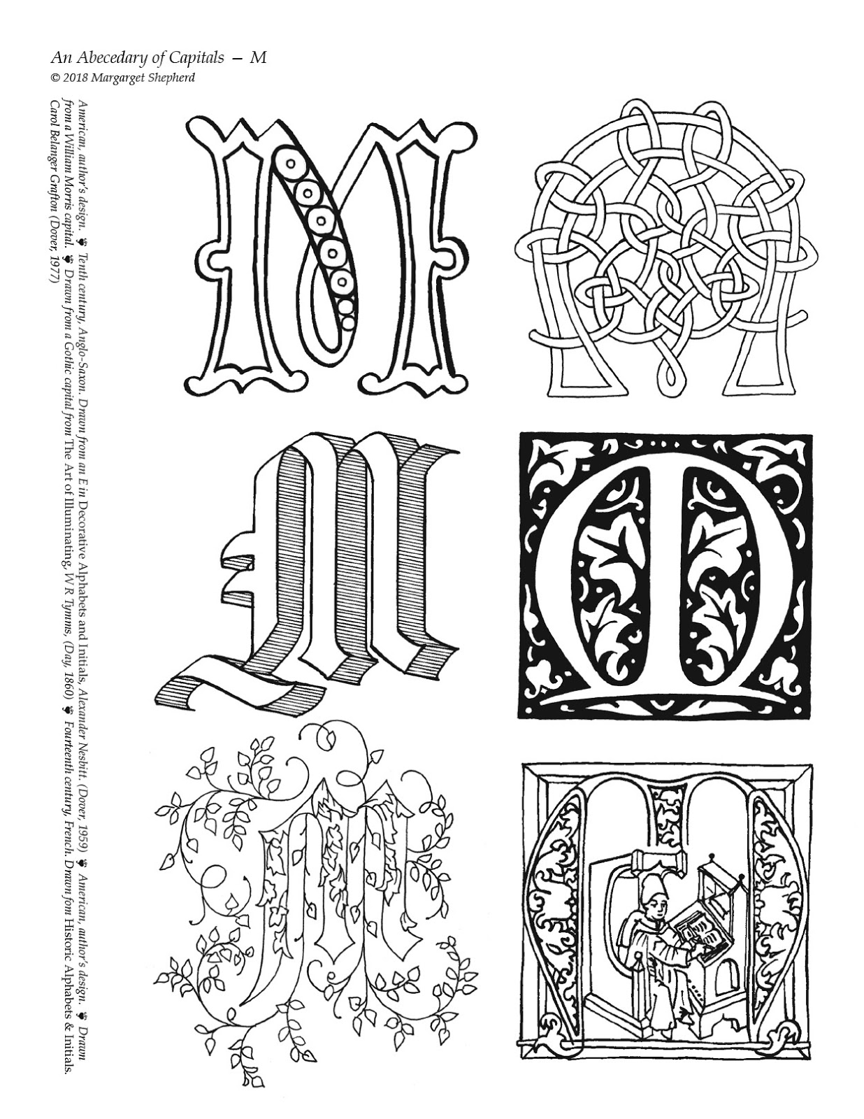
When calligraphers start learning letters, they deal with only with two dimensions, letting the pen lay down a flat trail of ink on a flat page. But the minute they start drawing the capitals, it's hard to resist exploring the third dimension.  
  
Each of the designs here creates the illusion of depth: the robed people kneel in a crowd; the plump angels hover; and even the flat strip seems to curl up off the page.  You can let them fool the eye without extra help, or add to the effect by shading your colors.  


This letter R starts with a simple outline, but is looped with twisted cord, draped with little pearl drop earrings, and adorned with one large gem. It makes you think that at least parts of it stick up from the page, even if you can't actually walk around it.  (You might try coloring that cut gem with several colors to suggest its shiny facets.)  
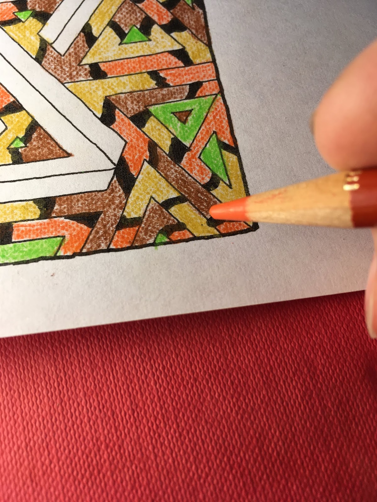
Tuesday, December 4, 2018

Abecedary to color: Q

Click here for a high-res, 
full-page printable.
 Q !  is a letter that calligraphers just love to find at the start of a quotation.  But a glance at the statistical tables tells them that they can't expect many opportunities in English; Q is third from the last in the list of letters that start words, and dead last in letters that start sentences. 
Medieval scribes, in contrast, copied the Bible in Latin, where they could start words, sentences, and verses with the letter Q often. Creative Q shapes included all sorts of tails: animals, vines, whole people.  A favorite motif was a knight killing a dragon, with the tail of the dragon forming the tail of the Q.   


Here is the original letter that I outlined on my abecedary page, in its original colors.  That tail could be redrawn into almost any shape. This dragon's color seems opposite to what modern custom suggests; since the discovery of the island where Komodo dragons live, green has become the default dragon color.  But early manuscript illuminations--and the illustrations to J R R Tolkein's The Hobbit--portrayed them as red.  

Wednesday, November 28, 2018

An Abecedary to Color: P

Click here for a high-res, 
full-page printable.
P doesn't have to stay in one shape, but offers you a tail that you can lengthen to stretch down a margin or shorten to cram into a box.  The tail can even turn a corner to turn itself into a leg with a foot, as in the third and sixth designs here.  


Medieval isn't everything. This P to be a total anachronism: I took a 16th century design from an 19th century Victorian sample book, and colored it with 21st century retro girly colors.  You can find similar inspiration [!] on my Pinterest boards. Enjoy. 


https://www.pinterest.com/shepherdscribe/an-abecedary-to-color/ 

Tuesday, November 20, 2018

An Abecedary to Color: O

Click here for a high-res, 
full-page printable.
 O  is a gift to illuminators, providing a beautiful frame around portraits, scenes, and patterns.  And because so many old poems or Bible verses use the vocative O to start a sentence, such as "O Lord" or "O my beloved," the English language will offer a lot of chances to use O.  
It doesn't give calligraphers total freedom, though; you'll have no serifs to work with.  


In collecting these letters, I have noticed a lot of variation in the weight of the outlines.  I have given you two different versions of the letter O, here made of leaves; one with thin gray lines that will almost disappear when you fill them, and one with heavy lines that look like the lead in stained glass.  You can decide what colors work with these.  At left, O in soft shades of green, from my upcoming series Song of Songs, Which is Solomon's.  At right, for contrast, I used the brightest markers in the set.        

Tuesday, November 13, 2018

An Abecedary to Color: N

I just discovered that I forgot to post this earlier.  Please accept my apologies.  And enjoy. 
Click here for a high-res, 
full-page printable.

N is a simple letter in both its angular and rounded versions. The diagonal is often decorated to focus interest at the center.  The round form creates a nice internal space to fill with decoration, scenery, or people.  

N figured often in Latin manuscripts, in Nunc, or Nobis, or Pater Noster, or Nolite [do not], but not so often that illuminators--or readers--ever got tired of it.  

Today, N names are not so common; but for women my age, Nancy was the 7th most popular name for a baby girl.  And you can use an ornate N to wish someone a Joyeux Noel or Feliz Navidad.  


I've colored this N but only to make a cautionary example out of it.  It comes from the Celtic tradition of interlaced knots, but if you look at it carefully you will find that the artist who constructed it realized too late that the coils in his two verticals did not really match, and he tried to tried to fix them up with dots.  It did not work.  AND his lumpy knots and coils make you appreciate the meticulous illuminators of the Book of Kells.  We can only excuse him for living in the early days of Celtic decoration, and perhaps not having access to a model to copy.  

Alex Bain, whose 1951 book* analyzed the structure of Celtic art, was unsparing in his disdain for anyone who would not take the trouble to look at the existing masterpieces of knotwork and dissect them accurately.  If you embark on construction of a Celtic letter or border, check the accuracy of your interweavings and crisscrossings!  Better yet, get the book; it's still the last word on Celtic calligraphy.  

*Celtic Art, The Methods of Construction. 

Tuesday, November 6, 2018

An Abecedary to Color: M

Click here for a high-res, 
full-page printable.
The English language gives you many, many chances to put M to use in your calligraphic life: the first letter for eight of the 50 states in America; Mr., Mrs., and Ms; and all those girls' names like Mary, Megan, Martha, Mariana, Malia, Maureen, and of course Margaret.  


AND, as a bonus, if you rotate them 180° many of your M designs can do double duty to serve as W s.  Or rotate them 90° to turn them into E s . 


Historical note: the last M on the page above seems to show you a scribe at work.  Don't believe it!  In the middle ages, pages were lettered on single sheets of calf vellum and illuminated, and only then were the finished pages bound into a book.  BUT it's just possible that he is a scholar making annotations in the margins.  

The drawing does include one an authentic detail, however. While he writes with his right hand, this scribe holds the page steady with a flat stylus, probably of bone or ivory, that keeps his left fingers from touching the surface of the page.  Oils from human skin would darken parchment or paper and make the ink bond less tightly.  

Mary holds her book in a linen
cloth to keep it clean (detail,
Annunciation Triptych)
. 

Devout readers, also, were careful not to touch their most precious holy books.   In The Nun's Story, Sister Luke describes being told to keep a small square of paper under her fingertip that touches the page as she reads, to keep the pages from being soiled. 
Like many calligraphers, I avoid letting the heel of my hand rest on the writing surface, to ensure that the ink will adhere evenly to the paper.   


Wednesday, October 31, 2018

An Abecedary to color: L

Click here for a high-res,
full-page, printable. 
 
Two weeks ago I showed you the way that printing your letter onto  parchment paper can add a Celtic feel to your color choice.  There are lots of other background textures that will help your letters create a different visual story. 


Here I printed a cross-stitch capital L onto denim motif paper and colored it in with colored pencils in two shades of lavender.  The slight variation in tone imitates the texture of yarn.  Voila: personalized bluejeans!  

I have left the grid lines showing in this example. If you want the cross-stitch L without the grid, I've pinned that version onto my Pinterest board, "An Abecedary to Color." 

Tuesday, October 23, 2018

Abecedary to color: K

Click here to go to a full page,
high res printable.
K is a peculiar letter; while it was common in ancient Latin, it died out around the beginning of the Common Era,* only to be re-discovered a few centuries later.  It joined the alphabet in the early Middle Ages in northern languages,** although even today it is absent in French, Spanish, and Italian, where it is used only to spell foreign loan-words.    

*Used only occasionally, and then always followed by a letter A.  
**But there is no K in the Book of Kells.  Go figure.  
This K appeared in Learn World Calligraphy,
Margaret Shepherd, Watson-Guptill, 2011


A letter's national identity can be strengthened through color choices. Russian graphic art blossomed in the early 20th century. This letter K can be colored in with its original garish hues (shown at right), or with the softer tones of nostalgia for a folk past popularized by master graphic artist Ivan Bilibin (shown below)


Check out some examples of Bilibin designs on my Pinterest board An Abecedary to Color.   

Wednesday, October 17, 2018

Abecedary to color: J

Click here to print out a full page at high res.
Color in calligraphy can strongly suggest national identity. In America-- and especially in Boston where I live--we are so conditioned by St Patrick’s Day, the Boston Celtics, good luck charms, and the myths about leprechauns, that any letter with a little knotwork implies Celtic origins. When you write in Celtic style, you have to be careful; and once you add green, you’ve basically suggested that March 17 is right around the corner. 


To heighten its Irish flavor, I’ve printed this letter onto faux parchment paper to suggest the yellowed parchment of the Book of Kells. (Even though the original scribes strove for pages of the purest white.) 

If you want to get picky, green paint was not common in the past: some pigments were expensive; they reacted in unpredictable ways when mixing with or touching other pigments; and they were not light resistant. There are, however, many blue-greens and yellow greens in the historical examples here and on my Pinterest board “An Abecedary to Color.” Over the centuries, green pigments improved and spread, until today our choices range from Olive to Pine to Lime to Emerald.

Tuesday, October 2, 2018

An Abecedary to color: H


Click here for a full-page, 
high-resolution printable.
A few weeks ago, with the F page, we talked about the Mauve Decade of the 1890s and its letter forms; I just can't resist adding a second installment.  Spoiler: it wasn't only about mauve.  

There’s always more you can say about Art Nouveau, and more of its characteristics to re-discover.  It permeated fashion, art, architecture, and typography for a generation.  Its pale colors, its drooping line, and its pose of blasé fatigue were so fundamental to the larger Aesthetic Movement that they were soon ripe for satire.  In Gilbert & Sullivan’s operetta Patience, a pretentious character based on Oscar Wilde describes himself: 


“A pallid and thin young man,
A haggard and lank young man,
A greenery-yallery, Grosvenor Gallery,
Foot-in-the-grave young man!”

Note on the poster design at right; Art Nouveau's languid line even manages to take the rigor out of classical Roman capitals.  


Here is an H colored in pale verdigris and yellow.  Try your own color choices versions.   


Tuesday, September 25, 2018

Abecedary to color: G


Click here for the full-page, 
high-resolution printable. 

You can print out your letter onto imitation parchment
 paper, color it, and then add hand-lettered names or words.  
My grand-nephew Gavin is shown
here practicing the Celtic alphabet,
 with the precision that comes from
using a dip pen.  It’s worth the
extra focus it demands. 
Now seems like a good time to remind you that you can select one letter and paste it into a blank page to make the initial of a name. 


This week’s page is dedicated to all the guys in my family with G names: Geoffrey, George, Graham, and Gavin, who is pictured below.  And most especially to all the Gordons, 5 of them at last count.  It’s a clan name that comes from my Scots great-grandmother Margaret Gordon.  People who marry into my family get confused, to put it mildly.  


Tuesday, September 18, 2018

Abecedary to color: F


Click here for a full-page, 
high-resolution printable. 

Last week we talked about how the colors you choose can suggest a specific place; we aren’t done with that idea and will come back to it again and again.   
But color is not just about where, it’s also about when.  Some color combinations have become strongly identified with certain decades or centuries.  You can play around with them.  

The last F on this page comes from Art Nouveau, which dominated the 30 years that peaked in the 1890’s, which was actually known as the “Mauve Decade.”* Around the turn of the century, the most popular colors were lilac, ochre, olive, brown, dark red, and of course, mauve. 
I've colored this sample F in a mix of these desaturated, languid, and slightly off colors.    

* A few years later, historian Lewis Mumford coined the nickname “The Brown Decades” to describe the 30 years leading up to the Mauve Decade, from the end of the Civil War to mid 1890.