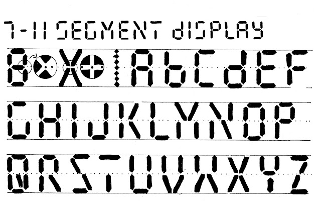
I've been rethinking this alphabet ever since 1985 when I presented it in Calligraphy Now, right up to the most recent version yesterday. Today, in 7-11 Segment Display, a more convenient style, I have added 4 diagonals to the 7 original strokes, to make all the letters accessible and to help you mix letters with numerals without ambiguity.
☞ For left-handers.
You can experiment with other ways to build letters and make them more legible.
If you don't use them with numerals you can do without the diagonals in S and Z. By the way, here are the numerals:
☞ For left-handers.
You can experiment with other ways to build letters and make them more legible.
If you don't use them with numerals you can do without the diagonals in S and Z. By the way, here are the numerals:


This comment has been removed by the author.
ReplyDeleteThis comment has been removed by a blog administrator.
ReplyDelete11 segment displays are very rare and highly underrated, all of the alphabet can be covered!
ReplyDeleteIt would be very useful to see the whole alphabet drawn with an exact font! Thanks
ReplyDelete