Tuesday, May 25, 2021

American Calligraphy #22: Carved slate

 ABCs of the USA: The stories behind America’s most distinctive calligraphy styles.

"He spake well who said that 
graves are the footprints of angels." 

Henry Wadsworth Longfellow

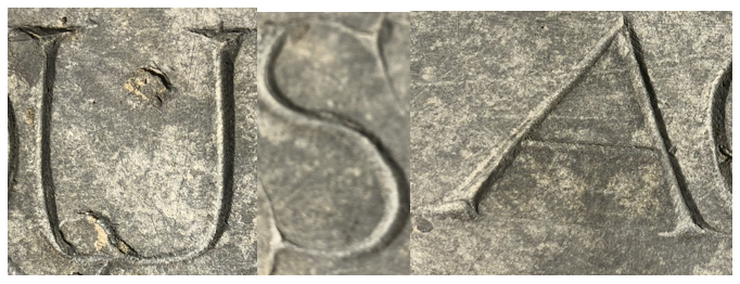
It will soon be Memorial Day, when we pay special attention to graveyards. The gravestone shown below is one of America's very earliest, carved for Ann Quinsey, who died at the age of 13 in Boston 1676. What little we know about her is summed up in this article. To preserve the headstone, it was moved from its original location to the portico of the new building that Old South Church built in Back Bay in 1872. 

17th century gravestone, Old South Church, Boston, Massachusetts. (Ann Quinsey appears in some documents as Ann Quincy.) The plaque measures about 15' x 16". 

In the first years of the Massachusetts Bay Colony, people had to accomplish a wide range of jobs with only the talents, and tools, that they brought with them. Sadly, the harsh climate and difficult logistics meant that one of their first tasks was to bury and commemorate the dead. These earliest American carvers were amateurs, repurposing stone masons' chisels to carve letters into local slate or sandstone. Probably working from memory or from printed type in books, they made letters that show great creativity and care. The letters here have the elegance of sincerity, with lovingly added serifs and swashes that attest to a sensitive connection with the person who died. 

I like to stop by now and then to look again at this exquisite memorial. I hope you will give the same kind of attention to gravestones in your neighborhood, which hold treasures and tell stories. American stories. 

This is the way people
used to abbreviate "the."
In an effort to plan the spacing of their words, 17th-century carvers relied heavily on contractions such as dec(ease)d; they linked letters by sharing strokes as in ANN; and they used the archaic Y-shaped thorn for th→.  


Tuesday, May 18, 2021

American Alphabets #21: License plate

ABCs of the USA: The stories behind America’s most distinctive calligraphy styles.  

   I love the letters on license plates. Everything about them is engineered to resist the mud, salt, rust, bumps. and flying gravel that they encounter 8 inches above the road. Although designs varied widely from state to state in the early decades of "motoring," license plates now share many standardized visual traits: 6" x 12" size; baked enamel finish; embossed letters and raised borders; letters and numerals 3" tall; state names and mottoes in smaller letters.  
    Numerals may have extra serifs to distinguish them from each other and from letters; also they are generally separated from the letters by a hyphen. Special number-selection protocols designate state officials, police, veterans, rentals, electric cars, or counties. Vanity plates are popular with drivers (1%-16% varying by state) who pay extra for the privilege of spelling out messages in tiny graphic gems as terse as haiku. 
Children who travel on long journeys can collect an alphabet of letters  from license plates, or look for all 50 states. 
Today, New Hampshire's "Old Man of the 
Mountains" continues as the state's symbol even
though in reality the cliff side collapsed in 2003. 
    Calligraphers who want to spoof this robust, eye-catching alphabet can practice it with a bull-nose marker or Speedball B nib. Its basic rounded-rectangle shape requires a little practice, but then it also can form the backbone of other distinctive styles. Anywhere you want to create a style that feels indestructible, use these letters.  

Writing dark letters on a gray background (above left) lets you add white highlights to mimic raised letters.  

Tuesday, May 11, 2021

American Calligraphy #20: Thruway exit

 ABCs of the USA: The stories behind America’s most distinctive calligraphy styles.

The apparent slant here comes
 from the camera's angle. 
   These letters have legibility as their immediate aim, with safety as their ultimate purpose. They must be readable instantly at midnight or noon, in rain, fog, glare, or snow, sometimes from half a mile away. As highway speeds got faster in the 1950s and 1960s, a car trip demanded ever quicker decisions. Clear, standardized signage replaced local hand lettering to make roads safer and journeys happier. 
Image © SEPS, courtesy of Curtis Licensing.

    Today's interstate signs are the outcome of decades of typographic testing. The letter style, constantly researched, tweaked, and upgraded, balances the uniformity of Block letters against the individuality of Roman. The white or pale yellow-green letters are at least 3" high; upper and lower case is more readable than all-capitals, especially if a and g keep the traditional forms of a and g; reflective glass beads intensify the green background paint (but not the letters, which would tend to blur). Different sign colors and silhouettes alert the driver to other turnoffs for parks, memorials, and services. Visual clutter was further reduced by the 1965 Highway Beautification Act, which tightly controlled ads on federal highways. 

    Next time you take your exit in a blizzard at night without panic, you can thank the designers who spent decades creating the pages and pages of federal specifications that made those highway signs so easy to read.  

Tuesday, May 4, 2021

American Calligraphy #19: Cooper

ABCs of the USA: The stories behind America's most distinctive alphabets. 

The pen requires three basic
angles [see alphabet below}
This alphabet is the serif version of the "National Parks" style from last week. Still a popular (if not exactly fashionable) typeface, Cooper Black, is derived from it. It is written with a Speedball D oval nib that reduces the contrast between thick and thin strokes, which also rounds off the stroke ends and shapes the serifs. 

Cooper Black was the alphabet of choice for 
candy wrappers and much, much more.  


I love writing these letters. The serifs look like plump little feet or baked potatoes or--in self-reference--little Tootsie Rolls. 


There is a nice graphic detail in the 2004 movie "Napoleon Dynamite," where the hero's nerdiness is summed up in his hand-made T shirt slogan made up of iron-on Cooper letters 


My daily alphabets blog offered six versions of this style to
copy in 2013.  Do a search on "coopy calligraphy" or go to 
 my blog for these dates: June 2, June 25, November 12,
November 20, November 23, November 27.   


Tuesday, April 27, 2021

American Calligraphy # 18: National parks


This plump, sturdy alphabet was in fashion 1920-1970. If you fattened up an alphabet of elegant, thin, worldly Art Deco, it would look like this. The contrast between thick and thin strokes is reduced, and the stroke endings are slightly rounded. 

These letters were popular for decades in packaging, posters, and signage. In addition, they coincided with a period of expansion in America's national parks. To survive outdoors in sun and rain, the letters were usually routed out of brown-painted wood and then painted white or sky blue. 

A classic landmark for visitors and locals in Eastham, Ma.
Like many such signs, it has recently been replaced with
metal; I feel like a beautiful old tree got cut down. Look
around you for these treasures while they still survive.
Photo, thanks to the Cape Cod National Sea Shore. 


Today, as the weather and public health begin to improve, national parks are appealing to American weekenders and vacationers. In addition to natural beauty, parks offer signage that traces a century and a half of learning about the land.  

As you  watch for interesting signs, remember that in America, state parks typically follow their own templates for letter styles, materials, and colors. 


Wednesday, April 21, 2021

American Calligraphy #17: The Funnies, part 2

Throughout the 20th century, mainstream cartoonists wrote in a brisk alphabet of all-capitals. 

They could chose from three kinds of pen strokes:  

  1. Shown in red: Contrasting thick and thin strokes of a flat pen held at a steep angle. 
  2. Shown in black: An oval Speedball D pen with moderate contrast between thick and thin. 
  3. Shown in blue: A monoline of uniform weight. 

(A few cartoonists did their lettering with a tiny brush.)  

A grab-bag of lettering styles from a typical 
daily newspaper page of funnies,
mainly in monolines here.  

Cartoons benefit from hand-lettering's expressive strengths. Each cartoonist's lettering establishes a personal voice, which can be varied with heavy letters and italics for emphasis, large sizes for shouting, small letters for whispers, a 'grawlix' (!@#$%&*?) for cursing, and occasionally a whole different letter style for a foreign accent. Even the shape of a speech or thought bubble can add meaning. 

Toward the end of the 20th century, a few cartoonists who felt overworked or tire of lettering began to save time by delegating the task to an assistant or using digital type. Some historians believe that this is the origin of the now-overused Comic Sans type style. 

Tuesday, April 13, 2021

American Calligraphy: #16 The Funnies

Similarly, symbols for speech
issue from the mouth of a Mayan
warrior as early as 650 CE.   
"Speech scrolls" contain the words of angels and
prophets in 9th-13th century European miniatures. 


Cartooning, the art of combining words with pictures, seems to be universal. Although it has roots in the Old World, it also appears in the New World long before Columbus
(above).  Cartoons, like the other arts, a special window into the way Americans live and think. 

Cartooning--first intended to teach or amuse--was sharpened into a political weapon during the heated era of the American Revolution. Left, this 1775 cartoon, attributed to Ben Franklin, is considered the first American political cartoon. Today's editorial cartoons continue this tradition. 

The 1905 debut of "Little Nemo", by Winsor McCay, (1866-1934) was a milestone in the evolution of cartoons into creative art. His letters were not only interesting and beautiful, but they interacted with the characters, adding self-reference in thought-provoking ways. Right, the repeated words "ouch" jostle against each other to be heard. 

The huckster P T Bridgeport spouts
his exaggerations in letters that
sound like an old circus poster.  


Another virtuoso who played with letters, Walt Kelley (1913-1973) excelled at using letters to evoke a tone of voice.  


To be continued next week...
with three ways to write cartoon letters.  


2nd day/week? 

Throughout the 20th century, syndicated cartoonists wrote
in a  brisk alphabet of all-capitals. Captions and speech in cartoons can be hand-lettered three basic ways: [▢▢▢ draw diagrams] 

  • Thick and thin strokes of a flat pen held at a steep angle. 
  • An oval Speedball D pen with moderate contrast. 
  • A monoline of uniform weight. 

(less common: a thin brush) 

Above, a grab-bag pf monoline lettering from a typical daily newspaper page of the funnies shows a range of personal styles. I've collected many examples here https://hu.pinterest.com/shepherdscribe/amcallig-ii-funnies-calligraphy/

Cartoons take advantage of calligraphy's strengths. Each cartoonist's letters is unique, varying from heavier letters and italics for emphasis, larger sizes for shouting, smaller letters for whispers, a "grawlix" (the typographic term for cursing: ☠️@#$%&?!), and occasionally a whole different alphabet style for a foreign accent. Even the shape of a speech or thought bubble can add meaning. 

Toward the end of the 20th century, a few cartoonists who felt overworked or just tired of lettering began to save time by delegating the task to an assistant or to digital type. A legend cites this as the origins of Comic Sans type.    https://www.fonts.com/content/learning/fyti/typefaces/story-of-comic-sans