


Song of Songs: Timeless love poetry in contemporary calligraphy.
This tandem design was too tame to portray the force of wind.
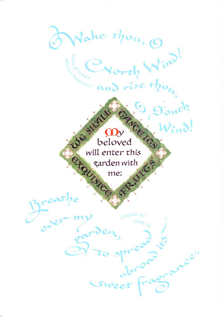
Sometimes you need a few failures to find a design that works. Above is my first take on the text at the end of Chapter IV that starts "Awake thou, O north wind..."
I tried to distinguish among the four distinctly different thoughts that fill this very short verse by making the two winds seem to blow into and out of the garden.* But they didn't have any force, and the green letters didn't add up to a garden.
*Note: Against all artistic advice, I rushed to complete these for an exhibition deadline. A lesson to remember; you cannot rush the design process.
*Note: Against all artistic advice, I rushed to complete these for an exhibition deadline. A lesson to remember; you cannot rush the design process.
On the next try, I took the time to ask myself: What does wind look like? Once I began to develop a design that suggested the wind's motion, I also had to decide, how big is the wind? and what color?
Through a series of drafts, I focused on the garden wall to create a sense of privacy, and then let the wind swirl around it.
I went down a few dead end streets before I found a path to my present design; whirls of wind around a garden seen from above. Then there were details to tweak: the relative sizes of the wind and the hedge; how uneven the contour of the hedge should be; where to add the citation; even the shape of the finials on top of the gold fence rails. A path of small, careful decisions leads to a design.
 |
| These were drafted at maquette size, about 4" x 5," letting me try a design quickly and then move on. |
Through a series of drafts, I focused on the garden wall to create a sense of privacy, and then let the wind swirl around it.
I went down a few dead end streets before I found a path to my present design; whirls of wind around a garden seen from above. Then there were details to tweak: the relative sizes of the wind and the hedge; how uneven the contour of the hedge should be; where to add the citation; even the shape of the finials on top of the gold fence rails. A path of small, careful decisions leads to a design.
 |
| This blue ink (above) is actually much closer to the original tone than the aqua in the full picture (above right). |
No comments:
Post a Comment