Sunday, June 30, 2013

Layouts for our ornery alphabet

Calligraphers might have it worse; it could be a prime number.  But our alphabet does pose a nagging problem; how to distribute those 26 letters in an orderly but interesting array?  

I've tried various grids:
x 13, or 13 x 2 
3 x 27 or 27 x 3 minus 1 
4 x 6 plus two
5 x 5 plus one (see April 7) 
This works if you shoehorn I and J into the same box.  It makes sense, sort of, because J was represented by I for centuries.  
Uneven lines (see May 20)
  
You can use any distribution that works for your design.  The layout illustrated here fits the letters roughly into 4 lines.  Starting with 7 letters in the first two lines, I let the O take up the room of two letters in the third line, and allowed the last line to expand so much that Z got a line to itself. I exaggerated the swash of G at upper right to balance all that drama in the lower left.    

By the way, note how the letters seem heavier when you reverse them to read white on black.  

Saturday, June 29, 2013

151 Bright Idea Upper Right.

Your eye supplies the invisible edge [I have drawn it in  on the letter A].
From time to time, I like to create 3-D illusions on the flat page.  Here, the light seems to shine on solid letters from the upper right.  As with other versions of this alphabet (March 21 Equinox, April 26 Bright Idea Overhead, May 12 Tall Uplight, June 19 Radiant Idea) you can lay your page over a simple block letter to guide your pen strokes.


152 Zoo kid

Here is a very creative alphabet by Zoo Kid, with most letters turned into monsters.
By Andrew Sage

Friday, June 28, 2013

150 Italic with low line contrast

This is D x 7;  one more version of Italic, measuring 7 pen-widths in height, and written with the Speedball D nib.  

Contrast this with Lightweight Italic, June 21, right, which has more line contrast.  

Wednesday, June 26, 2013

149 Twenty-six implied edges

The light source and the perspective on the letters varies. 
26 Implied Edges offers a variety of how-to ideas for fooling the eye.  By careful use of the broad-edged pen on flat paper, you can show the side of an imaginary 3-D solid.  Not only does the brain believe that there is a real object there, but the eye even supplies the missing edge.

Each of the letters here represent an alphabet you can invent for yourself.  
   

Tuesday, June 25, 2013

148 Coopy lc

Keep the serifs short--about half a circle should extend beyond the vertical.  
Coopy lc lets you add small letters to the Coopy Caps you learned on June 12.  This style, so evocative of mid-century America, uses my favorite Speedball D nib.   

As shown above, the solid strokes are written with a 0° pen angle; the outlined strokes are written with the pen at 90°; the cross-hatched strokes are written with the pen at 45°. 


You may find that, at less than 3 pen widths, the overall ratio of pen width to letter height is just too heavy, and you may want to lighten the caps to let the small letters breathe.  The letters here are about as heavy as they can be, and will still look appealing at 4 pen widths tall.  

Monday, June 24, 2013

147 Sn of Swsh

This style is abbreviated as Sn of Swsh, since the words, like the letters, are perfectly legible even without many of their strokes.  
You can try removing other strokes, starting with a basic swash alphabet such as Swash, April 12. 


Sunday, June 23, 2013

Line contrast


From the Italic chapter in Learn Calligraphy.  
Line contrast is a term I invented for a concept that lies at the heart of calligraphy: the difference between thick and thin.  The alphabets in "Calligraphy Every Day" make use of this whole range: 

  •  Most calligraphers like to work at near-maximum line contrast, where a broad-edged pen makes strokes that vary from very thick to very thin, depending on the direction of the pen.  Durer Caps May 2
Low line contrast is typical of pens like the Speedball D, where the thinner part of the stroke is half or two-thirds the width of the thicker part. Coopy June 12  

No line contrast characterizes a monoline, which does not vary no matter what direction the stroke.  Deco Mono May 27.  


Changing the line contrast of simple alphabets like Italic and Bookhand lets you explore dozens and dozens of styles.  Think about it while you write, and look at other people's calligraphy to analyze the line contrast.  It's all in what pen you pick.  


Saturday, June 22, 2013

146 Optimal

Optimal letters are loosely based on Optima type. Are they rounded squares, or sharp-cornered circles?  

Friday, June 21, 2013

145 Lightweight Italic

These letters are about 10 pen-widths tall.  They lean only a few degrees off vertical. 
Lightweight Italic is one of the infinite variations on Italic letters.  


Thursday, June 20, 2013

144 Deflated short Gothic

This comes from my book Capitals for Calligraphy.  I've also kept the "inflated" (convex) version that accompanies it in the book.
Letters look like containers to me, which can be inflated or deflated with imaginary air.  These Inflated Short Gothic letters are made by shortening regular Gothic letters [date] and sucking the air out of them, so they seem to collapse inward. The letters that don't completely enclose a white space just cave in on one side.  
You can see Deflated Gothic on April 13. It's taller than the one here.  


Wednesday, June 19, 2013

143 Radiant Idea

Lit-Up conveys a changing shadow as we approach the longest day of the year.  It appeared first in my book Calligraphy Alphabets Made Easy, where it shows the shadow emanating from a single place, but now I think it's all about the sun's slow unceasing motion.  
The light creates shadows at angles that change throughout the alphabet.  


Tuesday, June 18, 2013

142 Heavy Bookhand

Heavy Bookhand is about as wide as you want to let this alphabet get, when writing it with a broad-edged pen.  I've kept it free of serifs for clarity.  

Monday, June 17, 2013

141 E is for Eleanor

This set of designs for the letter E is posted on this day in honor of the birthday of my mother, who would have been 107 today.
These letters are from my book Capitals for Calligraphy.  

Sunday, June 16, 2013

A baby gift, for Fathers Day

This project creates a hand-lettered gift for a new father or mother. But you can celebrate on any occasion with a baby's name in calligraphy. The steps I followed provide a useful guide if you would like to try something like it.  

I like to use the letters themselves to make a shape on the page, so I decided to have the baby’s vital statistics form an oval frame around the name.  While you can draw your own oval with a loop of string and two pins, I just used an old reliable oval template from my drafting days to make a 3 x 3.5 cm oval, and then enlarged it on my copier.  If the baby's name looks better horizontally, just turn it the long way. 

• A quick pencil draft shows how the letters fit my idea. I spelled out several of the numbers to give myself more text to work with.  When using letters in a circle or oval, I like to help the reader by separating them into two halves so as to keep them right-side up.  

More pencil drafts = better design.  
I tweaked the layout by raising the name .2 cm (such things matter!), and added arrows reminding myself where to shrink or stretch the smaller lettering. 

Then I laid the oval guideline over the draft on a light table and pencilled a more accurate layout.  No light table?  Lots of calligraphers happily hold two sheets of paper up to a sun-lit window to make them translucent.  

I tried a few letters with the ink and pen I intended to use, as a dress rehearsal.  My first try, gold and purple, made it look too much like royalty, so I tried it in a Dr P H Martin green and Speedball gold, which I like much better.  The trial letters alerted me to guard against the possibility of ink blots.   

NOW I was ready to letter in ink.  Choosing my favorite paper, I laid a 7” x 9” * piece of Arches Satine over the final draft and went to work.  →


Although this may seem like a lot of steps, it produces a thoroughly worked-out design that lets you concentrate all your attention on how you shape your letters, not where you put them.  
Plus there are no pencil marks to erase from the front of the finished art, leaving the paper surface untouched.  

Your design, by the way, will improve if you can “sleep on it” at some point in this process.  It’s amazing how much more clearly you see and think after half a day away.    

*Standard paper sizes make for quick and easy framing, a relief to young parents with too many details to look after in their lives.  Or you can present it in a temporary frame and let them get it framed at their leisure--after the baby graduates from college!     

Saturday, June 15, 2013

140 F is for Flag

Today used to be celebrated as Flag Day.  It commemorates the official adoption of America's flag.  Now it's been overshadowed by Memorial Day.  In its honor, here are nine different designs for the letter F, plus one that looks like our flag.  

Friday, June 14, 2013

139 Frills

This delicate alphabet, Frills, adds interlaced swashes to the middle of each letter.  They look like musical trills made visible.  Each letter is different; DON'T use more than one of them at a time.  
This illustration comes from my book Calligraphy Alphabets Made Easy.  The two asterisks at upper left designate it as a challenging style.  You don't have to master it all; just choose your own initial and practice that for a while.  

Thursday, June 13, 2013

138 Rectangular Gothic

Rectangular Gothic completes the process begun with Half Gothic (May 19), turning the six-sided letters into four-sided rectangles. 
The three letters in the illustration at right show the evolution of Gothic from pointed to square.   

Wednesday, June 12, 2013

137 Coopy

I am an avid fan of the Speedball D Nib;* it adds extra flavor to every alphabet it touches and evokes American signcard lettering of the 1920s and 1930s.  Here it makes simple Roman capitals into warm, funky, down home letters for almost any practical purpose: posters, logos, place cards, and name tags.  I’ve named this style Coopy because of its family resemblance to Cooper Black type, which was popular for decades, through the eras of metal type, photo type, rub-on type, and now digital type.  
The height of the letters is just 3 times the width of the pen; heavy!  The serifs are 1 ½ times the width of the stroke. You can write most of the letters with the pen held at flat 0° angle. You'll have to turn the pen to 90° for all the strokes and serifs shown here in outline, and you'll probably want to use a 45° angle for the strokes in M and W and W shown with cross-hatching.  Just WATCH OUT; if you’re in the habit of easing your pen onto one corner to make thin lines in Roman letters without a change of pen angle, the layered D Nib can give you a surprising splat! when it re-aligns itself on the next flat stroke, as it did here in W.  
*Note on availability: try eBay or other sites, as the D nib was discontinued by Speedball for a while.  

Tuesday, June 11, 2013

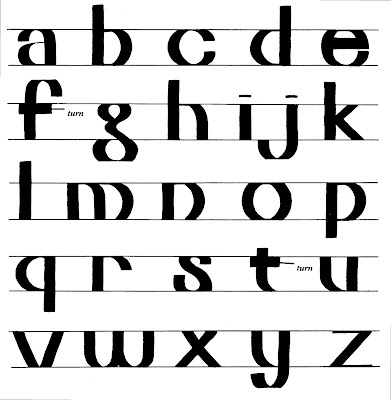
136 Truncate lc

This alphabet, Truncate lc, continues the philosophy behind yesterday's Truncate caps.  Each letter creates the illusion that its top and bottom curves have been sheared off.  But in fact the letters are written with a broad-edged pen held at a 0° pen angle.  A few strokes use a 90° pen angle: the mid-strokes of e and f and t.  


Monday, June 10, 2013

135 Truncate Caps

This alphabet, Truncate Caps, illustrates how willing the eye is to fill in missing areas of an image.  Even though the tops of the letters are gone, they're perfectly readable.  
Most of the letters are written with the broad-edged pen at 0°.  The strokes labelled "turn" are written at a pen angle of 90°.  
Add caption


Sunday, June 9, 2013

Words and images


Look for the word "cat" in the designs here. (you'll also find mouse, bird, window, kittens, and bowl).  
June is “Adopt a Cat” month. ( Just my cup of tea; I love cats!)  If you’ve read  Learn World Calligraphy, you know that I devote a whole spread to writing a word such as CAT so it looks like a cat and the word HORSE so it looks like a horse.  This lets English-speaking calligraphers writing phonetic letters share the visual experience of Chinese calligraphers writing symbolic characters.   
    Tips for design: 
  • To make a calligraphy picture, play around with the name of the thing you want to draw, looking for lucky coincidences.  The C in CAT, for instance, can have two pointed ears.  The A stands on two paws.  The horizontal stroke of T can lengthen into a tail.* 
  • Make a rough drawing of a cat, or pick out a photo of a cat.  Lay tracing paper over it and start to stretch, squeeze, and move the letters. 
  • This step is important: go away for a few minutes.  Then come back and look at your word, letting your brain see and read it at the same time.  Make sure that neither way of seeing dominates.  
  • Write the letters in ink, using brush or pen.  
*In the design for Mothers Day [May 12] the M s in MOM look like leaves and the O looks like a round flower. Keep looking for these similarities and you’ll start to see them everywhere.  

Remember, “A letter can be anything; anything can be a letter.” 


Saturday, June 8, 2013

134 Touched up Gothic

This is so pretty; Retouched Gothic is just regular Gothic with sharpened corners and little curls put in with a tiny pen. Top and bottom rows of letters can have hairline swashes added, too.  

Friday, June 7, 2013

133 Heavier Land

This alphabet, Heavier Land, fattens up basic Neuland, first seen as Heavy Land [February 23]. The letters here are about 2 pen widths tall, about as heavy as letters can get.  
You'll need to hold the pen at a flat 0° or turn it to a vertical 90°.  To see how the strokes overlap, check out Dryland, [January 26]; to see the strokes separated, see Disjoined [April 30].  
There are virtually no interior spaces -- even the tiny white dots inside O and Q are not really essential to identifying the letter.  You could consider closing up some of the white notches.  Trimming an alphabet down to the bare essentials is a fascinating exercise.  
Preview of tomorrow's alphabet.  

Thursday, June 6, 2013

132 Fancy Kid

Children have a wonderful time playing with letter forms.  This one, Fancy Kid, was invented at my request by one of my own children.  In fact, I have a standing offer for any kid I encounter; invent an alphabet for me and I'll "pay" for it with a set of calligraphy markers.  And preferably don't write it on blue-ruled notebook paper.  
The final line still warms my heart.  


Wednesday, June 5, 2013

131 Magdalene

These Magdalene letters are at least 500 years old.  Though they are shown together here, each one is so different from the others that they don't work well for writing whole words.  Better to use them one at a time for capitalizing single words.  

Tuesday, June 4, 2013

130 Spray

Spray! letters are made of aerosol lines.  The lines form the letter's spine, unlike Zap!, where they trace its outline (May 8).  These are easiest to write with spray paint outdoors, on large surfaces, using energetic but steady arm movements.  (Smaller versions call for learning to use an air-brush and compressor.) 
Join as many strokes as you can to avoid stopping and starting the spray.  Extra coils, swashes, and over-writes will help create a strong visual statement.   


Monday, June 3, 2013

129 Slanted Bookhand

Slanted Bookhand is not quite Italic, as you can see if you compare it with Italic alphabets from January 12, March 4, or May 24.  It is a simple lowercase alphabet that has been slanted without changing anything else about it.  

Sunday, June 2, 2013

Embedded capitals

It is easy to combine a Gothic Capital with any small Gothic text letter to create a medieval page.  Follow the steps here: 
  1. Choose a text at least 30 words long.  This gives you flexibility in line layout.  The passage here has about 200 words, and I still ended up having to hyphenate 10 of the words.  A medieval scribe would have used, or invented, abbreviations rather than hyphenate.  
  2. Arrange the line length to make the first 3-6 lines of the paragraph half as long as the rest of the lines.  Sometimes your chosen text cooperates, sometimes it resists.  Don't give up.*   
  3. Try to make the short lines stack up to the same height as your planned capital.  If the natural word breaks in your text don't leave you with enough short lines, you can fill the space with ornament. 
  4. Letter the text. Don't forget to start with the second letter of the first word!  (Trust me.)  Medieval scribes sometimes lettered the initial very small in the space left for the capital, to remind the illuminator, as shown with the letter V in the illustration here.  
  5. Try a rough draft of your capital, in the space, sketched on a separate scrap of paper with patches of color.  Stand back and squint.  
  6. Trace or transfer a light outline of your capital.  Ink it in and color it and gild it.  Those techniques are a whole other project, but you can start with a one- or two-color letter, improvised from your own skills.  

Design tips: 
Don't make every capital large and ornate.; they'll just compete with each other.  The letter O that starts the second column is simply lettered, with a wide pen; it could be blue or red.  
Illuminated capitals: Assorted Gothic May 29
Traditional text letters : Rounded Gothic March 6, Plain Gothic April 11.       
This illustration is a whole page from Capitals for Calligraphy, my hand-lettered how-to book about the history, design, and layout of capitals.  Each page delivers information both to the side of your brain that reads words and to the side that sees images.    

*You may have to make your first lines much shorter, as in the small example at left, where the large capital leaves room for "[A] S  T H E" in single letters stacked along its right edge. 

Saturday, June 1, 2013

128 Towel Dry

I like to try out new surfaces to write on and new pens to write with.  Here is a Towel Dry, a brush alphabet written with a flexible marker at medium speed on a paper towel.  It allows you to make interesting textures while the brush glides along.  I especially like this H and M and S and W.  Your own letters will offer you some favorites, too.  

If you speed up the stroke and pause at each end, you'll get something like "Waity" from January 2 .