Showing posts with label Street signs. Show all posts

Wednesday, June 22, 2016

A modern Finnish Gothic alphabet

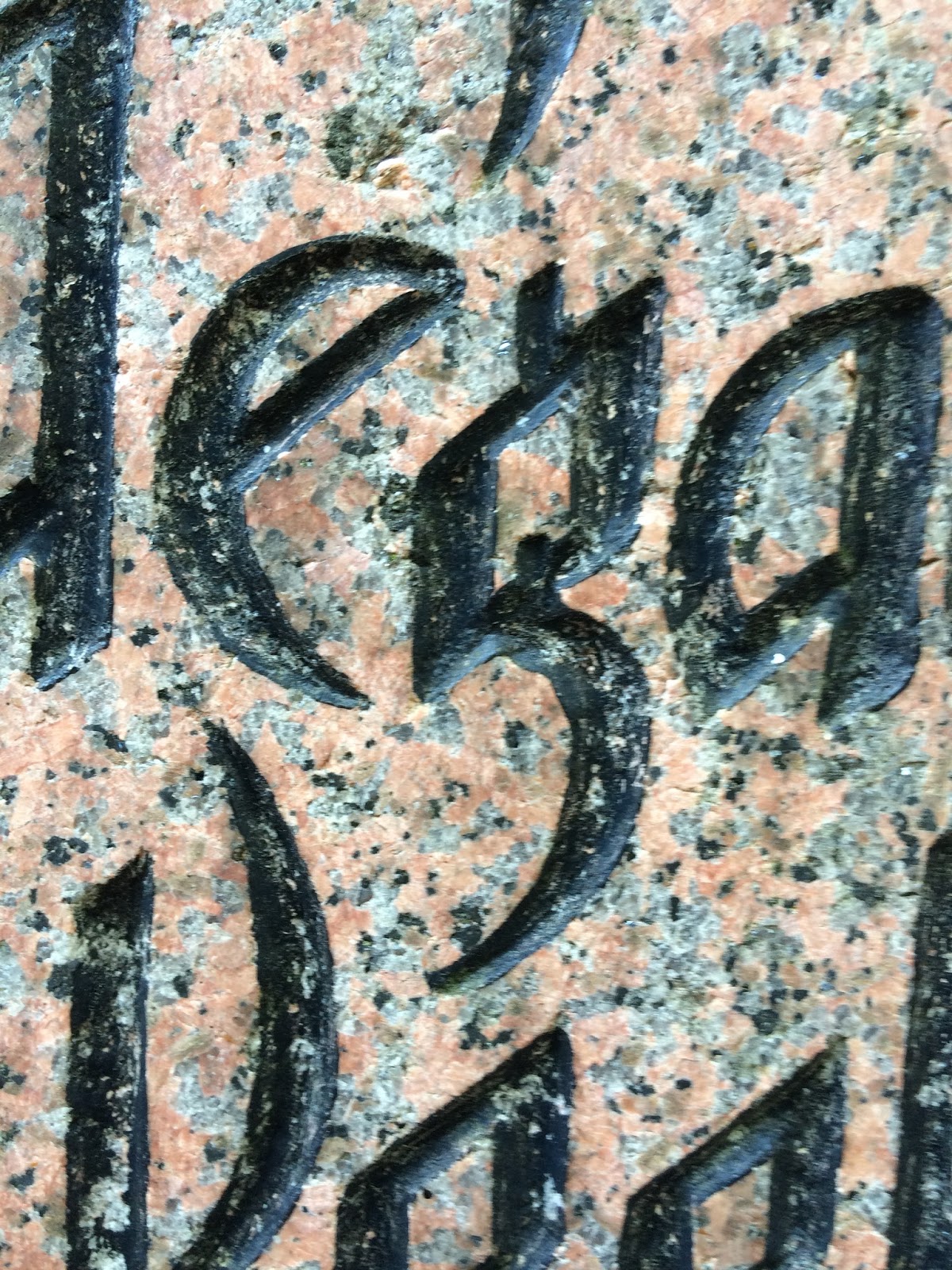
Last week, I noticed this war monument* in the Kamppi cemetery, by the Old Church in Helsinki.  It is carved in a stark, forceful version of Gothic, without the square serifs but with the same heavy width of stroke and uniform letter bodies.  Letters have to be robust to survive being carved into granite, a process undertaken today almost invariably with a power chisel.  


The letters e and a break up the rows of vertical
strokes, with half- or whole-round shapes, 
The letter g shows the kind of calligraphic
ingenuity that brings a smile to a calligrapher's
face. And the thought: I've got to try that one!  


The same message appears in three languages: Finnish, Estonian, and Swedish.  


* "The...monument in the Old Church Park was erected in 1919 in memory of the Finnish volunteers who fell in the Estonian war of independence. The bodies of 25 Finns from Helsinki were carried back from Tallinn aboard the icebreaker Wäinämöinen, and a service was held on 16 February 1919." From Park Walks in Helsinki website. 

Sunday, June 19, 2016

Numbers on the street, Helsinki

I continued to find new numerals on my rambles through Helsinki. 


Friday, June 17, 2016

Some more signs from Helsinki streets

Look in the shady section, for the
word KAHVILA in Jugenstil letters.  
This brass sign is about 12 inches wide or 30 cm.  
Looking for these signs can transform any walk, in any city, into a treasure hunt.  My tips for finding the calligraphy around you: look high, look low, and look again.  


Sunday, June 12, 2016

Two endearing Finnish calligraphy signs

Some 140 years ago, Helsinki artists embraced Art Nouveau, known to them as Jugendstil. Many of these letters can still be seen on buildings.  

I could not resist these two little charmers.  They are about half a meter in length.  


Two takes on Turku

I had just an hour to walk around Turku.  What a lovely city: but the only lettering I found was made of flowers.  And spray paint. 

A gold mine of calligraphy was to be found at the calligraphy conference nearby.  Finland's first national meeting; 80 calligraphers; half a dozen workshops; high level of design and execution; next year's convention already mapped out.  Everything.    

More beautiful Finnish letters!

House identification placque.
This week I'm back in Helsinki for a revisit.  Last year I thought I found every last gorgeous letter in town, but it took just a few short walks around to reveal a new batch for me.  

Here are a few gems:


"Suomi" is Finland's own traditional name for itself.  Above, and at right, it appears in hefty letters that emphasize the strength of the doorway below it.   


BÖLS is the name of the stock exchange, it is
appropriately carved of solid granite, in a style
that looks like 
pure muscle in letter form.

Saturday, April 30, 2016

The OOPS! file: numbers and letters that just miss the target

Street signs are supposed to tell you where you are and describe what something is.  Clarity matters most, of course, but so does design.  Even when you can read a sign without ambiguity, there is--or should be--an internal logic, born of the mechanics of the pen stroke and the habits of the reading eye, that gives the lettering integrity.  Still, here and there you see a small blooper.  IF you are a calligrapher, you can't not see it.  

It's good for our eyes to pay close attention the calligraphy style of what we read.  Every once in a while you will be rewarded with a sign that makes you ask, "What was that designer thinking ?!"  Take a picture and start a collection.  

Here are a few from my OOPS file: 

This swash on capital I got kind of carried away with itself, and now I find it hard not to read it as a capital T, that turns Infanta and Isabel to Tnfanta and Tsabel. 
Segovia, Spain.  


 This small a is missing the last little square stroke at the lower right corner that would make it more readable, while the n is just plain turned backward, or as graphic designers call it, "flopped."
Teatro Cervantes, Segovia, Spain

The right corner of this small e has its point  snipped off.  The correct form is shown next to it. 
  

The numeral 3 in this 32 has been installed upside-down. It looks top-heavy.  The lower curve should actually be a little larger than the upper curve.   


The W at left is backward, all too easy to do when using stencils.    


The design at right is clear and simple, but the edges of the white letters disappear where they overlay the beige background, making the M, in particular, hard to decipher.  Tomas turns into Tovas.  

The thick stroke should be on the left and the
thin stroke on the right (it's correct in the
brass letters below, set into the pavement).  

I pass this sign almost every day on the corner of Boylston and Clarendon St, and wonder who turned this V around: the architect, or the installer, or the fabricator.  It's a common mistake, for those who have never held a calligraphy pen in their hand.  

Thursday, April 21, 2016

The last few letters from Spain

A few letters from my recent trip: M and S, in honor of, well, me.  

If you squint at O S O (cropped from "El Coso" logo), it can look like a face staring at you through glasses.