Highlight #1. pp 93-106.


Highlight #1. pp 93-106.

The book takes the casual reader on a visual trip around the United States of the past and future, while calligraphers at all levels of skill will come home with new alphabets to use.
For centuries, American calligraphers have accepted the legacy of the classic Roman, Gothic, and Italic calligraphy they inherited from Europe without knowing that there are more alphabet treasures to be found in a larger pool of uniquely American alphabet designs. Wild West, New Deal, Prairie, National Park—all were made in America, and they express ideas that reveal national character. These styles come from here and nowhere else. Much like American music, language, fashion, and philosophy, calligraphy has matured, moved on from its origins, and become, in the words of the man who created Spencerian handwriting, “even more American.”
Every calligrapher will find inspiration in this book's hundreds of illustrations and dozens of model alphabets. We will be sampling from its hundreds of illustrations and dozens of model alphabets over the year.
Learn American Calligraphy is available wherever books are sold.
I'm blessed with beautiful letters to see in my neighborhood. But this means I can't avoid seeing the un-beautiful letters too, or more often the awkward spaces between the letters. When Boston threw itself into the Gothic Revival in the later 19th century, its Roman lettering suffered. Shown here is a cautionary example of all the inscriptions that could have been better spaced.
 |
| The spacing looks good enough until you focus between T and M; U and A; E and R. |
Enjoy the letters around you and the spaces between them.
ABCs of the USA: The stories behind America’s most distinctive calligraphy styles.
 |
| Because the text refers to the colonies as the "united States of America," I have used a small u above rather than making a capital U. |
The Declaration was read aloud the next day, but the 200 typeset and printed copies, printed immediately and distributed to the other colonies, were what really spread the word. Some 26 of the first printing still survive. The second printing was typeset by Baltimore postmaster Mary Katharine Goddard. A later version was distributed in German, still the first language of many immigrants. The delegates' signatures were gradually added to the original document over the next month, and completed on Aug 2. (See my blog post #4, about John Hancock, from January 26, 2021.)
The handwritten, signed Declaration of Independence is preserved in the National Archives Museum in Washington DC.
ABCs of the USA: The stories behind America's most distinctive calligraphy styles.

 |
| A Shahn poster memorializing controversial anarchistsSacco and Vanzetti. |
 |
| Ben's Folk type, a font that he inspired. |
 |
| Protest letters let people carry a sign that speaks in their own voice. |
 |
| Iconic anti-war poster by Lorraine Schneider |
ABCs of the USA: The stories behind America’s most distinctive calligraphy styles.
 |
| Modern version of iron for branding barbecued steaks... |

The word "brand" has roots in the terms for sword, torch, and burnt branch, (old English bærnan). Although today a super-cold, cryogenic branding iron has made branding somewhat more humane, some herd owners now opt for the more-humane practice of ear-tagging.
The brand designs used by Spanish cattle herders evolved into evocative symbols for the frontier era and the cowboy West. No dude ranch or steakhouse is complete without its iconic branding iron design. The abstract idea of branding, itself, has vastly expanded to become a key concept in American life. A product's brand has become a commodity with a residual value.
A design language describes the letters and symbols of cattle brands. The letters can look like they are lazy [lying down], dragged, walking, and tilting. like many logos, they pack a lot of personality into a simple glyph.
 "He spake well who said that
 Henry Wadsworth Longfellow
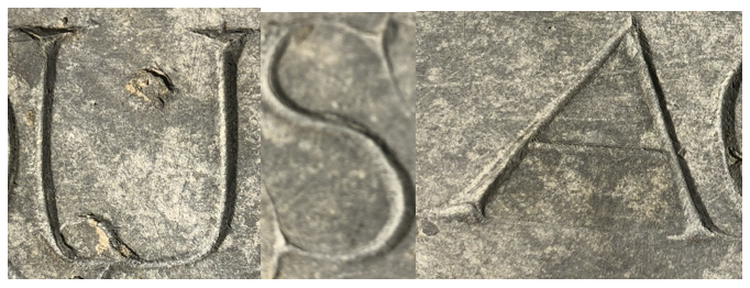
It will soon be Memorial Day, when we pay special attention to graveyards. The gravestone shown below is one of America's very earliest, carved for Ann Quinsey, who died at the age of 13 in Boston 1676. What little we know about her is summed up in this article. To preserve the headstone, it was moved from its original location to the portico of the new building that Old South Church built in Back Bay in 1872.
 |
| 17th century gravestone, Old South Church, Boston, Massachusetts. (Ann Quinsey appears in some documents as Ann Quincy.) The plaque measures about 15' x 16". |
In the first years of the Massachusetts Bay Colony, people had to accomplish a wide range of jobs with only the talents, and tools, that they brought with them. Sadly, the harsh climate and difficult logistics meant that one of their first tasks was to bury and commemorate the dead. These earliest American carvers were amateurs, repurposing stone masons' chisels to carve letters into local slate or sandstone. Probably working from memory or from printed type in books, they made letters that show great creativity and care. The letters here have the elegance of sincerity, with lovingly added serifs and swashes that attest to a sensitive connection with the person who died.
I like to stop by now and then to look again at this exquisite memorial. I hope you will give the same kind of attention to gravestones in your neighborhood, which hold treasures and tell stories. American stories.
 |
| This is the way people used to abbreviate "the." |
ABCs of the USA: The stories behind America’s most distinctive calligraphy styles.

 |
| Today, New Hampshire's "Old Man of the Mountains" continues as the state's symbol even though in reality the cliff side collapsed in 2003. |
ABCs of the USA: The stories behind America’s most distinctive calligraphy styles.
 |
| The apparent slant here comes from the camera's angle. |
 |
| Image © SEPS, courtesy of Curtis Licensing. |
Today's interstate signs are the outcome of decades of typographic testing. The letter style, constantly researched, tweaked, and upgraded, balances the uniformity of Block letters against the individuality of Roman. The white or pale yellow-green letters are at least 3" high; upper and lower case is more readable than all-capitals, especially if a and g keep the traditional forms of a and g; reflective glass beads intensify the green background paint (but not the letters, which would tend to blur). Different sign colors and silhouettes alert the driver to other turnoffs for parks, memorials, and services. Visual clutter was further reduced by the 1965 Highway Beautification Act, which tightly controlled ads on federal highways.
Next time you take your exit in a blizzard at night without panic, you can thank the designers who spent decades creating the pages and pages of federal specifications that made those highway signs so easy to read.
ABCs of the USA: The stories behind America's most distinctive alphabets.
 |
| The pen requires three basic angles [see alphabet below} |
 |
| Cooper Black was the alphabet of choice for candy wrappers and much, much more. |

 |
| My daily alphabets blog offered six versions of this style to copy in 2013. Do a search on "coopy calligraphy" or go to my blog for these dates: June 2, June 25, November 12, November 20, November 23, November 27. |

 |
| A classic landmark for visitors and locals in Eastham, Ma. Like many such signs, it has recently been replaced with metal; I feel like a beautiful old tree got cut down. Look around you for these treasures while they still survive. Photo, thanks to the Cape Cod National Sea Shore. |
Throughout the 20th century, mainstream cartoonists wrote in a brisk alphabet of all-capitals.
They could chose from three kinds of pen strokes:

(A few cartoonists did their lettering with a tiny brush.)

A grab-bag of lettering styles from a typical
daily newspaper page of funnies,
mainly in monolines here.
Cartoons benefit from hand-lettering's expressive strengths. Each cartoonist's lettering establishes a personal voice, which can be varied with heavy letters and italics for emphasis, large sizes for shouting, small letters for whispers, a 'grawlix' (!@#$%&*?) for cursing, and occasionally a whole different letter style for a foreign accent. Even the shape of a speech or thought bubble can add meaning.
Toward the end of the 20th century, a few cartoonists who felt overworked or tire of lettering began to save time by delegating the task to an assistant or using digital type. Some historians believe that this is the origin of the now-overused Comic Sans type style.
 |
| Similarly, symbols for speech issue from the mouth of a Mayan warrior as early as 650 CE. |
 |
| "Speech scrolls" contain the words of angels and prophets in 9th-13th century European miniatures. |

 Cartooning--first intended to teach or amuse--was sharpened into a political weapon during the heated era of the American Revolution. Left, this 1775 cartoon, attributed to Ben Franklin, is considered the first American political cartoon. Today's editorial cartoons continue this tradition.
 |
| The huckster P T Bridgeport spouts his exaggerations in letters that sound like an old circus poster. |
2nd day/week?
Throughout the 20th century, syndicated cartoonists wrote
in a brisk alphabet of all-capitals. Captions and speech in cartoons can be hand-lettered three basic ways: [▢▢▢ draw diagrams]
(less common: a thin brush)
Above, a grab-bag pf monoline lettering from a typical daily newspaper page of the funnies shows a range of personal styles. I've collected many examples here https://hu.pinterest.com/shepherdscribe/amcallig-ii-funnies-calligraphy/
Cartoons take advantage of calligraphy's strengths. Each cartoonist's letters is unique, varying from heavier letters and italics for emphasis, larger sizes for shouting, smaller letters for whispers, a "grawlix" (the typographic term for cursing: ☠️@#$%&?!), and occasionally a whole different alphabet style for a foreign accent. Even the shape of a speech or thought bubble can add meaning.
Toward the end of the 20th century, a few cartoonists who felt overworked or just tired of lettering began to save time by delegating the task to an assistant or to digital type. A legend cites this as the origins of Comic Sans type. https://www.fonts.com/content/learning/fyti/typefaces/story-of-comic-sans
 |
| The USA initials shown above are derived from capitals that were written with a flat brush and then V-cut into marble. The grooves could be accented with red paint or gold leaf. |
Father Catich taught the art of calligraphy for 40 years at St Ambrose University in Davenport, Iowa. "Art is not freedom from discipline, but disciplined freedom."
Right: Roman letters carved from slate and hand-framed by Father Catich. The gold letters here represent the original imperial Roman letters, the red letters were either not part of the alphabet in 113 CE or did not exist at the time, such as J, U, W.
Left: Father Catich painting the letters of his own cast of the Trajan inscription. Photographer unknown.
ABCs of the USA: The stories behind America's most distinctive calligraphy styles.
 These ambiguous figures debuted as "inversions" by Scott Kim (b 1955-) in his 1981 book of the same name, and by John Langdon (b 1946-). Then they were re-named "ambigrams" by Douglas Hofstadter (b 1945). Philosophically resembling palindromes, they perform the seemingly magical trick of being readable in at least two directions. Their capacity to be two words at once, or to keep being themselves when upside down, derives from a quirk of the Roman lower-case alphabet, which lets one letter transform into another when it is rotated ⤿ or flipped →.
 For instance: b ⤿ q. d ⤿ p. n ⤿ u. b → d. p → q.
No other writing system in the world has quite this peculiarity. Also, ambigram designers stretch and squeeze other pairs of letters that almost resemble each other when rotated or flipped:
For instance: e ⤿ a. V ⤿ A. N ⤼ Z. s → z. h ⤿ y. f ⤿ j.
 |
| This ambigram reads "alphabet" either way. |
 |
| A symmetrical alphabet by Scott Kim. |
 |
| This ambigram personal logo reads '"margaret" one way and "shepherd" when rotated 180°. |
 |

 |
| The letters "USA" above are inspired by "Samba with Cugat" and "Tango with Cugat." |

ABCs of the USA: The stories behind America’s most distinctive calligraphy styles.

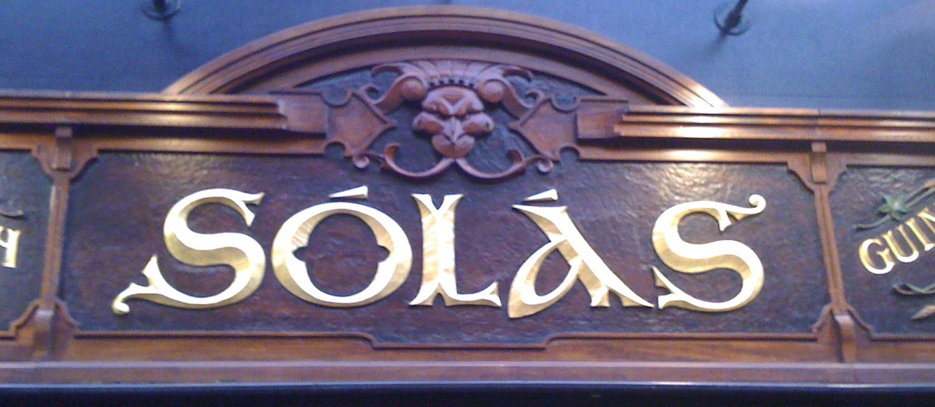
Generations of Irish immigrants have cherished many customs from the old country, including neighborhood pubs. Like ethnic restaurants everywhere, they declare their origins with logo designs in their own alphabet styles. All over Boston, where I live, green and gold signs welcome in a convivial crowd of celebrators wearing green. Many of them will spend the evening watching the broadcast of their favorite basketball team, the Celtics of course.
But celebrating national customs is not just about the Irish. Every immigrant adds to American life, enriching the tapestry. By celebrating each others' holidays, writing in each others' letters, we make our world.
Links to whole alphabets from earlier in this blog:
For more borders and capitals, see George Bain, Celtic Art: the methods of construction.
Also, see borders in Borders for Calligraphy: and read a chapter of insight and instruction in Learn Calligraphy.
 |
ABCs of the USA: The stories behind America’s most distinctive calligraphy styles.
 |
| Letter bars on early typewriters often went out of alignment. Ribbons dried out, picked up dust, and needed re-inking. Today, it looks "antique." |
 | ||
| Detail from a typist's diploma designed in 1921 and awarded in 1944, with a Gothic Revival headline and a mix of a dozen other letter styles--handwritten and typeset and hand-stamped. At the top, the typewriter is glorified as a holy icon. The French headline and maple leaf heading remind us that it is from Canada.
|
ABCs of the USA: The stories behind America’s most distinctive calligraphy styles.
 |
| Neon capitals. |
Gradually eclipsed by today's programmable giant screens, "classic" neon signs show the designer's ingenuity in transforming glass tubes into letters. Many neon signs imitate continuous lines of connected script, while individual capital letters can either be made with separate segments or the lines are "interrupted" with heavy black paint.
It's fun to look carefully at signs made of neon tubes, and see how each one solves the fundamental design challenges. Keep your eyes open and pay attention to surviving examples of this luminous art. Each one is custom-made. A recent book, Almost Lost Arts, profiles a handful of remaining artisans who are dedicated to preserving old neon signs as historic national treasures. And when you're next in Las Vegas, visit the Neon Museum (or take a virtual tour, though it charges a fee)


