Showing posts with label Mosaics. Show all posts

Friday, January 1, 2021

American Calligraphy 1: Subway Mosaics

ABCs of the USA: The stories behind America's most distinctive calligraphy styles. 

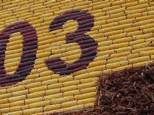
This sketch is based on two  
New York City subway panels
 
This year, I'm not making New Year's Resolutions; instead, I've got a short list of things I'd like to get back to once the virus of 2020 has truly gone away. Many of us miss the same things: a meal with friends, hugs, seeing people's faces, not feeling so threatened. But I also miss riding on subways and looking at the visual art that dresses up so many stations. Boston of course has its charms, but nothing quite equals the mosaics in the subway stops of New York City.  

Many stations in the New York subway system have vintage virtuoso mosaic station panels, designed and installed by the firm of Heins and LaFarge 1904-1907.  Today, an ongoing city program curates this world-class legacy while it sponsors new station signs of similar high artistic quality. 

America is a treasure box of beautiful calligraphy. Come back next week to see more, all through 2021. 


Wednesday, March 2, 2016

We Hereby Resolve

Resolution is another crucial choice the calligrapher makes when assembling letters out of separate bits.  The fewer and larger they are, the faster the work will go; the more numerous and smaller they are, the smoother the contours of the letter will look.  
Letters can be made by dots at greater and greater resolution.  

We read grids every day, from needlepoint to digital fonts to football fans.  The human eye will do its best to read any collection of bits as letter: even a 5 x 5 grid can express  every letter of the alphabet without ambiguity; with a little awkwardness the numerals can be included; there is even leeway for a little decoration.  
The lightbulbs on the old Goodyear blimp are
easier to read from far away than up close.

Scale is also to be understood in relation to actual size: a small, low res letter is actually easier to read than the same letter blown up big.   


Monday, February 29, 2016

All Together Now

Your eye and brain are programmed to look for meaning everywhere, so even a very few items can carry a message.  The first road sign made by the first human may have been a cairn like this, a pile of stones that says "Here is the path."  
The bits that make the message can be anything: pebbles, stitches, chopsticks, corn cobs, people, pixels.  We can call them mosaics, rasters, grids, arrays. They add up to beautiful, inventive letters that have a special place in American lettering.  They spring from the attitude that declares, "Let's get a committee together and everyone can contribute."  Letters that are made by a group have a special place in American life; crowdsourcing is in our DNA.  
    
When you arrange small items into larger images, you get to enjoy making lots of artistic choices about color, scale, and texture.  One of the most important decisions is whether to allow the contours of the individual bits to determine how they are arranged, or to force them to conform to a regular grid. 

These mosaic letters are irregular, or "crazy quilt." 
Here are two contrasting approaches, drawn from distinctly American letters: 
These quilt letters are like pixels on a square grid.
And here is a third, hybrid approach.  
The white tiles of this New York
subway sign 
follow the strokes
 of the letters, but most of the back-
ground tiles conform to a square grid. 
  
This mosaic is from the
annually-decorated Corn
Palace in Mitchell, SD. A
true American artifact.
The grid  of corn cobs is
rectilinear but also
sightly irregular.  
I hope you'll start looking at the many kinds of dots that form the letters you read, both onscreen and in the real world.  Ask yourself: What makes them calligraphy?  What makes them American?  


Thursday, January 21, 2016

What makes it American? What makes it Calligraphy?

I’m mainly interested now in American calligraphy, the topic for my future book The ABCs of the USA.  Most of the established calligraphers that I talk to say there isn’t any such thing, that "real calligraphy" can only come from the Roman, Medieval, and Renaissance styles of Europe.  So I think I may be on to something; when people can’t see an idea that is clear to me, it’s time to write a book. 
Every other American field has had to establish its independence from the Old World--philosophy, architecture, music, dance, fashion, and even spelling.  It's time calligraphy got recognized too.     

I’ll be posting examples of the letters that I see around me, here in Boston and from my travels in the USA.  What could be more American than those? 

What makes it American?  What makes it calligraphy?  Your comments are always welcome.     


Here’s a detail from a unique American gem. The Corn Palace in Mitchell, South Dakota, is covered annually with elaborate, eye-catching mosaic pictures and letters.  They are made out of—what else?!—corn cobs of yellow, red, purple, and black.  Americans have a long history of improvising letters out of individual dots, including such techniques as beading by Indians, lightbulbs displays on the Goodyear Blimp, and football fans in the card section.  All this creativity led to the first pixellated letters, and dominance in the field of digital typographic design.