Monday, September 30, 2013

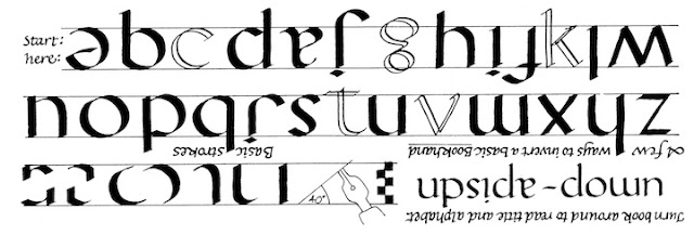
231 Mineral


This variation of basic Gothic, April 11, #84, looks simple--and it is, so long as you train your eye to watch the inside edge of your pen nib as it creates the interior white space.  I've included some guidelines that help you position the upper and lower corners of this square.  


The diagram at right shows how the strokes of Mineral diverge from the regular Gothic letter body.    


Sunday, September 29, 2013

Mistakes in your calligraphy project, and how to handle them. Part One of three.

People often look at calligraphy and ask “What if you get all the way through and find you have made a mistake?”  The answer is, I do make mistakes, lots of them, in lots of different ways; how I deal with my mistakes might help you deal with yours. 

I think there are three kinds of calligraphy mistakes:   Fundamental design errors, typos, and pen slips.  This week we will talk about design errors, because when you don't get the layout right, from the very beginning, there's no way to patch it up.  You should start over rather than go throw good time after bad.  

I think Dorothy L Sayers got it right in Gaudy Night, when one woman don says,"I'm quite sure that one never makes fundamental mistakes about the thing one really wants to do. Fundamental mistakes arise out of lack of genuine interest...”  

How not to make fundamental design errors.  Basically, make three kinds of pencil drafts.  
  1. Start with a "thumbnail" concept sketch about 3" square. Make several and just play around with the simplest aspects of the overall design.  Think about color and saturation.   
  2. Next, establish the line breaks and spacing of your text.  use a word processor if it speeds up this process, changing margins, line spacing, and letter size freely.  
  3. Finally, make increasingly exact renderings.   I work with pencil and markers, to keep it loose and reversible.  Don't put too much labor into any one version yet.  I lay a new sheet of tracing paper over an almost-right design to build on what's good in it, rather than starting over each time.    

Saturday, September 28, 2013

230 Refract II


This alphabet, Refract II, like yesterdays', offsets the lower half of the letter, but this time to the left.  A penciled guide line will help you keep the change point accurate.  

Friday, September 27, 2013

229 Refract I

Work with a penciled guideline in the middle to help your eye find each letter's breakpoint.  You may find a slightly different way to configure the center junction of K and R.
This alphabet, Refract, takes a simple Roman or Block letter and simply offsets the bottom half.    


The title at right suggests an interesting variation with a slanted, not level, transition line.  


Thursday, September 26, 2013

228 Swash caps grab bag

I might try out some of these as whole alphabets later this year.  Any special requests? 
These 26 different capitals offer a wide range of ways to add extra strokes to letters.  Choose a few and explore them.  Each one can spawn a whole alphabet of its own.  

Wednesday, September 25, 2013

227 Bubbly

I've shown the title and basic strokes in outline, so you can see their shape more clearly. Keep your eye on the inside edge of the strokes, not the outside.   
Bubbly is built on plain Gothic letters, which bend in the middle as though there were a bubble inside each letter. 

Tuesday, September 24, 2013

226 Banco


This alphabet, Banco, is a knock-off of a very snappy typeface.  Note the two pen angles: flat 0° for most of the strokes and vertical 90° required for the horizontal strokes of A E F T H Z.  The joins fall into two categories, where strokes either clearly overlap or touch each other.   
Note also that the first strokes of many letters start a little below the top line (shown as a dotted line).

Monday, September 23, 2013

225 Ambigram bookhand

From Calligraphy Alphabets Made Easy.  

Today's alphabet is Bookhand Ambigram, which relates to Italic Ambigram from July 12 #163. This alphabet has fewer pairs of letters that are exact rotated versions of themselves; d and p still correspond, for example, but h and y no longer do.  You have to start stretching and manipulating the letters to turn e into a, or  j into f.  
Two ambigrams.  

What makes this process really fun is that the brains of the readers are on your side.  Just give them a form that looks a little bit like the letter, and they will work it out from the context and their own eyes' desire to make meaning out of images.  


Sunday, September 22, 2013

Designing with striped letters


The advice in this quote is very astute.
We looked at striped letters earlier with Mesh,* # 5, January 6.  They already make a strong visual impact, but you can add extra pen strokes the same width as the narrower stripes. 

Here at left is a simple layout of the 26 letters, knit together with narrow swashes and a few wider ones.  Also, the inner space is accented with white.  


*A starting point for striped-letter designs.  

Saturday, September 21, 2013

224 Lights out

Today's alphabet, Lights Out, honors the Equinox, when the sun's light starts its long decline.  This simple style creates the optical illusion of a three-D letter on the page.  

Friday, September 20, 2013

223 Celtic color and line

Use water-resistant ink for the outlines so the interior colors won't dissolve it.  
I liked the fresh, unexpected quality of yesterday's Celtic Line alphabet.  So I took it a little further, with extra coils and some touches of color.  I call it Celtic Line and Color.  You can take it from here. 


Thursday, September 19, 2013

222 Celtic line

I've been thinking about what it is that makes Celtic letters Celtic.*   Here is a version, Celtic Line, that omits the traditional variation between thick and thin.  It still has eighth-century Irish flavor, but updated and simplified.  To keep it Celtic, I've emphasized the triangular serif and used some of the quirkiest letterforms.  

*In the Celtic chapter of Learn Calligraphy I dissect Celtic style into ten main characteristics, which I gave names that start with C to make them easier to remember

  1. comfort at all sizes
  2. choice of weights
  3. changeable pen angle
  4. compound serifs
  5. chunky extenders
  6. commoncase font
  7. cute proportions
  8. coils that continue
  9. coils that stretch
  10. contained spaces 


Wednesday, September 18, 2013

221 Secret identity/Nobody we know


I love the idea that letters have other identities they can slip into. Small d is p upside down, p is q from the back.  But maybe the letters have their own ideas...
Today's alphabet builds on Short Shadows, September 17 #221, to allow letters to reveal a whole other message.  Follow yesterday's steps, but choose different words, with the same number of letters, and allow for an extra step where you use a rough draft to work out the spacing.   
This design heads the last chapter in my book Learn World Calligraphy.

Tuesday, September 17, 2013

220 Long Shadow


Yesterday's Short Shadow can lengthen into Long Shadow, giving the impression of time passing.  Simply adjust the height of the guideline and the angle of the slant.  

To review, here are the steps: 
  1. First write the simple black letters [here they are Roman but you can choose any style].  Leave space between the lines of letters.   
  2. Add a pencil guideline twice the letter height.  
  3. Add pencil lines at an angle (60° here) so the shadows will all follow the same slant. 
  4. Write the slanted lines using gray ink.  Hold the pen at the same angle.  

Monday, September 16, 2013

219 Short Shadow

Sometimes I like to imagine that letters are vertical, stand-alone figures that can cast a shadow.  Here, in Short Shadow, they look like they do.  
Write this in four stages; 
  1. First write the simple black letters [here they are Roman but you can choose any style].  
  2. Add a pencil guideline halfway up the letter height.  
  3. Add pencil lines at an angle (60° here) so the shadows will all follow the same slant. 
  4. Write the slanted lines using gray ink. 

If your black ink is water-soluble, or if your gray ink is opaque, you may need to reverse the sequence.
  

Sunday, September 15, 2013

Simple is good

When you lay out your design, look for the One Big Thing about the text that you want the viewer to grasp visually before reading the words. Compare these:  
The invitation on the left is decorative, legible, and balanced, but your eye gets lost among the strokes, and important information competes with details for your attention.  
The invitation on the right guides you through the wording with a firm hand, clearly signaling which words have major, minor, or minimal importance.  Painters, also, are taught to deal with foreground, middle ground, and background in composing a landscape; calligraphers learn to make similar design categories.  What do you want the reader to notice first, soon, and eventually?  

  A second example illustrates the same point.  This quotation could have been much more complicated, with different styles and sizes for each phase of life and a layout with more going on.  But the text itself is so powerful that it does not need you to over-interpret it.  As composer Gustav Holst said, "If what you have written looks complicated to you, you should doubt its authenticity."   


Saturday, September 14, 2013

218 At One

This alphabet is made by using the pen strokes of Hebrew calligraphy to write the letters forms of the Roman Alphabet.  I've named it At One in honor of the day when Jews atone for their sins and celebrate God's forgiveness.  
This comes from my book Learn World Calligraphy, which includes three other Hebrew-flavored alphabets and a wealth of decorative motifs.  
Preview of tomorrow's alphabet.  


Friday, September 13, 2013

217 Not my fault!

Today is Blame Someone Else Day,* which falls on Friday the Thirteenth.  And who needs a scapegoat more than calligraphers, who make typos every day of their lives?! 

There are many online discussions about preventing, catching, and repairing errors you make when you letter by hand.  Here, from decades of freelance work, are my precautions:

*The first Friday the 13th in any year.  

I haven't made an alphabet style for today; I'm trying to think of Somebody Else to blame.  

Thursday, September 12, 2013

216 Gothic plus


This alphabet, Gothic Plus, adds a variety of decorative strokes to the bare bones of  basic Gothic: double stroke, small stroke, banner, staff, hairline, square dot.  


A common use of Gothic caps, here with a few extra strokes (B) and vertical hairlines (T G).  


Simple, decorated, or elaborate
You can adapt your own versions of the examples above, or push even further with more parallel strokes, interweaving, filigree as shown here at right.  


Wednesday, September 11, 2013

215 Redoubled Gothic caps

Y needs one more decorative stroke.  

Redoubled Gothic adds a little more ornament compared with yesterday's Doubled Gothic (left); two little strokes overlap the left stroke of half of the letters (except U and Y with the strokes inside, Z and W with the internal dash, and A C E G O Q S T V X with no extra strokes).

  
There are in fact at least three kinds of small strokes that can be added: square, parallelogram, curve.  And three are three ways to add them: float (not shown), touch, overlap.  The diagram at right comes from the Gothic capitals chapter in Learn Calligraphy


Tuesday, September 10, 2013

214 Doubled Gothic caps

These come from the dozens of alphabets offered in my book Capitals for Calligraphy.  

These caps, Doubled Gothic, are built on yesterday's Bare Bones Gothic(left). Each letter holds a doubled stroke, tied together with two hairlines.  

You can of course try out your own designs for the basic letter structure.   I lettered this alphabet a couple of decades ago and I've written a LOT of Gothic capitals since; in retrospect, the doubled lines look a little close together.)  
  

Monday, September 9, 2013

213 Bare Bones Gothic


This Gothic alphabet is stripped to its essentials.  The outlined strokes are optional.  The dotted strokes help fill the space. 

Bare Bones Gothic reminds us that although Gothic capitals have a reputation for fussy ornateness, they are actually built on a simple framework.  Almost every letter is built on three strokes or fewer.
From Learn Calligraphy. 

Then you can decide how much to decorate them. Ornament can be sorted into five basic categories of extra stroke: 

  1. Banner
  2. Hairline, often the stem of the banner
  3. Doubled (and tied)
  4. Square that touches the stem of the banner
  5. Square that floats

Traditional scribes used simpler capitals within the text and more ornate capitals when time and space allowed.  

Simple letters deliver the most Gothic flavor for the fewest strokes, and provide a starting point for the increasingly ornate alphabets that follow later this week.  
Preview of tomorrow's alphabet.
  

Sunday, September 8, 2013

New capitals in new designs

Now that we've spent the last two weekends learning to decorate medieval capitals and place them in Gothic texts, we can bring the idea into our own century.  Capitals today are still an important focal point of page design and they still add EMPHASIS to texts, but they are free to assume other identities and fill other functions.

Capitals don't have to be the first letter in a word.  Capital T , above, grows inside the word imagination. to demonstrate the sense of the quote.  

Two weeks ago, Etchy reminded us that the last letter in a word can be capitalized too.  

Enjoy finding new places for your capitals.   

Saturday, September 7, 2013

212 Surreal Perspectives


These letters, Surreal Perspectives, are drawn from many sources to suggest initials that might add head-scratching intrigue to a design.  Type designers have had fun with the forms of M C Escher, who pioneered surrealism for many mid-20th century artists.    I've pinned one such font for you here.   

I'm sure that with a little online searching you can invent your own  surreal letters.  (BTW please excuse the off-straight T.)

Friday, September 6, 2013

211 Heraldry Language

This alphabet, Heraldry Language, derives from Heraldry (July 9, #160).  It shows how the colors, patterns, and precious metals of medieval heraldry can be specified with great precision using words from a special vocabulary.  After reading the description, the illuminator used his own imagination and talent to create the escutcheon.*  
* If that word brings you to a screeching halt, think how I felt when I first encountered it on the SAT in high school.  Not fair!  I've made a point of using it here so you can ace your own tests.
There are a lot more ways to fine-tune the description of a family crest.  But these will get you started.


Thursday, September 5, 2013

210 Ronde Light LC


This is absolutely lovely for wedding calligraphy.  But make it more legible by crossing the F and T, take care with the H, and modify the D and X.

Ronde Light LC coordinates with Ronde Light Caps from the day before yesterday (September 4, # 208).  These letters can be as small as one-third the height of the capitals; bring their ascenders up to that height too.    

Wednesday, September 4, 2013

209 Rosh Hahanah

This alphabet comes from my book Calligraphy Alphabets Made Easy.  You can find four other Hebrew-themed alphabets there, plus three more in the Hebrew chapter of  Learn World Calligraphy.  These are not quite in alphabetical order throughout, in an effort to help you classify them into letter families.  
September is the season of Jewish New Year.  These letters, Sabra, are a blend of Roman alphabet forms with Hebrew pen strokes.   You may take some time to get used to the extreme pen angle and the backward letter slant. 


Tuesday, September 3, 2013

208 Ronde Light Caps

Ronde is adaptable to a range of heights, from a heavy 7 pen widths to today's delicate 16 pen widths. These Ronde Light Caps are more demanding than they might seem, as the curves are organic rather than geometric.  

Of course, you wouldn't DREAM of using them to spell out whole words; they are happiest one by one, when they capitalize a word.  


Monday, September 2, 2013

207 L for Labor Day


These nine versions of the letter L come from my book Capitals for Calligraphy.  I like the idea that the scribe's labor comes in so many flavors--medieval, Celtic, floral, mechanical to name the most obvious.  And the two figures pay tribute to holiday weekend activities: a dip in the hot tub and a quiet session of writing.  What more do you need?   


Sunday, September 1, 2013

Project: Placing a capital in Gothic text

  he first letter of a Gothic text is usually enlarged.  There are three ways to attach it to the text: no indent, partial indent, complete indent.


No indent
1.  Line up the capital to the left edge of the text without indenting it. The scribe has tagged the next letter with a dash of red after I, left, because it is as tall as three small letters.  P, right, is closer to the text letter's size.  

2.  Indent part of the capital, letting some of its left half hang into the margin.  E and P, right.  

3.  Completely sink the capital into the text, leaving its left edge flush with the text.  N, left, and S, below. 
Complete indent.

The illustrations here are from 50 Medieval Manuscript Leaves, used with the kind permission of photographer David Bindle.  The book is a treasure house of beautiful and instructive examples, well worth its price.  
http://www.blurb.com/b/2272528-50-medieval-manuscript-leaves