Friday, May 31, 2013
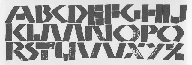
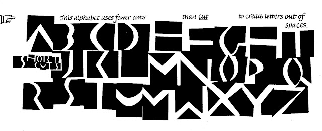
127 Simple Split Capitals
Thursday, May 30, 2013
Wednesday, May 29, 2013
125 Assorted Gothic Capitals
Gothic capitals are drawn with many shapes, scenes, serifs, and styles. Here is an assortment of 26 ways to decorate an initial. For the basic shapes, you can refer back to Versals (April 29) and Versals in Circles (May 6).
The alphabet below first appeared in my basic book Learn Calligraphy . You might enjoy printing it out and coloring it in. Use bright primary colors, plus gold or silver.
Today, by the way, is considered by academic historians to be the ending of the middle ages, as the day in 1453 when Constantinople was conquered by the Turks.
 |
| Because so many medieval capitals are built on similar shapes and resemble each other, you can easily modify, flip, or rotate one to look like another. Change N to H, D to C, G to O, M to W. |
Tuesday, May 28, 2013
124 Arts & Crafts
The Arts and Crafts movement in the US prefigured some of the letters in Art Deco, with quirky forms and proportions that convey the flavor even without variation between thick and thin strokes.
Compare this with yesterday's alphabet, Deco Mono, to see how important letter shapes are in conveying calligraphy style. Both are done with the simplest unvarying line.
☞ For left-handers.
Compare this with yesterday's alphabet, Deco Mono, to see how important letter shapes are in conveying calligraphy style. Both are done with the simplest unvarying line.
☞ For left-handers.
 |
| Note the underlying shield shape, giving A & C letters a faint medieval subtext. |
Monday, May 27, 2013
123 Deco Mono

Deco Mono shows that the aesthetic style of Art Deco doesn't demand an exaggerated line contrast between thick and thin strokes, but derives partly from the proportions of the letters. The letters A E K R W here are especially Deco-looking.
☞ For left-handers.
Sunday, May 26, 2013
Many American ABCs
 |
| A timeless poem by an ancient Greek author is written in Greek-flavored Roman letters. |
Being American often means coming from somewhere else. So today I'm offering several projects using calligraphy that originated from outside the ABCs.
In Learn World Calligraphy the book, I coined the term "virtual alphabets" to highlight the use of calligraphic techniques from outside Europe to write words in the English language.
 |
| An event with a Russian flavor has a logo with Cyrillic calligraphy. |
 |
| A blend of Hebrew and Roman letters evokes the sound of Israeli music at an American college gathering. |
Anytime you want to express your own identity on paper, the true American way is to blend writing from your own roots with the ABCs.
Saturday, May 25, 2013
122 Blot
Rather than "Blot," a better name for this alphabet might be "Dribble." India ink used to be sold in dropper-stopper glass bottles, which made it easy to fill your pen with a drop of ink from the side, rather than dip the nib and wipe off the excess each time. It occurred to me that the dropper itself could shape some interesting letters.
The illustration just shows some typical letters. Everyone's letters will be different, every time. I can suggest that the fewer separate strokes you make, the more motion and individuality you'll create. In the alphabet below, I particularly like E F H Q W Z. But you'll have fun discovering your own favorites.
The illustration just shows some typical letters. Everyone's letters will be different, every time. I can suggest that the fewer separate strokes you make, the more motion and individuality you'll create. In the alphabet below, I particularly like E F H Q W Z. But you'll have fun discovering your own favorites.
 |
| You vary the weight of the line by squeezing out more or less ink, and by changing the writing angle from low to more vertical. |
Friday, May 24, 2013
121 D x 6 ItalicLine contrast
This alphabet uses my favorite pen point, from the Speedball D series. The thin part of the stroke is only about ⅔ the weight of the thick part, giving the letter a pleasing contrast without overstatement. [comment on availability?]. Because this pen was popular with sign-card letterers in the 1920s, 30s and 40s, the nib adds period flavor of its own.
The D nib, by the way, went out of distribution for a while. Now it seems to be available again. Check online sources, and start with the D3 or D4 medium size to get acquainted. It's versatile and easy to use, so it's worth tracking it down.
 |
| I discuss and illustrate "line contrast," a term I coined, in the Italic chapter of Learn Calligraphy . I like this alphabet because its line contrast is in the middle between broad-edged nib and monoline. |
Thursday, May 23, 2013
120: Pro Musica
Yesterday was the 200th birthday of Richard Wagner. This alphabet, Pro Musica, was supposed to be posted in his honor, but I mixed up the dates, um...
Nevertheless, it illustrates how musical symbols can masquerade as letters. In fact, you could probably just arrange little oval letters on those 5 horizontal staff lines, and people would see them as notes.
☞ For left-handers.
Nevertheless, it illustrates how musical symbols can masquerade as letters. In fact, you could probably just arrange little oval letters on those 5 horizontal staff lines, and people would see them as notes.
☞ For left-handers.
 |
| Preview of tomorrow's alphabet. |
Wednesday, May 22, 2013
119: 26 Serifs
 This calligraphy, 26 Serifs, is like a chocolate box; you can sample it to see what you'd like to try more of. Most of these alphabets will be covered--or already have been--during this year of daily styles.
 You'll need, variously, a broad-edged pen, a Speedball B and C and D nib, a brush, and a thin- line marker.
☞ Many of these are for left-handers.
Tuesday, May 21, 2013
118: Continuo
 |
| Try your own versions of one-stroke letters. |
*See Endless, from April 5, for another approach to continuity.
Monday, May 20, 2013
117: Half Gothic
If you give the hexagonal letters of medieval Gothic a rectangular base, they become Half Gothic. It's a useful alphabet, somewhat more legible than Plain Gothic, daily alphabet #84 (find it at April 11).
 |
| Upper serifs and strokes are flattened squares set at 45° while lower serifs and strokes are short horizontal parallelograms. |
Sunday, May 19, 2013
Alphabet design project
Calligraphers have a special affection for making a design from just the 26 letters of the alphabet. It's familiar; it's short; and everyone knows what it says. And it offers infinite arrangements.
Your perpetual challenge with alphabet designs is to make an interesting grid out of the number 26.
Or you can experiment by expanding some letters, as in the design here.
.
Your perpetual challenge with alphabet designs is to make an interesting grid out of the number 26.
- I've had fun with 5 x 5 (crowding I and J together).
- 4 x 6 is good, too, with the A and Z treated alone as beginning and ending.
- 3 x 9 can work, vertically or horizontally, if you let Q stretch to two spaces.
Or you can experiment by expanding some letters, as in the design here.
 |
| Be forewarned that reversing calligraphy to read white on black will make it seem heavier. And these Italic letters were pretty heavy to start with. |
The second design simply abbreviates the alphabet to A-Z, with a swash in between to represent the other letters.
.
Saturday, May 18, 2013
Friday, May 17, 2013
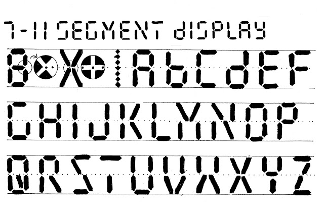
115: Seven-Eleven segment Display
I've been rethinking this alphabet ever since 1985 when I presented it in Calligraphy Now, right up to the most recent version yesterday. Today, in 7-11 Segment Display, a more convenient style, I have added 4 diagonals to the 7 original strokes, to make all the letters accessible and to help you mix letters with numerals without ambiguity.
☞ For left-handers.
You can experiment with other ways to build letters and make them more legible.
If you don't use them with numerals you can do without the diagonals in S and Z. By the way, here are the numerals:
☞ For left-handers.
You can experiment with other ways to build letters and make them more legible.
If you don't use them with numerals you can do without the diagonals in S and Z. By the way, here are the numerals:
Wednesday, May 15, 2013
114: 7 - Segment Display
I love elegant, thrifty letters that can be made with a minimum number of parts--like reimagnining Gothic for the end of the analog age. 7-Segment Display is made almost entirely of one basic stroke, arranged along a 7-piece grid.
2 to the seventh power [=64] ought to let you make all the letters you need, but like all simplistic alphabet formulas, it doesn't actually work for our alphabet.* You have to make compromises, especially if you plan to use letters and numerals together. (Writing numerals without letters is easy, and even writing letters without numerals can make life a lot simpler.)
Once you get past the first 10 letters, this alphabet won't fit the grid. You have to compromise in order to construct M, T, and W. U is difficult and there's just no good way to make K or X (I've given you the scaffolding to try). The extra stroke for J and R are given just help make them a little readable.
Tomorrow we will add diagonal strokes, and see how that helps solve the problem.
*Those Phoenicians, Greeks, and Romans didn't anticipate electronic displays!
Note that, just like Gothic, the vertical stroke starts a little shy of the top and bottom line.
The fun in this alphabet is the precision it demands wherever two or three strokes meet each other. It gives you a chance to really get acquainted with the square Speedball A nib.
You can heighten the effect by writing with neon orange or lime green on a black background.
☞ For left-handers.
Tuesday, May 14, 2013
112 Tall uplight
You can make just about any letter look solid on a flat page. This version, Tall Uplight, uses a wide pen to create the illusion of an edge.
You'll find that as your letter gets "taller," your flat pen has trouble negotiating the invisible corners inside. Your implied letter may need to be revised to have more rounded corners. In this alphabet I tried turning some of the cross strokes into separate dots to solve that problem.
You'll find that as your letter gets "taller," your flat pen has trouble negotiating the invisible corners inside. Your implied letter may need to be revised to have more rounded corners. In this alphabet I tried turning some of the cross strokes into separate dots to solve that problem.
 |
| Don't ask me why the "shadow" in the Basic strokes is the opposite from the actual letters themselves. Brain took a nap. |
Monday, May 13, 2013
111 Deflated Gothic
Letters sometimes look like closed containers that have air (white space) inside and around them. It's fun to try pumping out some of that air, to make this Deflated Gothic alphabet. Later in the year we will try inflating some letters to make them bulge.
 |
| This comes from my book Capitals for Calligraphy, a source for dozens of pen alphabets. And page designs. Stay tuned for more excerpts. |
Saturday, May 11, 2013
Mom and me, a calligraphy project for Mothers Day
I'm posting this one day early, in case you want to give your mom a calligraphy rose.
I have a few guiding principles in calligraphy, which could be boiled down to "A letter can be anything; anything can be a letter." When I look at letters I see flowers; when I look at flowers I see letters.
I am also fond of the idea that "Letters are all you need on the page." This calligraphy for Mothers Day turns the words MOM AND ME into a rose. Red petals form a coiled O. The leaves, stem, and thorns make M s, as well as the bud, which makes the M that cradles a tiny rolled up e.
I'm posting this today even though I think my own mom's favorite flowers were actually lilacs, and I'm partial to hydrangea. I think she'd understand. All those little petals would be hard to turn into letters. But not impossible.
110 Retouched Roman
When you write very formal Roman capitals with a pen, it's almost impossible to resist neatening them up, as shown here with Retouched Roman. Our eyes are so accustomed to seeing the perfect letters of carvings and typography, that the original hand-written caps may look a little shaggy.
The alphabet here suggests where you can sharpen your calligraphy for formal purposes, when you have just a few letters or a few words. But don't try to pretend your ink on paper is mechanically perfect type or an inscription. Refer back to Friendly Roman, which lets your letters written by hand act natural.
The alphabet here suggests where you can sharpen your calligraphy for formal purposes, when you have just a few letters or a few words. But don't try to pretend your ink on paper is mechanically perfect type or an inscription. Refer back to Friendly Roman, which lets your letters written by hand act natural.
Friday, May 10, 2013
109 Celtic Commoncase
A few decades back, there was a phenomenon in the type world called "Commoncase," where large and small forms of a particular style were piled into a common font together.
The Celts, however, got there long ago, in the 6th century, a millennium before the terms uppercase and lowercase even had been invented. Today's alphabet lets you use any Celtic letter you like with any other, uniting them with common height, pen width, and serif style.
Celtic alphabets from earlier posts include:
and there will be many more for you to choose your favorites from.
The Celts, however, got there long ago, in the 6th century, a millennium before the terms uppercase and lowercase even had been invented. Today's alphabet lets you use any Celtic letter you like with any other, uniting them with common height, pen width, and serif style.
Celtic alphabets from earlier posts include:
- March 11 Celtic Caps
- March 12 Celtic Lc
- March 16 Super Celtic
- April 22 Coiltic
and there will be many more for you to choose your favorites from.
 |
Thursday, May 9, 2013
108 Skinny Gothic
Alphabets are people, too, and sometimes they can hit a growth spurt. Here is a tall alphabet I call Skinny Gothic.
 |
| My hand was a little unsteady. Don't look too close! but you can improve on these letters, keeping the general proportions. |
 Like any true Gothic, the center sections of these letters make a regular "picket fence" pattern. Here are o p q r, without tops and bottoms. Like any true Gothic, the center sections of these letters make a regular "picket fence" pattern. Here are o p q r, without tops and bottoms. |
Wednesday, May 8, 2013
Tuesday, May 7, 2013
Monday, May 6, 2013
105 Versals in circles
 These letters, Versals in Circles,* add structure to the Versals we saw a week ago [April 29] and echo the circular strokes of yesterday's King Arthur. While the letter bodies may seem organic, they are shaped by their intended use as frames for scenes from the Bible. Here you can see the circles that underlie their structure.
 *Circles in Versals might be just as descriptive.
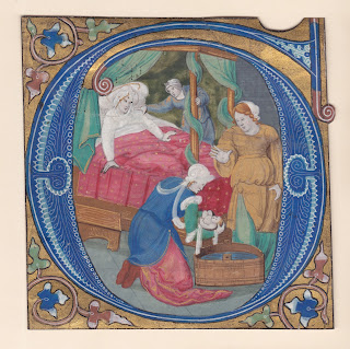
This early 16th century illumination shows how a letter G has been turned into a frame for a detailed scene depicting the birth of the Virgin Mary. The white tracery on blue is extremely fine: the whole letter measures about 4 1/2 " [11 cm] square.
Sunday, May 5, 2013
Calligraphy Circles Project
I'm fond of letters laid out in a ring. The design gives whatever quote you choose an air of completeness, and the form is satisfying to the eye.
Below: The swashed ascenders will look better if they all extend to the same height, and also extend sideways to evenly fill up the ring without gaps or clumps.
If you think your readers need help, break the quote into two parts so that none of the words need to be read upside down.
Using several kinds of letters in concentric rings will give intriguing contrast.
[See also February 3, Calligraphy in a Ring.]
Saturday, May 4, 2013
Friday, May 3, 2013
103 Minimalist
Now, for relief from all those ornamental dots and dashes, here is Minimalist. Not only does it strip away everything extra but it also takes off some strokes we normally think of as necessary. I like the way it forces us to think about how the future of the alphabet might look.*
Thursday, May 2, 2013
Wednesday, May 1, 2013
101 Morse Code for May Day . . . _ _ _ . . .
 Today we honor Morse Code. Why today? When people in trouble used to call out for help, it was actually a phonetic version of "M'aidez," which meant "Help me!" in French, the common international language of the 19th century. "May Day" became a phrase understood everywhere.
 Morse Code was a vital long-distance alphabet, from its introduction in 1837 until 1997 when it went out of official use. The dots and dashes that substituted for the May Day call make use of the code's most distinctive letters, S O S. It was understood around the world. The first of May seems like a good day to feature it.
Maybe because I'm married to a former ham radio operator who seems to have Morse Code in his DNA, I love the way Morse Code looks. Even though there's a typo in the title.
 |
The alphabet at left is based on calligraphic dots and dashes. They touch each other, rather than being separated by the width of one dot as Morse rules require, and can be used for decoration and subtle double meanings.
| Here at right is a Morse alphabet in brush strokes, a design by scribe Rick Cusick, which I included on page 178 of Learn World Calligraphy. |
Subscribe to:
Posts (Atom)


