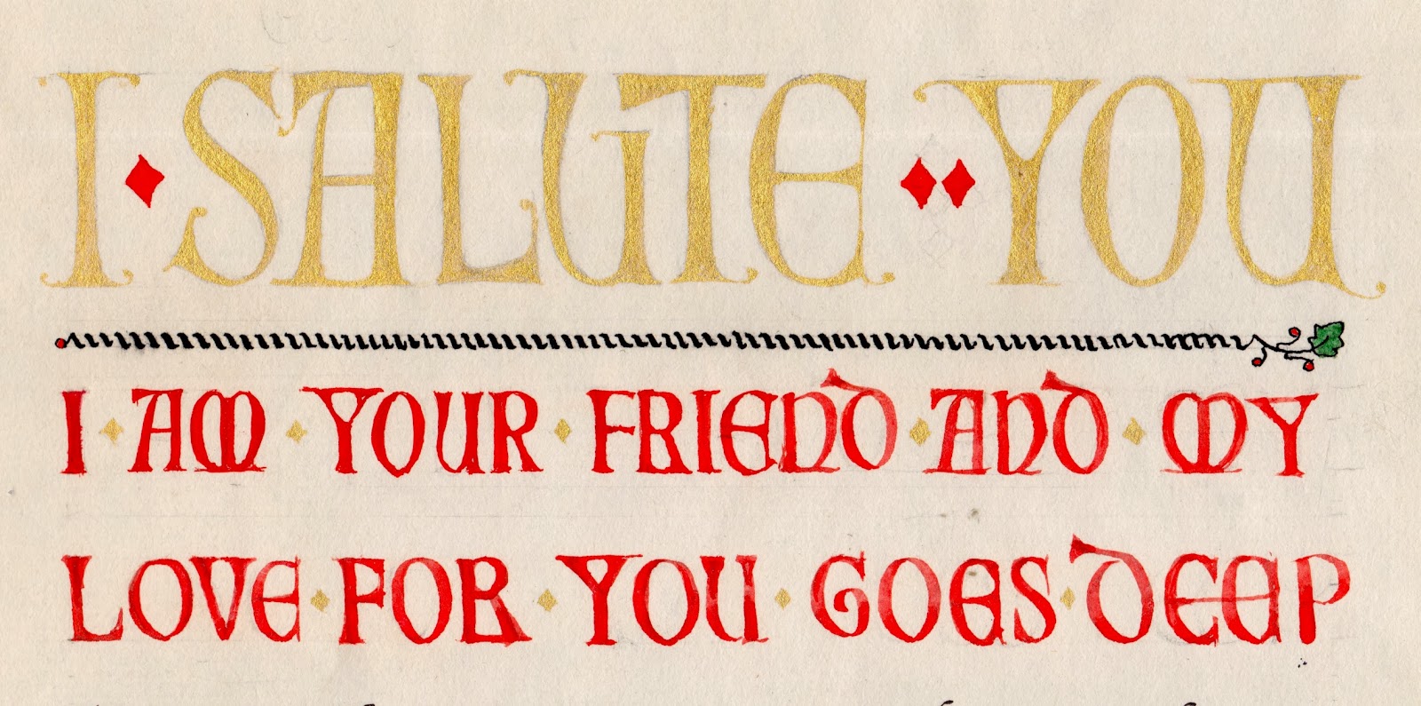
Saturday, November 30, 2013

283 Leafy


Across, down, up.  
This alphabet, Leafy, shapes the basic italic a and b bodies into a pointed, organic leaf shape.  The down and up strokes slightly overlap at the tip of the leaf.  You can make the leaf narrower or broader to imply different species.  
Keep the pen angle steady at 45-50° to make the corners accurate.  
Final down stroke.   
Look at real leaves to absorb natural shapes.  


Preview of tomorrow's alphabet.  


Friday, November 29, 2013

281 ThereThere

Use a flat 0° pen angle for the round and straight strokes, and a 45°.  
ThereThere is a type style that is meant to make what you read feel calm, clean, and healthy.  This is a pen draft of alphabet that grew out of the first weekend I spent learning how to design digital type.  The pen and ink characters above are a reinterpretation of the type I'm working on.  

I only have a dozen or so letters finished, since you shouldn't derive the rest of the alphabet if you haven't get those core forms right.  And I don't know yet how I'm going to handle those diagonal letters, whether to round off more of them or leave them with sharp corners. The workshop leader optimistically said it should only take a few months to learn what I am doing.  
Preview of tomorrow's alphabet.  

Thursday, November 28, 2013

282 Thanks!

I'm taking today off to have thanksgiving dinner.  You can make a turkey out of a T, or vice versa. 


Wednesday, November 27, 2013

280 Slanted Coopy Caps


A very simple alphabet, Slanted Coopy Caps.  If I had it to do over, that B would be better.  

Tuesday, November 26, 2013

279 Chrome Plate

Sometimes a few simple techniques can help pen, ink, and paper mimic real materials.  This rounded outlined Gothic alphabet, for instance, can be filled in with tones of gray to make it look like Chrome Plate.

  1. Outline the letter using water-proof ink such as india or Higgins.
  2. Draw light guidelines that divide the letters into thirds. To keep them invisible, you can draw them on the back of the paper and work on a light table.   
  3. Fill the bottom half of the letters with water-soluble black ink or paint.  Fill the middle third with a diluted gray tone of the black, blurring the edge between the two.  Then use the palest gray you can mix to fill in the top.  These grays imitate the reflected sky, curb, and pavement that are characteristic of chrome car logos. 
Note: use bluish-black to fill the letters, not warm sepia.  Brush or pen?  Depends on size.
Round these off to look like chrome.  

Note: to help your letters look like they are made of metal, imagine chrome in the real world.  You'll probably want to thicken the thin parts of the letter, since tiny hairlines and sharp corners are not characteristic of solid chrome.  
Look at chrome logos on cars for ideas.  The designs take two basic approaches: each separate letter can be attached one by one, or the whole logo can be turned into an inter-connected whole.

Once you've learned this technique, you can Chrome Plate anything. 

Like Gothic Highlight

Monday, November 25, 2013

Pricing your work, an afterword

Last week we looked of categories of freelance work and how to price them.  Now we're ready to add a grab bag of some other guidelines.
  • Discuss the work first, the price second.
  • Too low is worse than too high.  Human nature and Murphy's Law suggest that if your work is substandard people will forget that it was a bargain and just remember that it wasn't done right; if the quality is high, they may still remember the low price and under value the work.  And in the long run, by undercharging you just make it harder for you and your fellow scribes to make a living.  
  • If you ever do work for free, make sure the recipient knows they got something valuable from a professional.  Spell out clearly what kind of barter payment they may have promised to you: publicity, membership, services, free copies.  I once did free work for a group promoting professional women; they promised me "exposure" and then left my name off the program.
  • Cover your hidden costs such as special materials and paying the printer.  Ask for a reasonable advance to cover out-of-pocket expenses.  
  • Do not take jobs where you know, in your gut, that the client is going to be unreasonable--by undervaluing your time, waiting until the last minute, constantly changing the job, or just asking for bad design.  
  • Ask for a contract on a large job; one third up front, one third half way through, and one third on delivery.  Include a "kill fee" in case you get partway through and they cancel it.  
  • Sometimes it's not a good idea to work for friends.  You may all be happier if you can refer them to a colleague.... [Has anyone else found this to be true?]
  • This all gets easier as you get more experience.  Emerson says "There is no courage like the courage of having done the thing before," and there is nothing like believing firmly that you are charging what your work is worth.

If you are just starting out, ask other calligraphers what they charge.  Find out the "going price" is for such standard jobs as designing an invitations, lettering a quotation, engrossing a diploma, addressing an envelope.  They'll thank you for the courtesy.  
    

Saturday, November 23, 2013

278 Coopy Italic caps


Coopy offers almost as many variations as standard Roman.  Here is a forward-slanting Coopy Italic Caps with serifs.

Friday, November 22, 2013

277 Land Ahoy


Land Ahoy is the simple basis of all our previous Land variations; [list dates].  It relies on a height of 3 1/2 pen widths and a pen angle of 0° or 90°.  Most strokes join by overlapping.  


Thursday, November 21, 2013

276 Clear cut

These letters, Clear Cut, are made by cutting black 1" squares with mostly straight lines and moving the pieces to make white strokes.  

You can create simple block letters, or spend a little extra time and trouble to give the illusion of serifs and decorative strokes.  

We will come back to this idea during December, when patterned paper is a big part of our lives.  Start saving now.


Wednesday, November 20, 2013

275 Coopy light


Some people just look better zaftig.  Coopy light kind of takes the fun out of Coopy by slimming it down.  You can use it for more projects, it's easier to construct neatly, and it doesn't overwhelm the reader with period flavor; but at 4 pen widths tall, instead of 3 1/2, it's a lot like skim milk.  


Tuesday, November 19, 2013

274 Nouveau D-2

I don't have a good way to do K.  Ideas? beyond just picking words without it. 
I am not satisfied with yesterday's Nouveau D.  Here is another try, Nouveau two nibs, using a broad-edged pen for about half of the strokes to control the swell of the curves, and then finishing off the upper parts of the letters with a Speedball B nib to make a thin unvarying line.  

Admittedly, it's an clunky process that limits you to a few carefully planned words, but these letters do work.  And once you've tried them with your own pen, they belong to you in a special way.  

The blue strokes, at right, are done with a different pen from the black strokes, for emphasis only.  That's not the way I recommend you write the alphabet.  When you actually construct it, use one color for everything, as at lower right.  
  

Monday, November 18, 2013

273 Nouveau D

I'm sure you can do a more polished version of this rough draft.  It's just to get you started.  
This is a case where my battle cry "I can do that" turned into more of a challenge than I expected. The flowing forms of Art Nouveau generally lend themselves to drawing by hand or writing with a brush, rather than lettering with a thick and thin nib.  But i was convinced there had to be a way.  
This ambitious pen version Nouveau D uses the Speedball D nib at a 90° angle for most strokes but flat at 0° for some of the upper horizontals [illustrated in gray above].  This keeps the visual weight down low at the base of the letter.  

Sunday, November 17, 2013

Pricing your work: rights and reputation

The last two kinds of pricing come when you are really launched into your career, when you can sell your RIGHTS and your NAME.  
First, know your rights before you sell them. Your client's right to own and enjoy a piece of calligraphy does not include the right to reproduce it.  Prevent misunderstandings by spelling out just what the client is buying from you.  Familiarize yourself with a typical contract, and with the laws about copyright.  Add the line "Calligraphy © [your name]" to everything you sell.  And if you see someone using your work without permission, let them know that they need to have your permission.  
And be scrupulous about copyright yourself.  Don't use someone else's words without seeking permission.  Fair usage may cover a one-time hand-lettered copy, but if you reproduce a text in your own calligraphy, you'd better find the author and ask for permission.  

Really successful artists get to use their name to give their work extra value.  I don't think many calligraphers reach that peak, but it is worth keeping in mind that if you are famous in your vicinity. your name will add luster to any project in which your calligraphy plays a part.  

Enjoy getting famous, getting employed, and getting rewarded!  


Saturday, November 16, 2013

272 Coloring the countdown to Christmas

Like yesterday's Alphabet Advent calendar, today's ABC Advent calendar uses letters to map the road to December 25.*  A child can color in the line drawings on the outside of the little door, and then read the word for each letter; for instance, A is Angel and B is Bell.  
*If the numbers seem a little off, remember there's "No-El" in Advent.  Noel.  
If you only print out the line drawing, you'll miss the fun of opening each door.  You might enjoy drawing holiday pictures yourself, or helping your child brainstorm seasonal words for each letter. But --trust me--cutting those little doors will take time and patience.  So you might like to have the actual Advent calendar.  There's still time!  

The calendar is 8 1/2" by 14" on stiff card stock, and can be requested for $15 for one, or a much, much lower price for more than one, from shepherdmargaret5 [at] gmail.com.   


Friday, November 15, 2013

271 Alphabet Advent calendar

Christmas season is almost upon us.  I've always loved Advent calendars, but I didn't like the random arrangement or the lack of a connection between what was on the little door and what lay beneath it.  

This one uses the illuminated letters of the alphabet to count down to Christmas. (The missing letter is L, as in: there's NO EL in Christmas. [it's a pun]) 
Behind each door there is a line from a carol. For instance, A on day one is "Angels we have heard on high" and B is "I heard the bells on Christmas Day." Can you guess the others?   

Historical note: Advent calendars traditionally helped count the 24 days leading up to Christmas Eve.  In distinction, the Twelve Days of Christmas, known through song and story, start on Christmas Day and extend until Epiphany or "12th Night."

The calendar is 8 1/2" by 14" on stiff card stock, and can be requested for $15 for one, or a much, much lower price for more than one, from shepherdmargaret5 [at] gmail.com.  

Thursday, November 14, 2013

270 Sawtooth

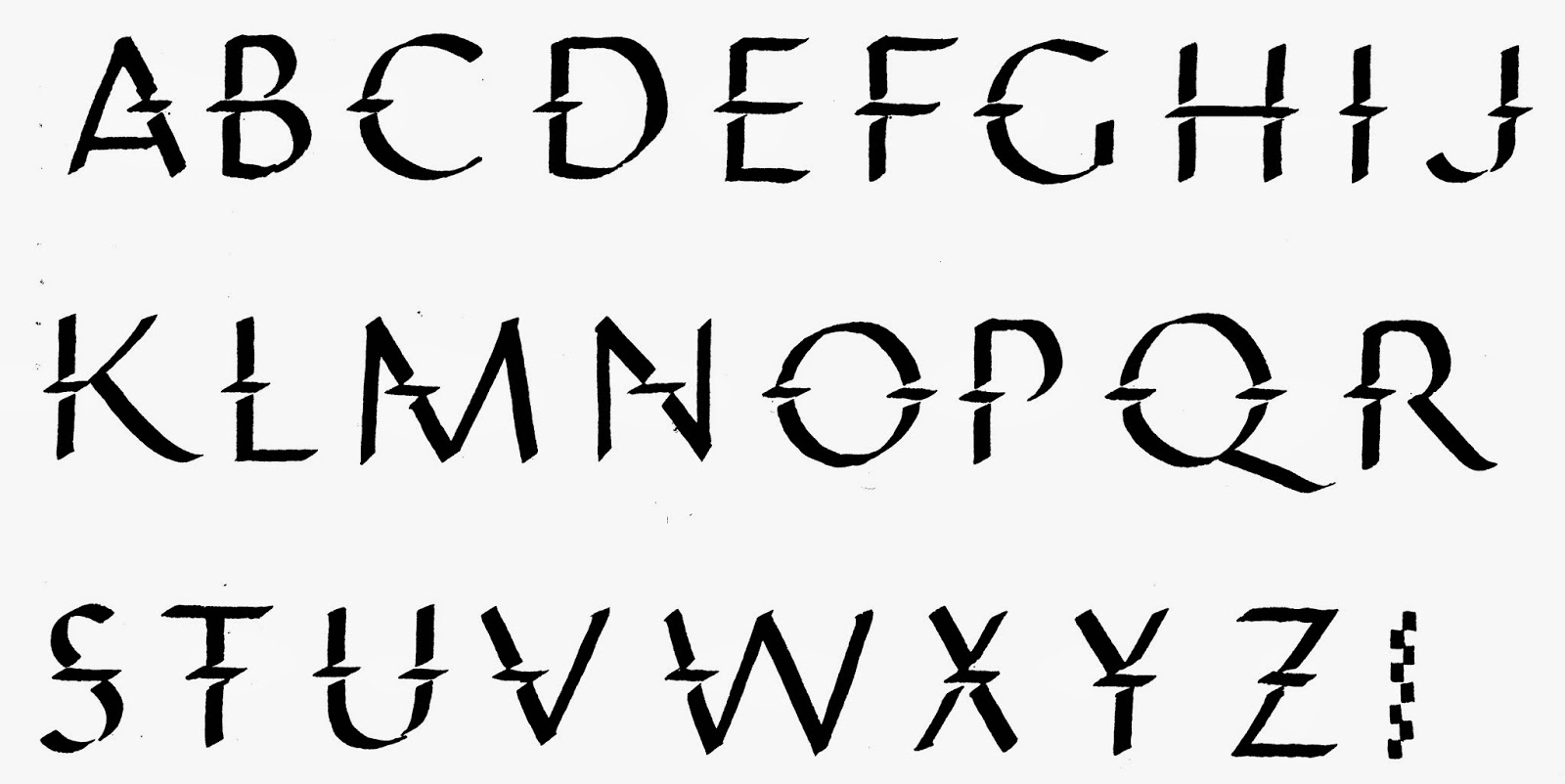
Sawtooth uses a little square stroke to create a decorative ridge along the back of the letter's main vertical.  I tried adding it to the curves and diagonals but I have come to think it's better to keep this one simple.  


Wednesday, November 13, 2013

269 Poster caps

Note ten to one ratio of height to pen width.  Don't let this alphabet get heavy.   

During the heyday of hand-lettered signage, there were hundreds of sample alphabets to choose from.  Here is one I came across recently.  I've named it Poster caps.  It's appealing, legible, and easy to write, and it has the charming flavor of a bygone American era.  

Tuesday, November 12, 2013

268 Showcard

The simplicity of Deco plus the humble warmth of the 1940s makes these letters appealing.   

Showcard is one more alphabet based on my favorite Speedball D nib.  This one, simplified from Coopy, was a workhorse for commercial letterers during the 1930s, '40s and '50s.  They cranked out stacks of signs for local businesses and national meetings--in fact, they were so vital to the big convention halls that they had their own unions.  
Eventually Letraset (and other brands of rub-on letters) and desktop printers put most of the sign writers out of work.  But their alphabets live on and continue to catch the eye.  

Monday, November 11, 2013

267 Doodled caps

Hard to improve on; you can try it out with your own doodle. 
Once you start to amuse yourself by dashing off drawn capitals, it's hard to stop.  Non-calligraphers, particularly, seem to rush up that learning curve to have fun with letter design long before they've learned the rules.  This means they invent GREAT alphabets.  

Here's my left-handed cousin Fred Fiske, giving yesterday's Post Medieval letters a handsome Deco look and then doodling inside the empty stroke [top row].  

OK: that's probably enough alphabets for a while based on Medieval Caps.  

Some taboos to try now and then in your calligraphy:
  • Use lined paper. 
  • Write with a thin marker.  
  • Walk off with hotel stationery. 
  • Hold a pen in your left hand....
  • Goof around.


Sunday, November 10, 2013

Pricing your work

What to charge?  
Last week we talked about UNIT pricing, useful for small, uniform items like name tags, envelopes, and reproductions.  Here are two more categories for pricing your calligraphy work: time and expertise.  

Category 2. You can set a price by estimating the TIME it will take to complete the work.  You have to include all the time, which adds up fast: talking to the client, shopping for special materials, learning a special alphabet, making mistakes, cleaning up.  
Once you have added up the hours, you still need to set a rate per hour.  A good rule of thumb for a beginner is four times the minimum hourly wage in your area.  For every hour you spend with pen in hand, you will spend another hour on general non-lettering chores, a third hour on the vacations, sick leave, and coffee breaks any reasonable boss has to give, and a fourth hour providing for the overhead expenses of workspace, furniture, utilities, and transportation.  
Typical jobs that can be estimated and charged per hour even when you present an invoice based on the piece of finished work: poster design, award, retirement scroll. 

Category 3. Once you have learned about selling items or charging for your time, you are ready to sell your EXPERTISE.  Don't underprice it.  You are billing not only for the hour it takes to ink a monogram design and the time spent meeting with your client, but for the days you spent thinking it up and the decade you spent sharpening your skills.  And since expertise often consists of knowing what to leave out, a simple design does not necessarily cost less than a complicated one, nor take less time.
Typical jobs: logo design, signage, wedding graphics.  

More about pricing next week, when we look at what to charge when you are really well known.  


Saturday, November 9, 2013

266 Post Medieval caps


This appears to have been overlooked and posted out of order.  It is the basis for Doodled Medieval Caps.  
Here is Post Medieval, which takes the essence of outlined medieval letters and dashes them off with insouciance and spontaneity.  I asked my cousin Fred Fiske, retired editor, to re-stage the caps he and my aunt Janet have made famous in the family.  Their wrapping paper usually doubles as gift card and chatty letter in our clan, and you can even draw aribbon to tie it.

After these casual caps arrived wrapped around a book, I requested a full alphabet.  Fred reports that it's easier to write without thinking too much.  A lot like life. 


☞ Note: this is marked as friendly to left-handers.  It actually is done by a left-hander. 


Friday, November 8, 2013

265 Complex Medieval caps + dot


I used a Speedball B to make the dots all the same size.  You can just make circles with a small pen and fill them in.  
In addition to yesterday's Complex Medieval caps, you can add a decorative disk to the very thin curves.  I've shown this on most letters except A V W X Y Z; you may want fewer of them.  Or more!  


Thursday, November 7, 2013

264 Complex Medieval capitals


Complex Medieval builds on yesterday's Simplified Medieval.  Transform the letters with a mix of these six steps:
  1. Choose forms of E H M N T W that are less modern and more medieval.
  2. Exaggerate the contrast between thick and thin parts of curves.
  3. Make the outer curve a little sharper.
  4. Lower the corners of B D F P R...
  5. And extend their serifs, as well as those of P and H.
  6. Add a dramatic bulge and taper to one stroke in A H J K M N Q R T X Y Z
  7. An alternate M can be derived by rotating the W 180°.

This quotation starts with large caps carefully rendered in powdered gold paint, known as "shell gold."  The smaller red caps are heavier, more like yesterday's  Simplified Medieval. It ends with the attribution, to Fra Giovanni also in shell gold. 

I haven't shown the text lettering itself.  This was only the third piece of calligraphy I tried, back when I was a beginner.  Actually, I'm still a beginner...  


Preview of tomorrow's alphabet.

Wednesday, November 6, 2013

263 Simplified Medieval caps

These drawn and filled in letters are not as refined as I would would make them for a formal design.  I just drew them to illustrate the two-step process.
When medieval scribes wanted to start their text with an enlarged word or two, they often chose to draw Roman letters, which came to be called Versals or Lombardic capitals.  I've named these Simplified Medieval caps, because they render the classic forms in a style that highlights their decorative inner spaces and hairline serifs.


Outline, to be covered up.  
Here is the first, outlined version; a scribe or illuminator would have sketched the letter in diluted gray or brown ink, intending to cover the outline with the final solid color of red or blue paint, or gold leaf.  The outlines--shown in black here--are not meant to be seen by the final reader; they just suggest where to paint or gild.


Tuesday, November 5, 2013

262 Original Medieval caps

I've left the J and V and W blank for your own versions.  

I recently traced these Original Medieval letters from a page that provided models for an illuminator to dramatize a paragraph once a scribe had lettered the text.  These letters are much more individual than modern versions, which tend to try to look like a font with uniform letter bodies and line endings.  Sometimes tracing is the only thing that will keep you from needlessly improving and updating an alphabet--not necessarily a bad thing but it's hard to stop doing.  
Source of initials.  


Tracing calligraphy is like historical re-enactment; you learn to do what the person of the period did, without trying to impose your own interpretation onto it. 


Monday, November 4, 2013

261 Bandy


This alphabet is a variation of simple Roman.  The short horizontal strokes add visual complexity without interfering with legibility.


Sunday, November 3, 2013

Pricing your work 1 of several

Many freelancers find it hard to know how much to charge.  While each job is different, you can categorize your work and then evaluate it on that basis.  I use four categories to distinguish what you sell: items, hours, expertise, and rights. 

 This week I'll talk about pricing your work per item.  
1. You may be selling things that do not take much work, such as reproductions of your design or quickly written name cards, made to be sold in quantity.  Often the cost of the materials means more than the amount of labor.  You should price these by the ITEM--a certain price for each one, with maybe a discount for the purchase of a number of them.
Freelancers sometimes sell through a middleman, such as a store or a specialized website.  They charge a markup; to sell a poster at $10, for example, an art or stationery store will pay you $5, a bookstore $6, a consignment crafts store around $7.  Remember, though, that the higher the markup, the more incentive they have to sell your items.  Lower markup usually means that the retailer will return your items to you if they don't sell.  

Saturday, November 2, 2013

260 Enviro


This alphabet, Enviro, is based on a mid-20th-century type design.  I've offered it in letter groups rather than alphabetic order to make it easier for you to focus on the letters that are really distinctive and what makes them stand out.  
I'm not sure where the name comes from--type designers have mysterious minds.

Friday, November 1, 2013

259 Double Gap


The texture of this simple Roman is enriched and brightened by lifting the pen twice during each major stroke to create a Double Gap.  Guidelines that cue your lifts will keep it easy to read.